Harper’s Bazaar Italia, issue 23, “Trompe l’œil”
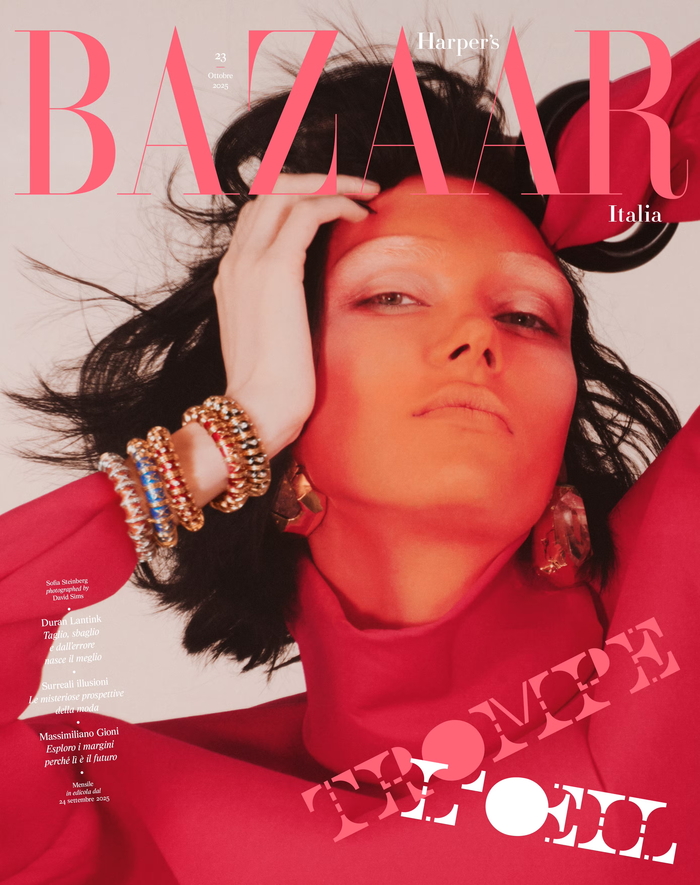
Source: www.harpersbazaar.com Harper’s Bazaar Italia, M/M (Paris). License: All Rights Reserved.



In its 23rd issue, titled TROMPE L’OEIL, Harper’s Bazaar (the world’s oldest fashion magazine still in publication), explores optical illusion through fashion, including Bizzarro, a fashion story photographed by David Sims and styled by Paul Sinclaire. It is the second issue under the creative direction of the art direction duo M/M (Paris), Michael Amzalag and Mathias Augustyniak, who began their collaboration with the magazine in September 2025.
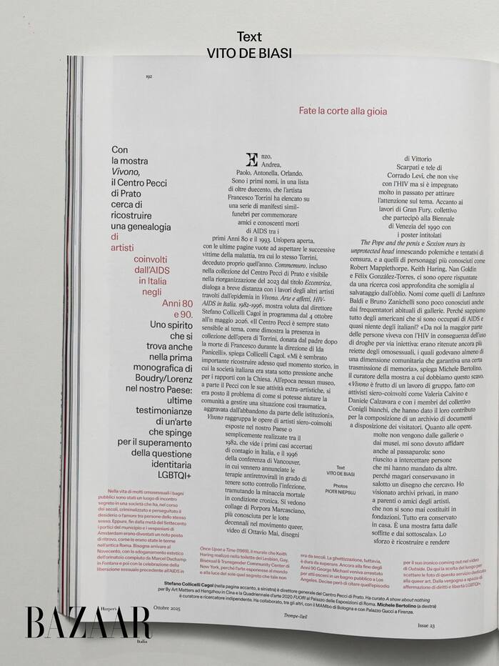
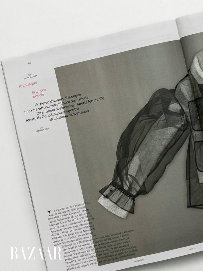
M/M use AL Sigla for long-form texts, a faithful revival of FTC Sigla by Umberto Fenocchio, a charming Italian Times New Roman from the 1960s. For shorter texts, they chose LL Schema, newly released by Lineto and designed by Alberto Malossi. A reinterpretation of Permanent (Karlgeorg Hoefer, 1962), more contemporary, more approachable and with fluid forms—a warm modernist grotesque that emphasizes contrast between shapes. Harper’s Bazaar Italia marks its first appearance in a major editorial project, several months before its official release. The typeface was officially launched during an event held at Program/me Paris, the space run by Syndicat and M/M, on June 26, 2026.
Words from M/M:
We wanted to reconnect with a language shaped by the warmer, more idiosyncratic side of Italian modernism.
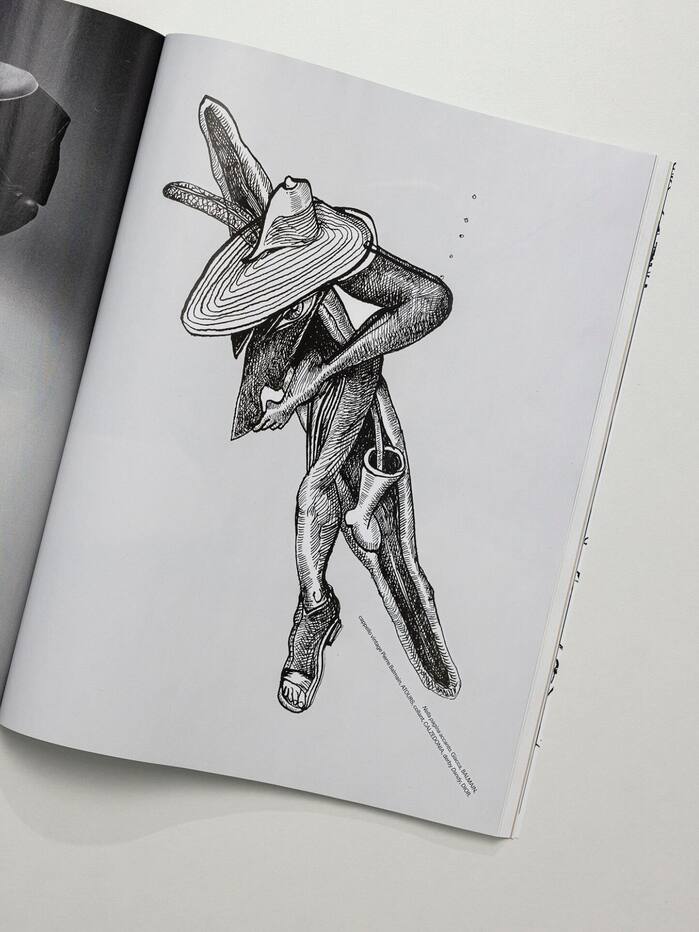
For the headlines, M/M designed an exclusive all-caps typeface, Gran Bazaar, that functions as an additional typographic tool throughout the magazine. The semicircles and bars that make up this alphabet recall the mobile sculptures of the Italian artist and designer Bruno Munari. Used throughout the magazine, the typeface begins to blur the line between letterforms and typographic composition. This brings us back to Munari, who similarly explored the boundaries between form and space in some of his works, most notably in his Negativi-positivi series (1950), where figure and ground become difficult to distinguish, creating a sense of perceptual instability and illusion that echoes the theme of the issue.
Words from M/M:
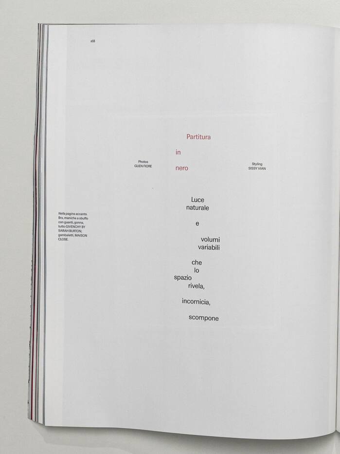
We push it with what we call staccato: deliberate spacing, repetition, colours and shapes drawn from the images it sits beside. It builds the magazine’s space.
Through its playful and colourful forms, its wraparound and shaped paragraphs, its tangible use of spacing and repetition, its circular and diagonal lines of text, the new Harper’s Bazaar Italia begins to read as a manifesto for a typography that is free, playful and in motion. It revives a certain idea of Italian graphic design applied to fashion, bringing a playful and joyful breath of fresh air back into an editorial landscape too often confined within tailoring as impeccable as it is conventional, an approach that would become increasingly pronounced in the issues that followed.
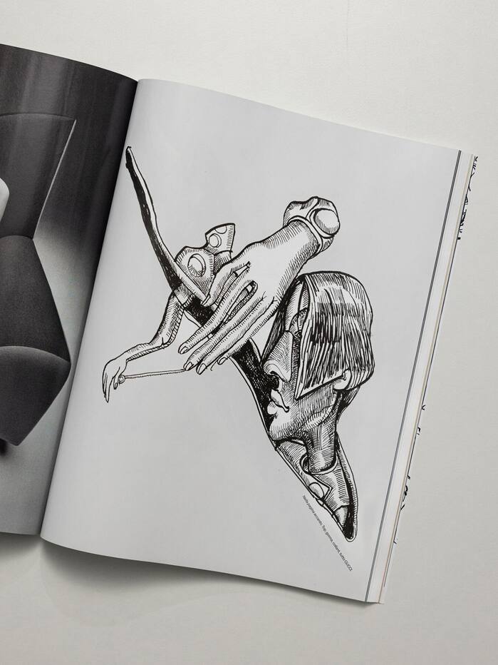
Source: www.harpersbazaar.com Harper’s Bazaar Italia, M/M (Paris). License: All Rights Reserved.
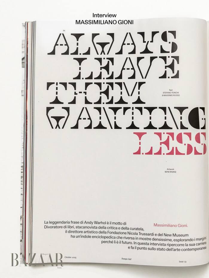
Source: www.harpersbazaar.com Harper’s Bazaar Italia, M/M (Paris). License: All Rights Reserved.
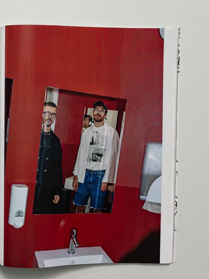
Source: www.harpersbazaar.com Harper’s Bazaar Italia, M/M (Paris). License: All Rights Reserved.
Source: www.harpersbazaar.com Harper’s Bazaar Italia, M/M (Paris). License: All Rights Reserved.
Source: www.harpersbazaar.com Harper’s Bazaar Italia, M/M (Paris). License: All Rights Reserved.
Source: www.harpersbazaar.com Harper’s Bazaar Italia, M/M (Paris). License: All Rights Reserved.
Source: www.harpersbazaar.com Harper’s Bazaar Italia, M/M (Paris). License: All Rights Reserved.
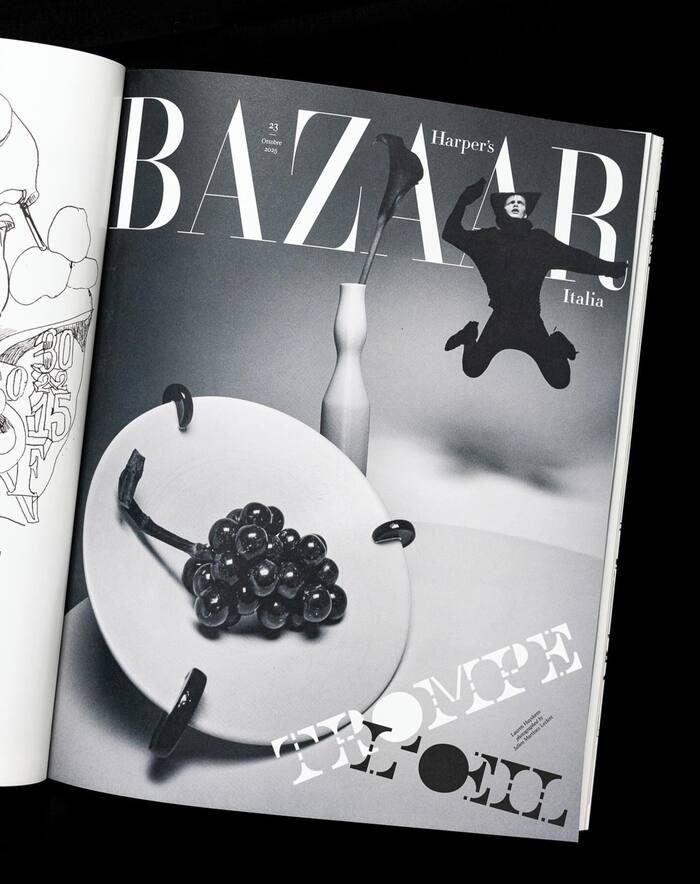
Source: www.harpersbazaar.com Harper’s Bazaar Italia, M/M (Paris). License: All Rights Reserved.
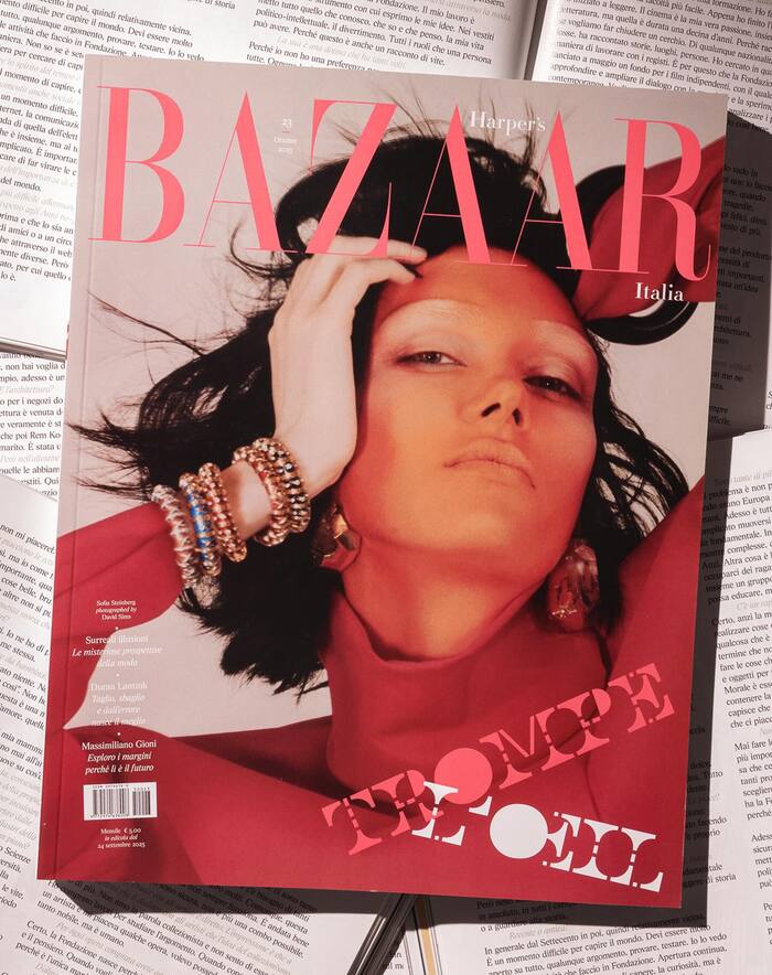
Source: www.harpersbazaar.com Harper’s Bazaar Italia, M/M (Paris). License: All Rights Reserved.
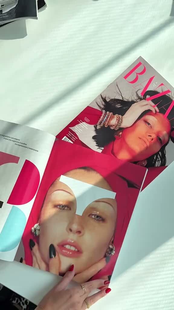
Source: www.harpersbazaar.com Harper’s Bazaar Italia, M/M (Paris). License: All Rights Reserved.
Source: www.harpersbazaar.com Harper’s Bazaar Italia, M/M (Paris). License: All Rights Reserved.
This post was originally published at Fonts In Use