Eight

Source: www.instagram.com Samantha Cai. License: All Rights Reserved.
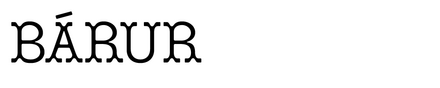

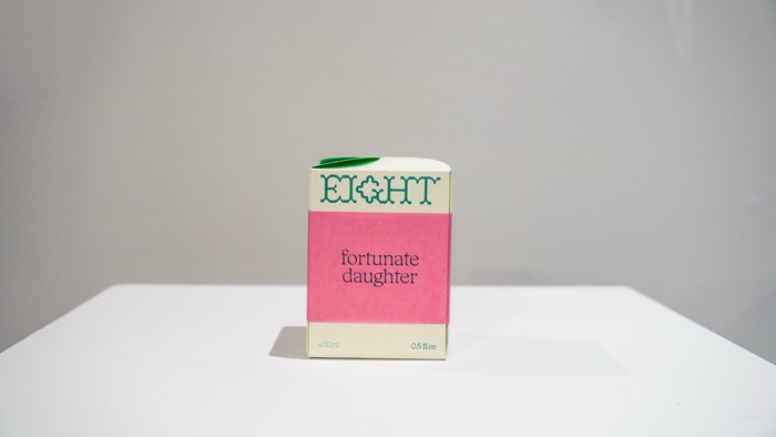
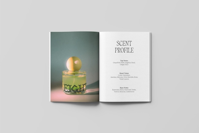
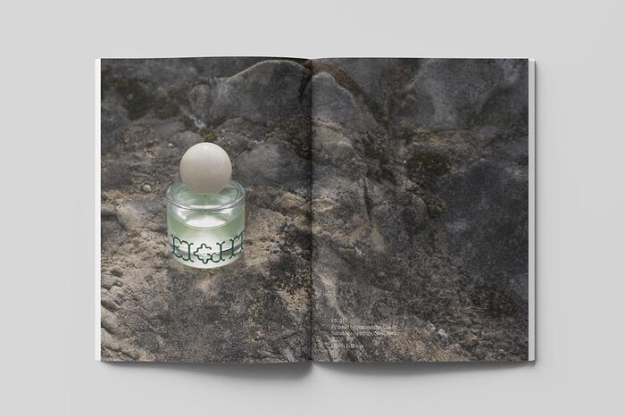
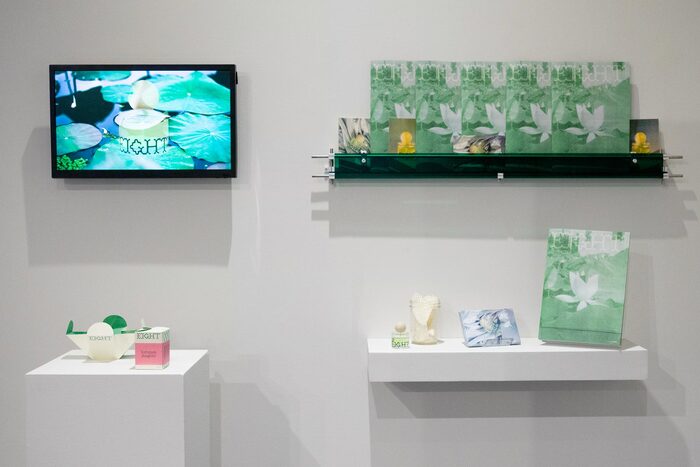
Eight is the thesis project by Skidmore College student Samantha Cai, inspired by Chinese culture, symbols of luck, and the relationship between memory and scent. The visual identity centres on a glass fragrance bottle with a large, round yellow cap and a wordmark set in Bárur Regular. A custom G was integrated into the wordmark, extending the typeface’s visual language while adding a project-specific detail. The complementary serif typeface is Fenul from Displaay Type Foundry
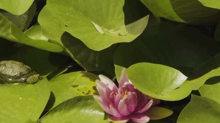
The identity is developed across a packaging concept, perfume testers, a magazine, promotional video, and Risograph printed postcards. Atmospheric product photography brings together colour, light, and material, while the distinctive geometry of Bárur contributes to a coherent visual language across the different applications.

Source: www.instagram.com Samantha Cai. License: All Rights Reserved.
Source: www.instagram.com Samantha Cai. License: All Rights Reserved.
Source: www.instagram.com Samantha Cai. License: All Rights Reserved.
Source: www.instagram.com Samantha Cai. License: All Rights Reserved.
Source: www.instagram.com Samantha Cai. License: All Rights Reserved.
Source: www.instagram.com Samantha Cai. License: All Rights Reserved.
This post was originally published at Fonts In Use