LÔCÔ Art Market Summer 2026

Source: m-n.associates M — N Associates. License: All Rights Reserved.


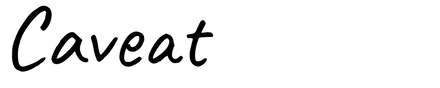
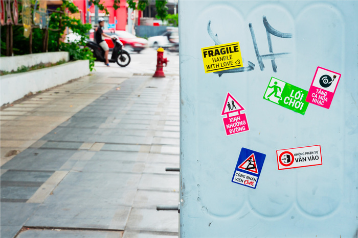
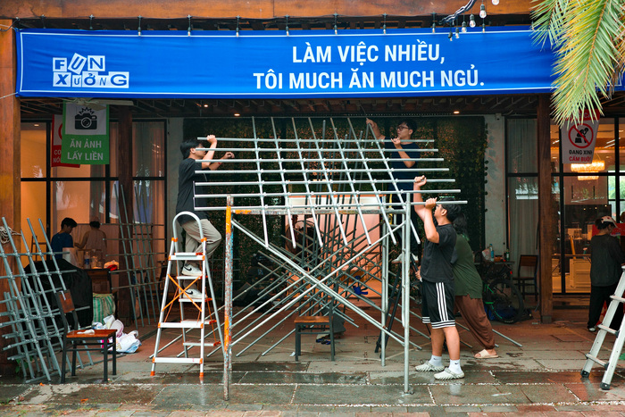
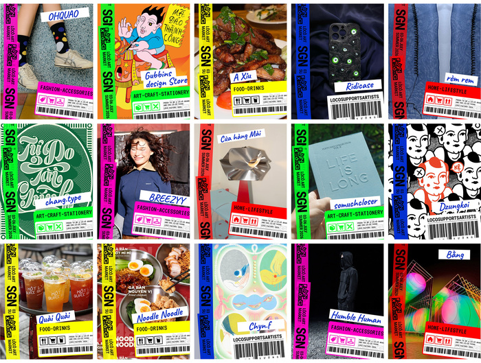
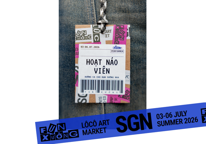
For the Summer 2026 edition of LÔCÔ Art Market in Ho Chi Minh City, Vietnam, M — N Associates developed a visual identity that treats typography as something to pack, stack, label, and rearrange. Bringing together Roboto Flex, Roboto Mono, VT323, and Caveat, the branding translates the language of logistics into a setting for local art and creative exchange.
The starting point is the factory: a place where separate contributions become a finished whole. Carton boxes, shipping labels, and packing tape provide a vocabulary for the event’s graphics. In the logo, individual letters occupy boxes of different proportions. Their shifting heights and uneven arrangement give the name the appearance of a small stack of parcels.
Roboto Flex brings this play with proportion into the display typography, with variations in width, height, weight, and slant. Its variable design makes it an apt choice for a visual language built around letters that seem to occupy, fill, and negotiate space.
Roboto Mono and VT323 provide the monospaced foundation. Their consistent character widths establish a regular rhythm beneath the more changeable display compositions. The pairing also introduces a difference in texture: Roboto Mono’s clean forms sit alongside VT323’s terminal aesthetic. Caveat adds a handwritten voice to selected headlines and moments of emphasis, suggesting a note left on a package. Its informal strokes make the presence of a person visible within the industrial theme.
The complete branding project shows how these four typefaces work together across the identity, from individual letter boxes to the physical market.

Source: m-n.associates M — N Associates. License: All Rights Reserved.

Source: m-n.associates M — N Associates. License: All Rights Reserved.

Source: m-n.associates M — N Associates. License: All Rights Reserved.

Source: m-n.associates M — N Associates. License: All Rights Reserved.

Source: m-n.associates M — N Associates. License: All Rights Reserved.
Source: m-n.associates M — N Associates. License: All Rights Reserved.
Source: m-n.associates M — N Associates. License: All Rights Reserved.

Source: m-n.associates M — N Associates. License: All Rights Reserved.
Source: m-n.associates M — N Associates. License: All Rights Reserved.
Source: m-n.associates M — N Associates. License: All Rights Reserved.

Source: m-n.associates M — N Associates. License: All Rights Reserved.
This post was originally published at Fonts In Use