mini studio – “For ornament” flag
Source: mini-studio.fr mini studio. License: All Rights Reserved.

This summer Fig. Festival, an annual graphic design festival that takes places in Liège (Belgium) since 2017, invited several members of the Rencontres internationales de Lure to design a flag, as part of the Micromega exhibition in Lurs (France).
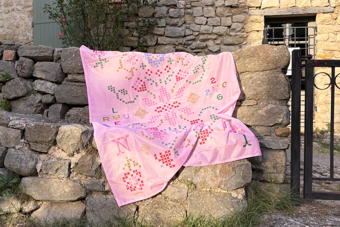
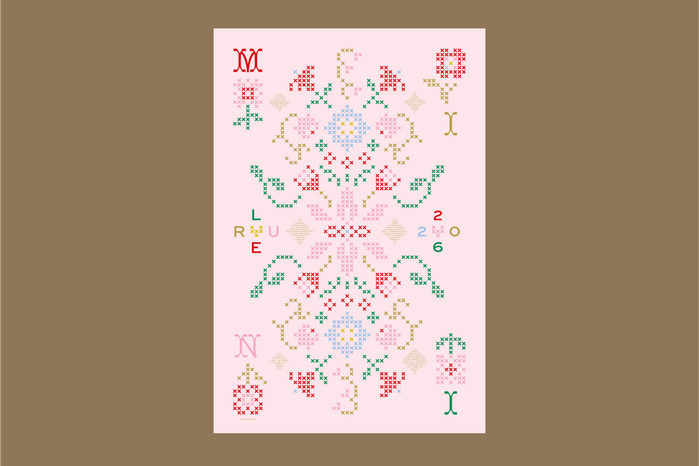
For its flag, mini studio questions the ever-debated place of ornament, color, and the feminine in the fields of art and design. Long admired and then fiercely criticized, ornament continues to divide—caught between the ideal of a supposedly superior “purity” (the famous “less is more”) and the maximalist stance of “less is a bore.”
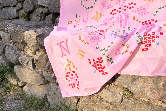
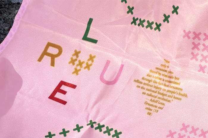
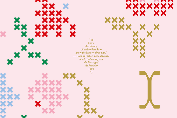
A tribute to the art long dismissed as feminine and decorative—embroidery—this flag reinterprets a Renaissance-inspired ornament in the form of cross-stitch. It pairs this design with statements both in support of ornament and excerpts from its detractors, written as small decorative diamonds set in Matthieu Cortat’s Louize (205TF).
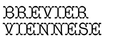
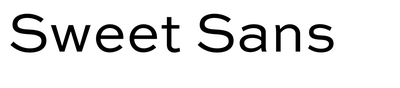
Surrounding it all, the “quaint charm” of the Brevier Viennese letters (by Johannes Lang and Ellmer Stefan, based on a specimen from the Fann Street Foundry, London, 1874) spell out the name of the studio, proudly displaying its manifest on this flag. “Lure 2026” is added in caps from Mark van Bronkhorst’s Sweet Sans.
Where others might see here excess, ease, triviality, decadence, or even irresponsibility, mini studio invites you to rally under the banner of ornament, color, decorative, and frivolity.
Source: mini-studio.fr mini studio. License: All Rights Reserved.
Source: mini-studio.fr mini studio. License: All Rights Reserved.
Source: mini-studio.fr mini studio. License: All Rights Reserved.
Source: mini-studio.fr mini studio. License: All Rights Reserved.
This post was originally published at Fonts In Use