Weine Spirituosen Tabakwaren shop, Leipzig

Source: www.flickr.com Maurits van den Toorn. License: All Rights Reserved.
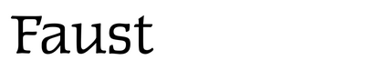
Faust-Antiqua is a boxy low-contrast serif designed c.1959 by Albert Kapr (1918–1995) in roman and italic styles. It was made specifically for the Institut für Buchgestaltung at the HGB Leipzig. Kapr, who served as professor for type and book design from 1951, initiated the institute in 1955 and supervised it until 1978. While Faust was cut in metal by Otto Erler and cast by Typoart, I don’t think the East German foundry ever made it available for general use.
Still, Faust found some applications outside of the academy. One example is the sign of Renate Bergmann’s shop selling wine, spirits, and tobacco. It’s used with condensed proportions and a white shade. The photo was taken by Maurits van den Toorn in 1989, one year before the GDR came to its end.
This post was originally published at Fonts In Use