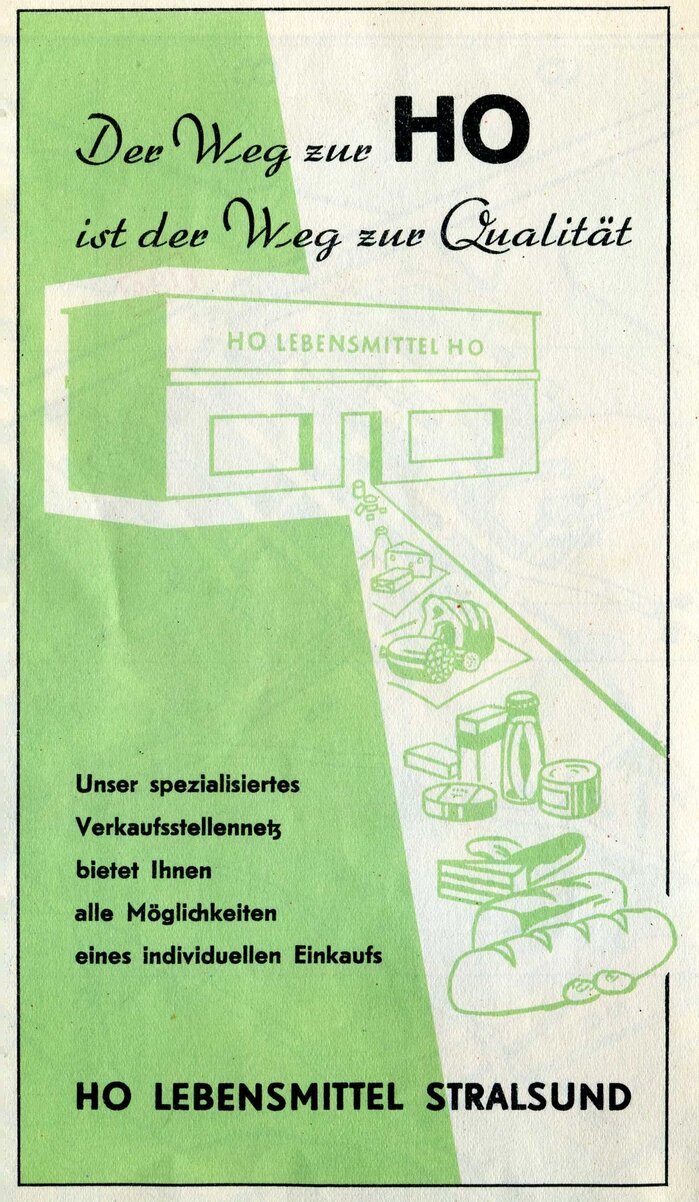
HO Lebensmittel Stralsund ad
Source: www.flickr.com Sludge G. License: CC BY-SA.

Via Sludge G’s Flickr photostream:
Advertisement, one of several, from the inner folds of a 1957 street map of Stralsund, at the time when trams still ran in the town, shortly before abolition. Some tram track may still be observed 50 years later.
The state-owned HO (Handelsorganisation, English: “Trading Organization”) was the largest retail chain in the GDR. In addition to regular department stores, it also operated the large Centrum department stores, specialty shops, hotels, and many upscale restaurants.
This ad for a grocery store in Stralsund uses Arabella for the slogan, “Der Weg zur HO ist der Weg zur Qualität” (“The path to HO is the path to quality”). Arno Drescher’s script typeface was first cast by Ludwig Wagner in Leipzig in 1936. It was later sold both by Johannes Wagner in West Germany and by Typoart in East Germany.
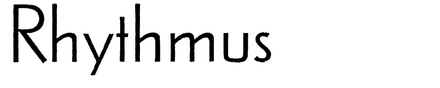
The geometric sans with the double-story a has a similar backstory. Rhythmus originated at Schelter & Giesecke, likewise in Leipzig. The first styles were released in 1931, in response to Kabel and Futura. The larger x-height seen in the ad suggests that this is Rhythmus-Werkschrift, a revision intoduced in 1937. After the war, Typoart continued Rhythmus for a while, but eventually phased it out in favor of Fundamental and Super-Grotesk.
This post was originally published at Fonts In Use