Primer
Source: newkid.services newkid. License: All Rights Reserved.


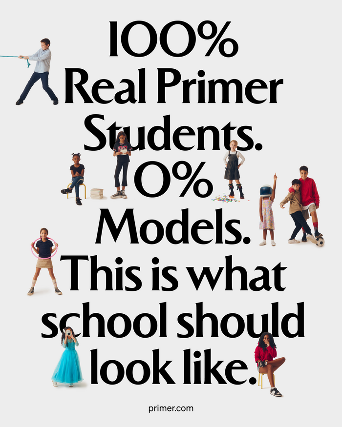
Toronto-based agency newkid (a play on the concept of the newly-arrived kid in town, or in school) claims to nurture the visual Identity as well as the verbal identity when approaching a client. They did so beatifully with their all-encompassing rebranding of Primer, a Florida-based network of teacher-led K-8 schools that is expanding its presence to other parts of the US.
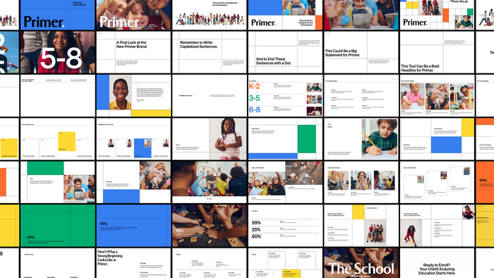
As stated in the project page, Primer resorted to newkid to rebrand and overhaul its footprint, which entailed “brand strategy, full identity system, website, and brand launch film”. The website is not a mere window display, as the company seeks investors and parents alike to join its network.
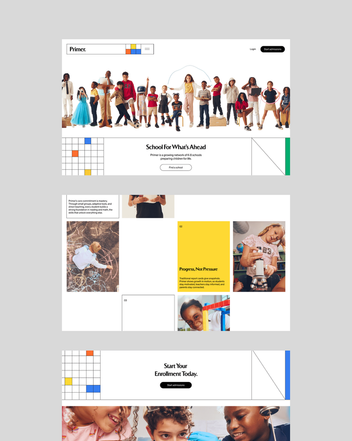
The website rebuild brought the full brand system to life across a complete digital experience (...). Built to serve families at every stage of consideration, from first encounter through enrollment, it also functions as a brand statement for investors, press, and prospective Primer Leaders.
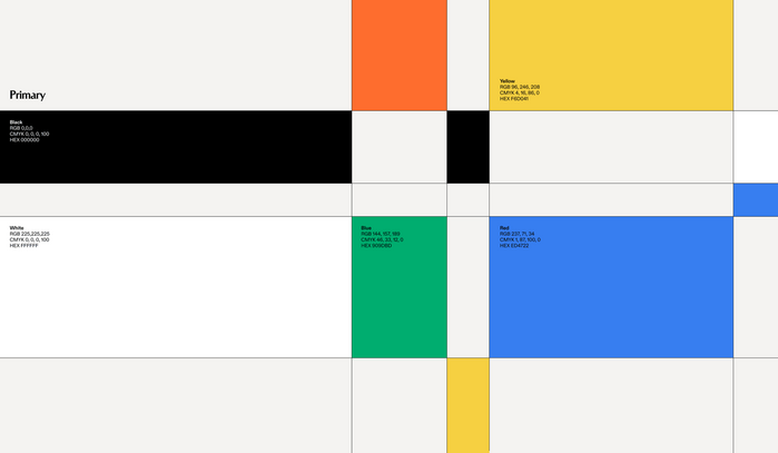
As we’ll see, a playful and colourful Mondrian-like grid and two gorgeous fonts support this effort: Sirca by the Parisian foundry Edito and Söhne by Klim Type Foundry from Aotearoa/New Zealand.
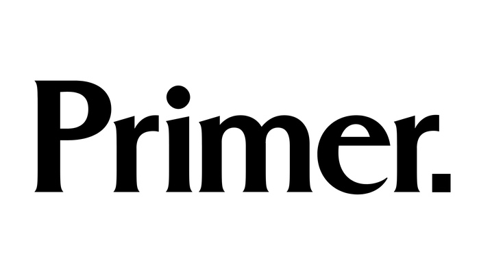
Sirca Medium is employed in the six-letter wordmark and it embodies the charisma and the gravitas of a brand that exudes the privilege of quality private education and the promise of multifaceted creative learning.
Söhne Buch is used for buttons, some explanatory or secondary items headlines and body copy, but Sirca still reigns supreme, just like San Diego’s famed news anchorman Ron Burgundy in the 70s.
One thing to note is that typographical hierarchy here is definitely not constrained by customary web-based typesetting, as no headline is too loud or strident from a design point of view to outshine the Primer wordmark.
For instance, the news section header, “Latest Primer news”, is 2.5rem– or 48px tall, only slightly bigger than the Primer wordmark: the logo SVG seems to be rendered by the browser at circa 32px—pun intended. Then, each headline features 1.75rem/33px headlines.
So the scale used purposely avoids excessive contrast in the headline line-up and adopts a smooth sizing approach.
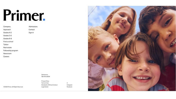
One exception would be the often-neglected footer section, which has been cooked to perfection, meaning grid, typographical contrast and use of photography. The size contrast is enough to parade the wordmark in all its glory, although the designers chose to use a blue-coloured dot at the end to punctuate —pun intended—the brand.
Some of the signature traits of Sirca are the sharp edges in the m’s and w’s and its distintictive letter a, which seems to have lost weight due to a bout of melancholy. They cannot be spotted in the Primer mark, but the reader can still catch them in the headlines.
As for the marketing copy, claims and leading ideas have been fitted into very short headlines that extend the glow of the flagship serif employed in the project. Nothing is out of place or necessarily in the expected place in the website, and the sans/serif pairing works like a son cubano choreography: leader and follower both shine in their respective roles.
In a time of Claudemania, AI imagery and design copycats, the Primer brand and editorial vision serves as a showcase of what fine art direction, fine photograpy and videomaking, fine typography and fine copywriting—all of them human-based—are capable of. Cheers to human craft.
Source: newkid.services Primer. License: All Rights Reserved.
Wordmark

Source: newkid.services newkid. License: All Rights Reserved.
Source: newkid.services newkid. License: All Rights Reserved.
Source: newkid.services newkid. License: All Rights Reserved.
Source: newkid.services newkid. License: All Rights Reserved.
Source: primer.com Primer. License: All Rights Reserved.
Source: newkid.services newkid. License: All Rights Reserved.
Source: primer.com Primer. License: All Rights Reserved.
Website footer
This post was originally published at Fonts In Use