Boteco de Manu
Source: allesblau.studio Fabiana Kocubey and the Alles Blau collection. License: All Rights Reserved.


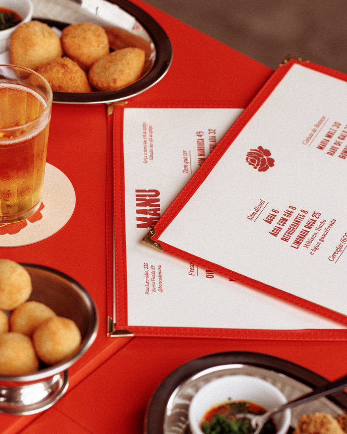
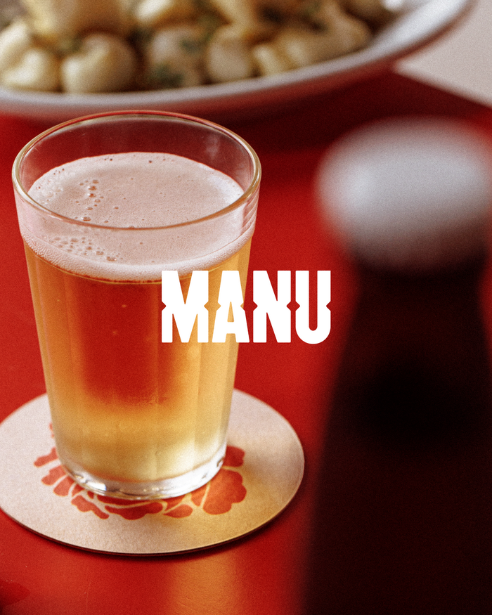
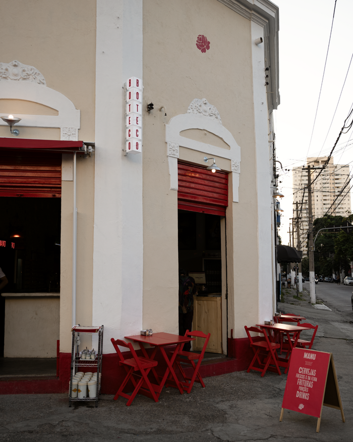
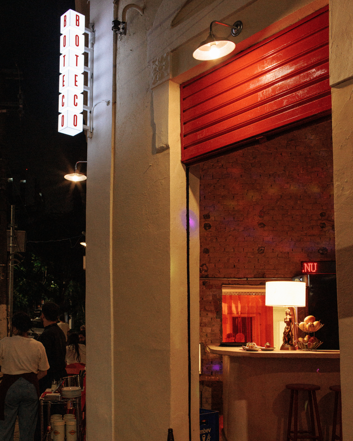
Bar Boteco da Manu, created by Manuelle Ferraz of A Baianeira, occupies a renovated corner house in Barra Funda. The visual identity draws on elements commonly associated with the boteco, including cold beer, glassware, snacks, and street-facing social spaces.
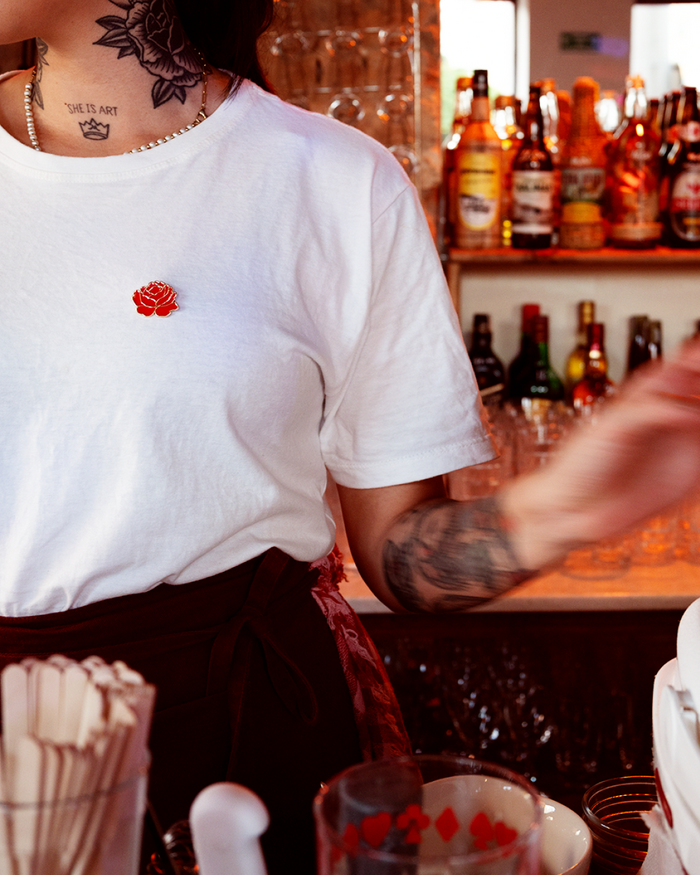
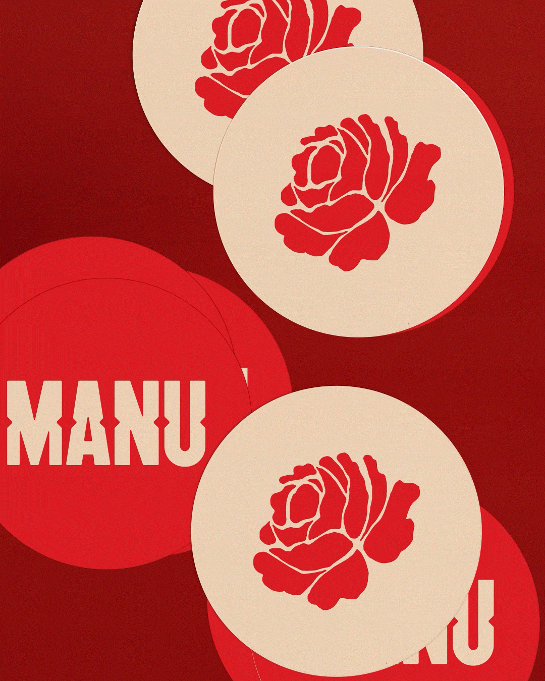
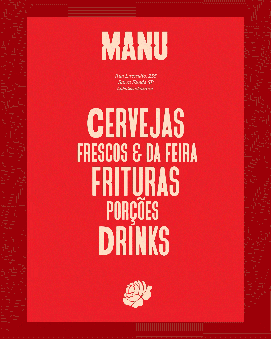
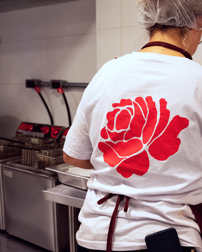
A red rose serves as the central graphic element, appearing across applications and connecting references from popular culture, nightlife, and everyday urban life. The color palette revolves around different shades of red.
The VTC Bayard typeface, by Vocal Type, relates the identity to a vernacular visual vocabulary, close to signs, street banners, and other graphic codes of the urban space. GT Alpina, by Reto Moser (published by Grilli Type), appears more selectively throughout the communication, establishing a dialogue between vernacular and editorial references.
Boteco da Manu does not conceal the kitchen, the refrigerator, or the beverage crates. The identity reflects this openness, drawing on references that move between the everyday and the theatrical. A place of exchange and hospitality, where drama and conviviality share the same table.
Source: allesblau.studio Fabiana Kocubey and the Alles Blau collection. License: All Rights Reserved.
Source: allesblau.studio Fabiana Kocubey and the Alles Blau collection. License: All Rights Reserved.
Source: allesblau.studio Fabiana Kocubey and the Alles Blau collection. License: All Rights Reserved.
Source: allesblau.studio Fabiana Kocubey and the Alles Blau collection. License: All Rights Reserved.
Source: allesblau.studio Fabiana Kocubey and the Alles Blau collection. License: All Rights Reserved.
Source: allesblau.studio Fabiana Kocubey and the Alles Blau collection. License: All Rights Reserved.
Source: allesblau.studio Fabiana Kocubey and the Alles Blau collection. License: All Rights Reserved.
This post was originally published at Fonts In Use