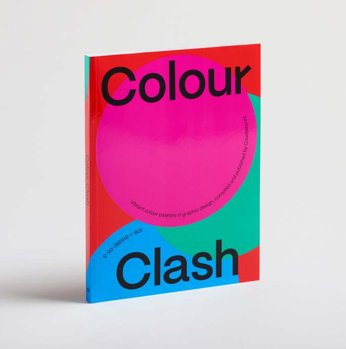
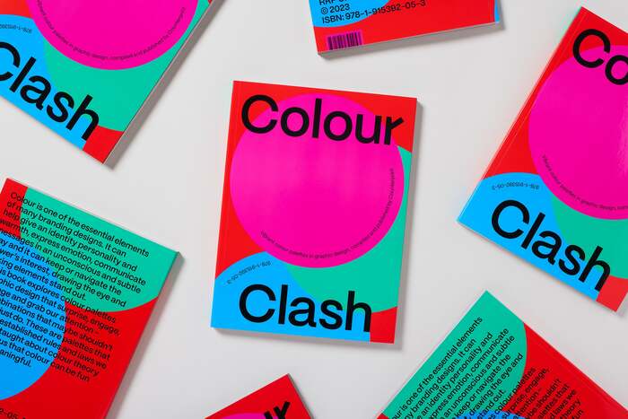
Colour Clash by Counter-Print
Published June 29, 2026
By FontsInUse
Contributed by Ethan Midoriya
Source: www.counter-print.co.uk Counter-Print. License: All Rights Reserved.

Source: www.counter-print.co.uk License: All Rights Reserved.
Source: www.counter-print.co.uk License: All Rights Reserved.
Source: www.counter-print.co.uk License: All Rights Reserved.
Source: www.counter-print.co.uk License: All Rights Reserved.
Source: www.counter-print.co.uk License: All Rights Reserved.
Source: www.counter-print.co.uk License: All Rights Reserved.
This post was originally published at Fonts In Use
Source: www.counter-print.co.uk Counter-Print. License: All Rights Reserved.
From Counter-Print:
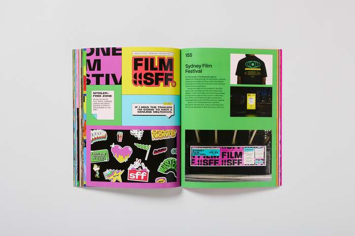
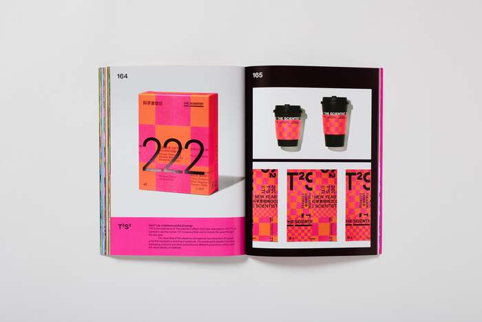
Colour is one of the essential elements of many branding designs. It can help give an identity personality and warmth, express emotion, communicate messages in an unconscious and subtle way and it can keep or navigate the viewer’s interest, drawing the eye and making elements stand out.
This book explores colour palettes in graphic design that surprise, engage, challenge and grab our attention – the combinations that maybe shouldn’t work but just do. These are palettes that break the established rules and laws we have been taught about colour theory and remind us that colour can be fun as well as meaningful.
The book uses Pangram Pangram’s Mori throughout, with its alternate lowercase r activated.
Source: www.counter-print.co.uk License: All Rights Reserved.
Source: www.counter-print.co.uk License: All Rights Reserved.
Source: www.counter-print.co.uk License: All Rights Reserved.
Source: www.counter-print.co.uk License: All Rights Reserved.
Source: www.counter-print.co.uk License: All Rights Reserved.
Source: www.counter-print.co.uk License: All Rights Reserved.
This post was originally published at Fonts In Use
Read full story.
WRITTEN BY
FontsInUse
An independent archive of typography.
More from FontsInUse