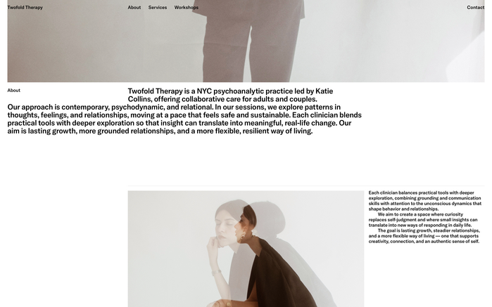
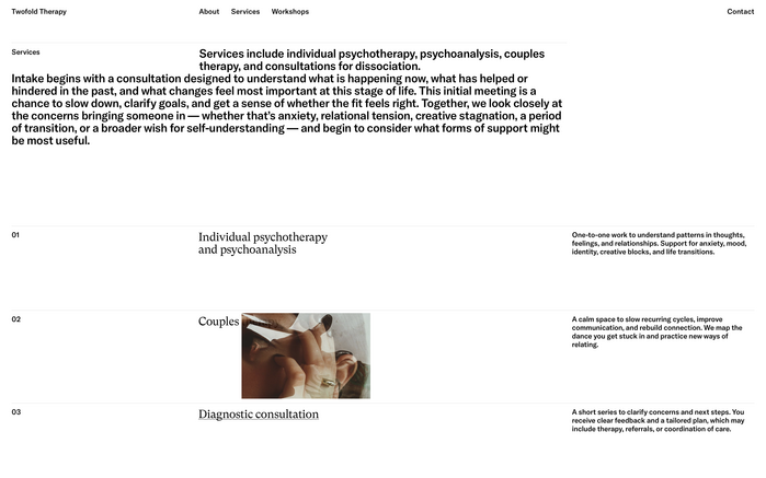
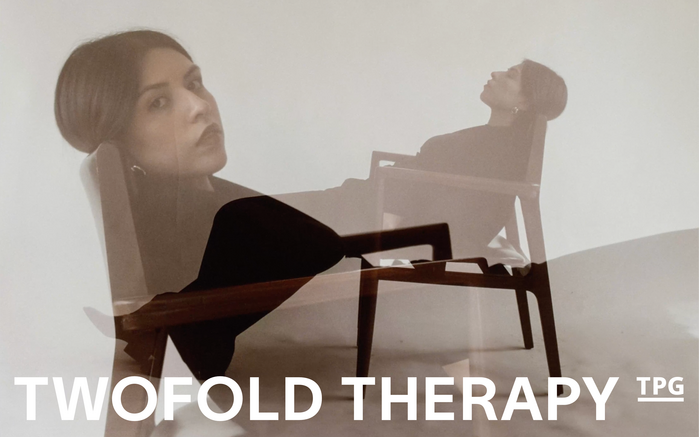
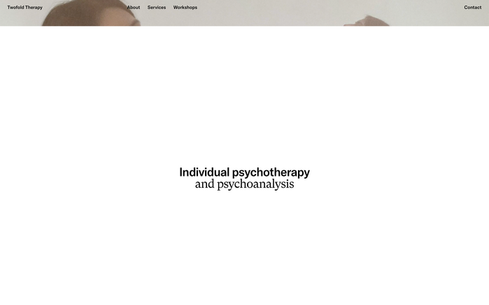
Twofold Therapy
Source: twofoldny.com License: All Rights Reserved.


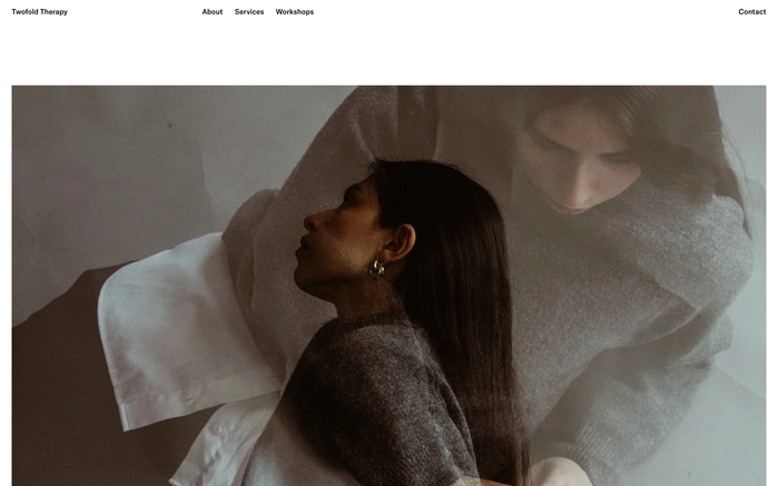
I completed the identity, digital design, and development for a psychoanalytic practice in New York City.
For a psychoanalytic practice, the typography needed to bridge the gap between clinical authority and deep, human expression. I chose to pair GT America and GT Super Text to create this exact balance. GT America provides a sturdy workhorse structure that bridges the precision of a European Grotesk with the expressive flow of an American Gothic, establishing immediate trust and clarity for the user interface. In contrast, GT Super Text – rooted in the idiosyncratic, calligraphic motions of 1970s and 80s editorial type – injects a warm, literary, and introspective quality into the reading sections, beautifully reflecting the rich, narrative nature of psychoanalysis.
Source: twofoldny.com License: All Rights Reserved.
Source: twofoldny.com License: All Rights Reserved.
Source: twofoldny.com License: All Rights Reserved.
Source: twofoldny.com License: All Rights Reserved.
Source: twofoldny.com License: All Rights Reserved.
Source: twofoldny.com License: All Rights Reserved.
This post was originally published at Fonts In Use