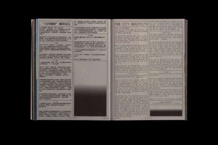
Cao Fei. My City Is Yours
Source: evi-o.studio Daniel Shipp. License: All Rights Reserved.


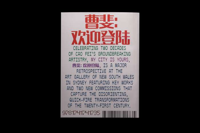
Evi O. Studio’s design for the book Cao Fei: My City is Yours accompanies a major retrospective of Chinese artist Cao Fei’s work in the Art Gallery of New South Wales.
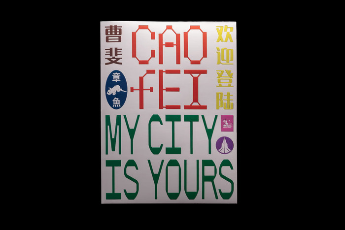
Spanning two decades, the publication presents themes of urbanisation, digital culture, and globalisation through essays, an artist interview, and rich imagery. The design merges contemporary aesthetics with nods to early Y2K style and Chinatown phone books, forming a unique blend of traditional and digital visual language.
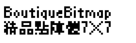
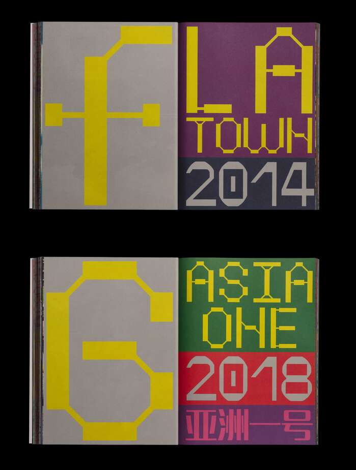
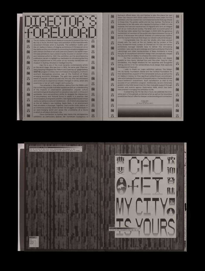
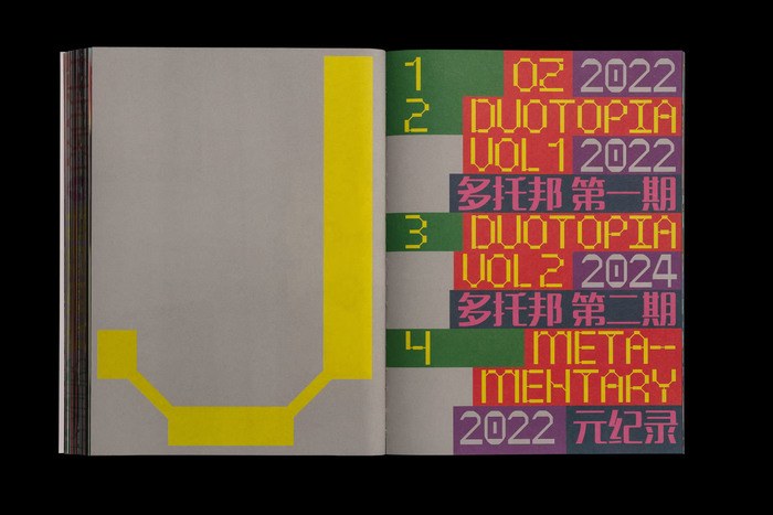
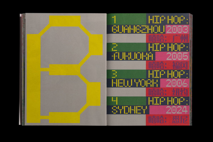
The main font is Splinter by Mario Julián Gutierrez / Dum Dum Studio. It’s used together with Acid Grotesk by Pablo Fernández de la Fuente / Folch for English text. The fonts used for Chinese text are BoutiqueBitmap7x7, Fixedsys Excelsior, MF LangQian, and PingFang HK.
From the publisher:
Cao Fei is one of the most innovative artists to have emerged on the international stage, known for work that charts the breakneck urbanisation, environmental changes and social flux of China in the 21st century.
Born in 1978 in Guangzhou, Cao is a world-builder who works across videos, photography, sculpture and immersive installations. Her acclaimed practice mixes social commentary, pop culture, references to surrealism, and documentary and she has appeared no less than six times in Art Review’s ‘Power 100’ list of the world’s most influential people in art.
This book, published in conjunction with the first Australian retrospective of the Beijing-based artist, showcases key works from the past 20 years, as well as newly commissioned works that explore China’s deep ties to Australia. Together, they encompass a range of compelling themes including urbanisation, digital transformations, 21st-century globalisation, family histories and diaspora.
Designed by award-winning graphic designer Evi-O, the book offers new scholarship on the artist by the exhibition’s curators, Ruby Arrowsmith-Todd and Yin Cao, together with essays by the renowned scholar of Chinese contemporary art Hou Hanru and emerging Asian–Australian writers Michael Sun and Pao-chen Tang. An expansive interview with Cao Fei and short entries on key projects features alongside a rich selection of artwork stills, reproduction images of props and paraphernalia, and a playful array of archival material spanning the artist’s influences.
The images of the book are by Daniel Shipp. See more on the website of Evi O. Studio.
Source: evi-o.studio Daniel Shipp. License: All Rights Reserved.
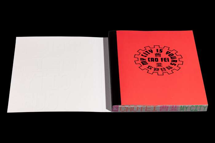
The title page additionally uses Futura Display in squeezed caps, set on a circle.
Source: evi-o.studio Daniel Shipp. License: All Rights Reserved.
Source: evi-o.studio Daniel Shipp. License: All Rights Reserved.
Source: evi-o.studio Daniel Shipp. License: All Rights Reserved.
Source: evi-o.studio Daniel Shipp. License: All Rights Reserved.
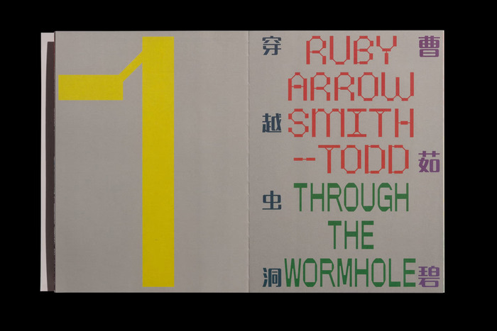
The chapter opening on this spread pairs Splinter (yellow and red) with OT 2049 from Off Type (green text).
Source: evi-o.studio Daniel Shipp. License: All Rights Reserved.
Source: evi-o.studio Daniel Shipp. License: All Rights Reserved.
Source: evi-o.studio Daniel Shipp. License: All Rights Reserved.
Source: evi-o.studio Daniel Shipp. License: All Rights Reserved.
Source: evi-o.studio Daniel Shipp. License: All Rights Reserved.
Source: evi-o.studio Daniel Shipp. License: All Rights Reserved.
This post was originally published at Fonts In Use