O último conhaque by Carlos Herculano Lopes
Published October 15, 2026
By FontsInUse
Contributed by Caio Maia
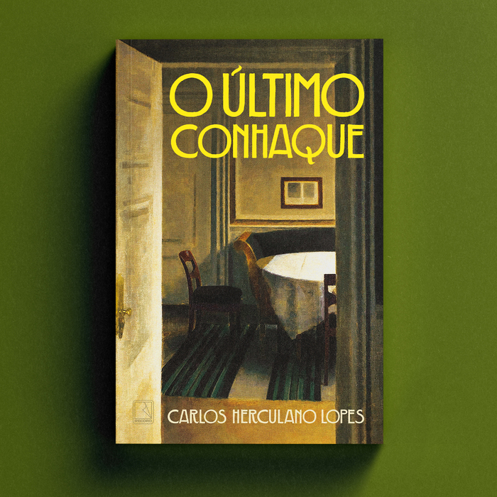
Source: www.caiomaia.com.br Photo: Caio Maia. License: All Rights Reserved.

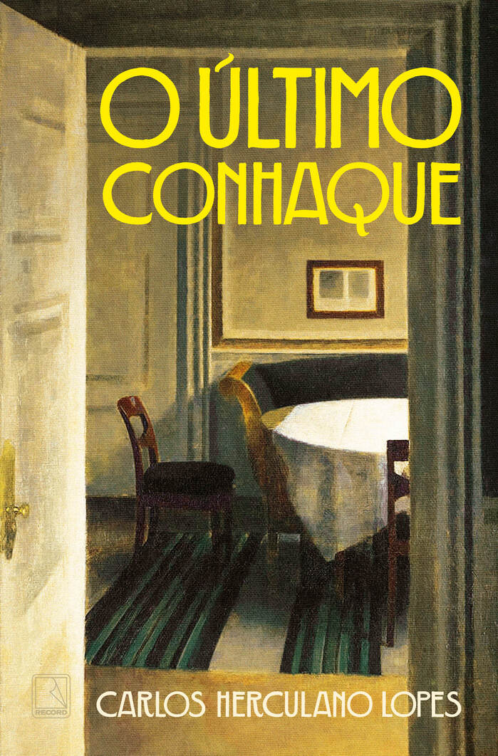
Source: www.caiomaia.com.br Photo: Caio Maia. Editora Record. License: All Rights Reserved.
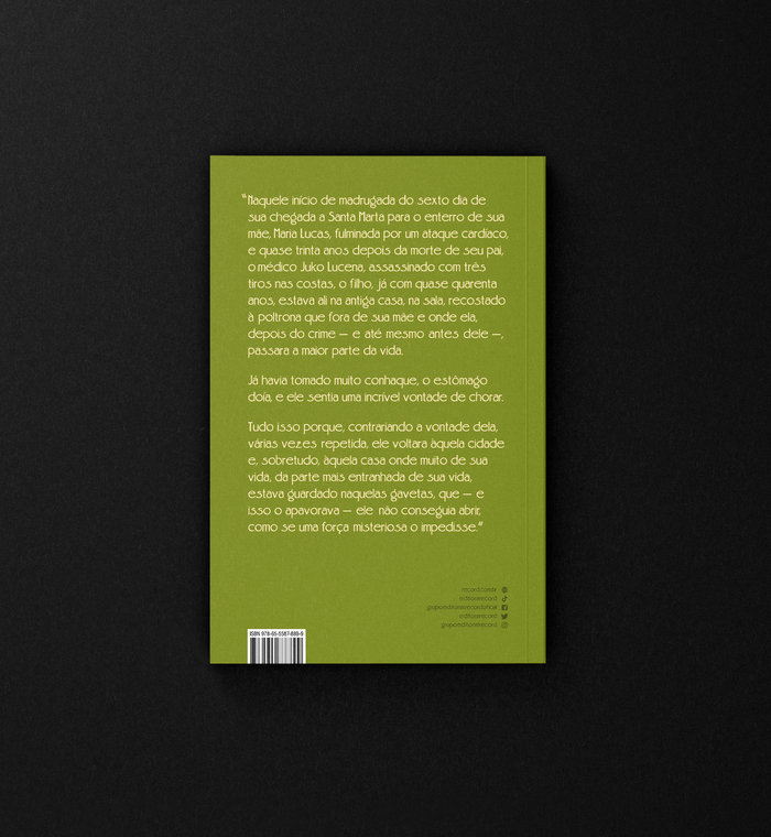
Source: www.caiomaia.com.br Photo: Caio Maia. License: All Rights Reserved.
This post was originally published at Fonts In Use
Source: www.caiomaia.com.br Photo: Caio Maia. License: All Rights Reserved.
Caqui is used for the title of O último conhaque (“The Last Cognac”), a novel by Carlos Herculano Lopes, published by Editora Record. The story is centered on grief, childhood memories, and rootlessness in rural Minas Gerais.
The typeface is a modern digital revival of an alphabet shown in William Hugh Gordon’s Lettering for commercial purposes from 1918. It creates a powerful visual dialogue with the cover artwork, a painting by Vilhelm Hammershøi's named “Interior Strandgade 30” from 1904. The contrast between the font’s bold, early 20th-century geometric weight and the muted, ghostly solitude of Hammershøi’s interior perfectly mirrors the protagonist's internal torment and atmospheric homecoming.
Source: www.caiomaia.com.br Photo: Caio Maia. Editora Record. License: All Rights Reserved.
Source: www.caiomaia.com.br Photo: Caio Maia. License: All Rights Reserved.
This post was originally published at Fonts In Use
Read full story.
WRITTEN BY
FontsInUse
An independent archive of typography.
More from FontsInUse