Cherub Tricho
Source: www.atin.studio Photo: Atin. Atin. License: All Rights Reserved.



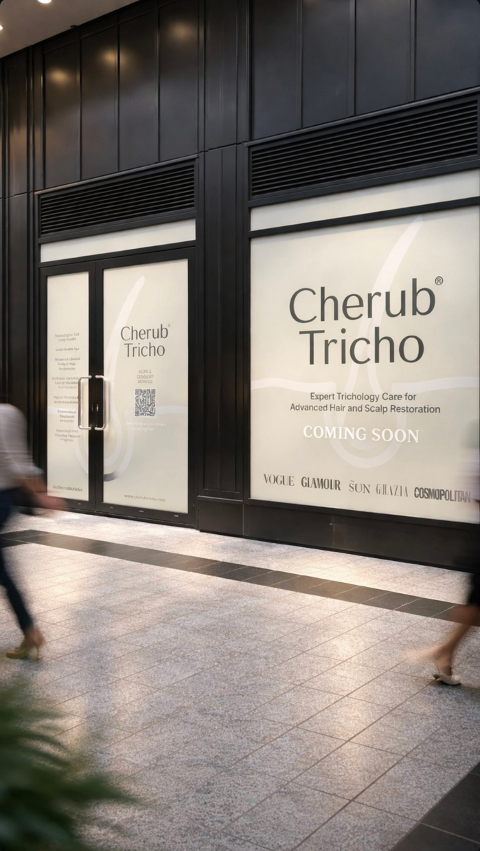
Cherub Tricho is a premier trichology clinic located in Canary Wharf, London. Strategic branding agency Atin was commissioned to undertake a complete visual evolution, establishing a “Minimalist Physician” persona that balances scientific authority with a restorative, sanctuary-like soul.
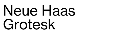
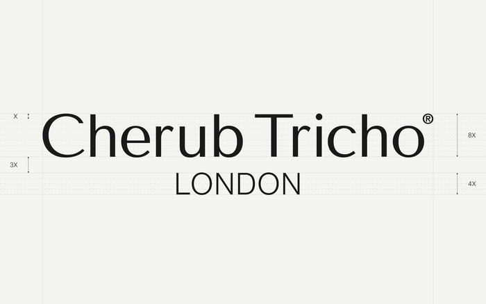
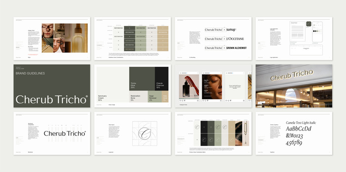
The primary wordmark is crafted using Tenor Sans, providing an elegant, bespoke foundation. To establish geographic authority, the ‘LONDON’ flagship descriptor is set strictly in Neue Haas Grotesk Light.
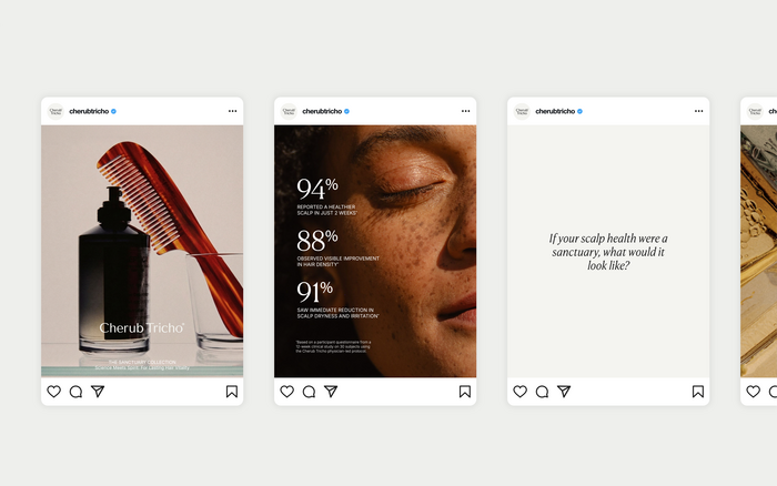
The broader typographic system relies on Inter (Light and Medium) for clean, clinical data legibility, contrasted with Canela (Deck Light and Text Light Italic) to provide a soft, human-centric touch for storytelling across their digital footprint and physical apothecary touchpoints.
Source: www.atin.studio Photo: Atin. Atin. License: All Rights Reserved.
Source: www.atin.studio Photo: Atin. Atin. License: All Rights Reserved.
Source: www.atin.studio Photo: Atin. Atin. License: All Rights Reserved.
Comprehensive brand guidelines detailing the typographic hierarchy, primary lockups, and the Sanctuary colour palette (Tricho Olive, Cherub Charcoal, Sanctuary Cream).
This post was originally published at Fonts In Use