Playtime Approved: BlazeType’s New Site Lets the Fonts Do the Talking
There’s something refreshing about a type foundry that doesn’t take itself too seriously. BlazeType, the independent French foundry founded by Matthieu Salvaggio in 2016, has always had a distinct voice. But with their newly redesigned website, they’ve turned their digital home into something genuinely fun to explore.
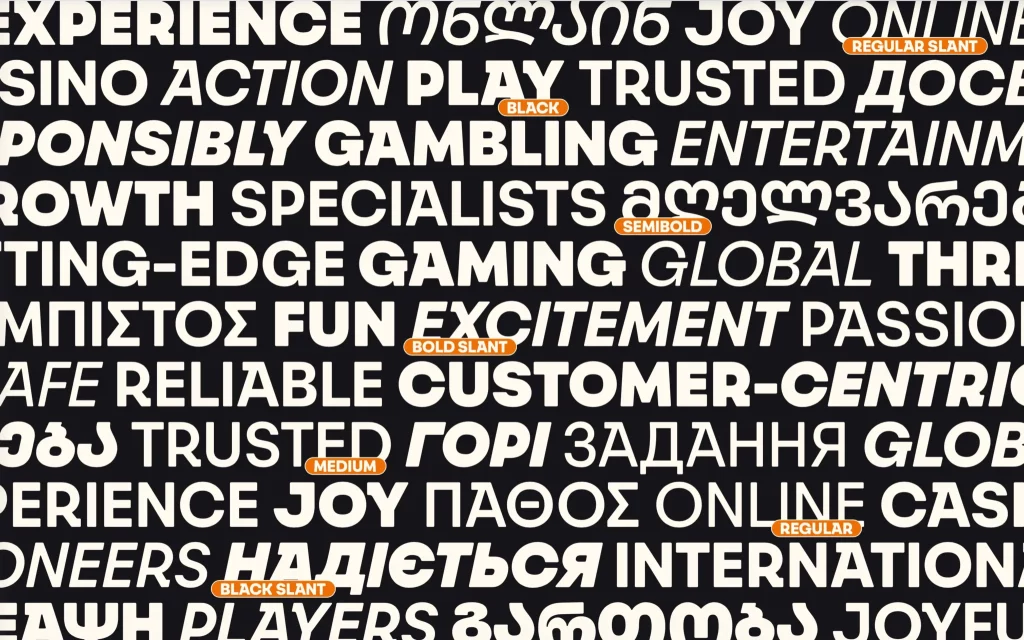
A Catalog That Feels Like a Gallery
The typefaces page is where the shift becomes immediately obvious. Instead of scanning through endless lists of names, you’re met with a colorful mosaic, each typeface given its own visual moment.
Bagne appears in bold, all-caps geometry against a contrasting backdrop. Scroll further, and Signifier stretches across a longer passage, showing off its editorial elegance. It’s less like shopping and more like wandering through a well-curated exhibition. You stop. You look. You start playing.
Pairing Fonts Without the Guesswork
Font pairing can feel like a dark art. BlazeType’s new pairings page makes it surprisingly simple, and actually interactive.
They offer combinations like Faro (friendly, humanist sans) alongside Eddy (confident slab serif), but the real usefulness comes from the live preview. Type your own headline. Write your own paragraph. See how the two work together in real time. It’s a practical tool that cuts out the usual trial and error, whether you’re a student or a seasoned designer.
Try Before You Buy (Really)
Specimen pages can only show you so much. BlazeType seems to know this, which is why they’ve made test-driving fonts a core part of the experience.
Drop a font into your actual design setup. See how it handles your copy, your sizes, your layout. It’s a straightforward gesture, but it signals confidence in the work, and respect for the designer’s process. When you do make a purchase, you already know it’s the right fit.
Small Touches, Big Difference
What rounds out the experience is what happens outside the catalog. Their student discount, 80% off, is hard to ignore. It’s a genuine investment in the next wave of designers, giving them access to tools that might otherwise sit out of reach.
The case studies are worth a look too. Not just polished logos, but deep dives into real-world work: custom variable fonts for sports brands, visual identity overhauls for major clubs. They serve as quiet proof that these typefaces aren’t just playful, they’re built for serious work.
BlazeType’s redesign doesn’t try to reinvent the wheel. Instead, it clears away the friction, adds a sense of discovery, and lets the typefaces speak for themselves. For a typography blog, that’s exactly the kind of site worth bookmarking.
The post Playtime Approved: BlazeType’s New Site Lets the Fonts Do the Talking appeared first on Typography Daily.