Tightle: A Bold, No-Gaps Display Face That Pushes Typography to the Edge
All Caps, No Gaps
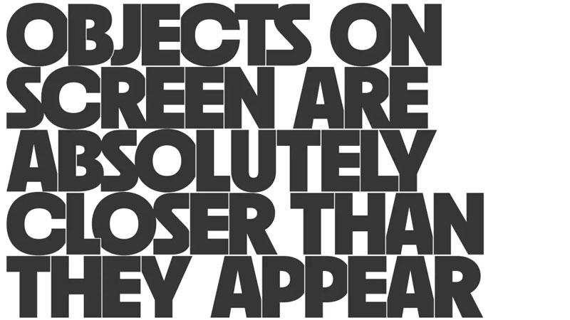
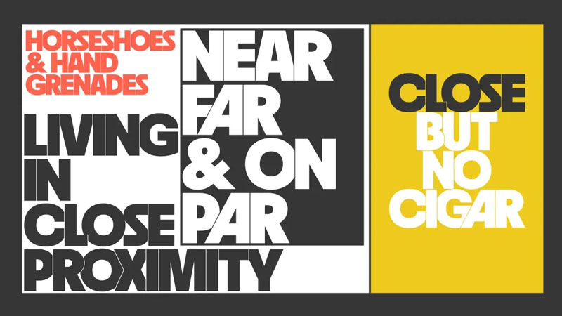
Meet Tightle—Mark Caneso’s latest typeface that takes spacing to uncomfortably great places. This bold, in-your-face display font thrives on extreme tightness, creating lock-ups and wordmarks where letters seem to tuck behind, slide close, or nestle into one another. With clever OpenType magic, Tightle turns any text into a visually striking, tightly packed composition. Type a word, and you’ll instantly think: “That’s Tight!”
The Origin Story
Tightle’s journey began in 2022 while Caneso was designing specimens for Neighbor, another of his typefaces. Experimenting with the heaviest weight and ultra-tight spacing, he pushed negative tracking to the extreme—letting letterforms crash into each other before separating them with hairline strokes. The idea of an all-caps, zero-gaps typeface intrigued him, but he shelved it, unsure if it was genius or just a gimmick.
By 2024, the concept still excited him. Despite doubts (“Will anyone even use this?“), social media reactions—fire emojis and “take my money” comments—kept the spark alive. Tightle had already made cameos in Caneso’s work, like the “Heart All Types” tote bag and Punchlines specimen book. It was time to bring it to life.
Collaboration & Refinement
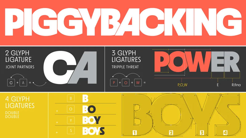
To perfect Tightle, Caneso teamed up with Fahdl Haqq, a font developer who’s worked on his previous releases (Scale, Skew). Together, they expanded Tightle into a 3,000-glyph powerhouse, with each letter featuring initial, middle, and final forms that adapt based on their position in a word.
How Tightle Works
This isn’t just a font—it’s a typographic tightrope act. OpenType features like ligatures, contextual alternates, and automatic substitutions ensure seamless letter collisions. The result? A typeface that feels like custom lettering, with every combination locking together perfectly.
Why Designers Will Love It
- Unapologetically bold – Perfect for headlines, logos, and punchy statements.
- Smart, not just tight – The tech behind the scenes makes it effortlessly functional.
- Endless versatility – With 3,000 glyphs, it handles almost any word with flair.
Tightle proves that sometimes, the best ideas come from breaking the rules—or in this case, crashing through them.
Tightle overview on this page.
The post Tightle: A Bold, No-Gaps Display Face That Pushes Typography to the Edge appeared first on Typography Daily.