Yllw rebrand – Transforming Spaces, Driving Growth
Source: www.yllw.com License: All Rights Reserved.
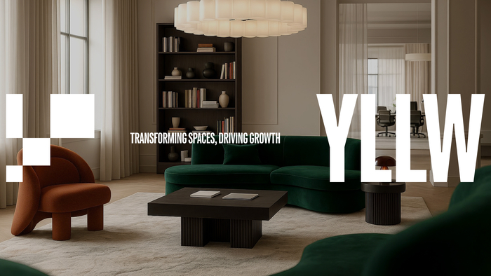
Yllw transforms how people experience physical space – from flexible offices and restaurants to hospitality and circular refurbishment in their own factory. Their work is driven by intention, adaptability, and long-term impact.
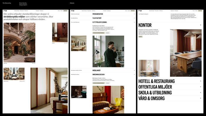
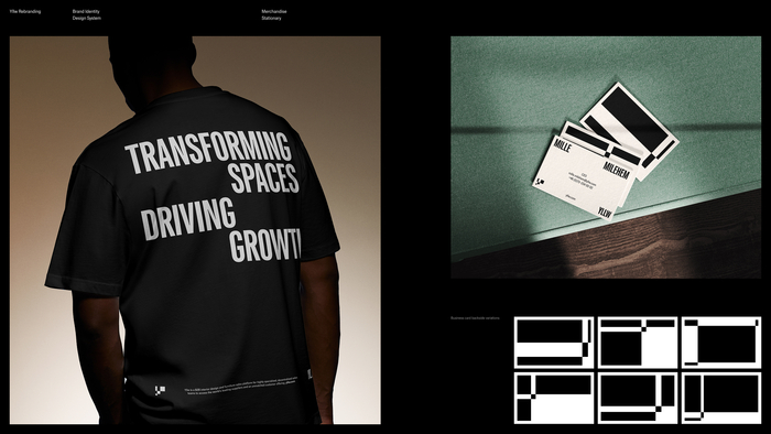
Gärde Design Studio created a new visual identity and digital presence built on Yllw’s essential unit of change: the square meter. The system functions as a dynamic spatial framework where patterns stretch, shapes shift, and layouts adapt, reflecting how Yllw reshapes interiors with purpose. At its center is a symbol derived from the geometry of the square meter, capturing Yllw’s role as both designer and transformer.
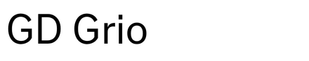
GD Grio (Gärde Design Studio) anchors the identity with warmth and structural clarity. Designed to fill space, it condenses for tight layouts or expands with confidence while preserving rhythm and readability. Inspired by Venus Grotesk (1907), Grio embraces the human charm of early grotesques, uneven proportions, irregular rhythms, and expressive terminals. As a variable font, these qualities translate into a flexible digital tool that shifts seamlessly between refined text and bold display, giving Yllw a typographic voice that feels crafted, confident, and distinctly alive.
Source: www.gardedesign.com License: All Rights Reserved.
Source: www.gardedesign.com License: All Rights Reserved.

Source: www.gardedesign.com License: All Rights Reserved.
Source: www.yllw.com License: All Rights Reserved.
This post was originally published at Fonts In Use