Gaia Andrenacci

Source: www.behance.net Emmesse. License: All Rights Reserved.


An identity designed to speak the language of mindful movement. A brand that transforms movement into visual balance, capturing harmony and dynamism in a single mark.
The brand concept stems from a reflection on a series of key words. From these ideas a visual system takes shape, expressing the dual nature of Gaia Andrenacci’s work: the precision of technical practice and the fluidity of natural motion. The goal was to translate these sensations into a graphic language that is simple, clean, and contemporary—able to convey well-being, professionalism, and presence, without sacrificing lightness or elegance.
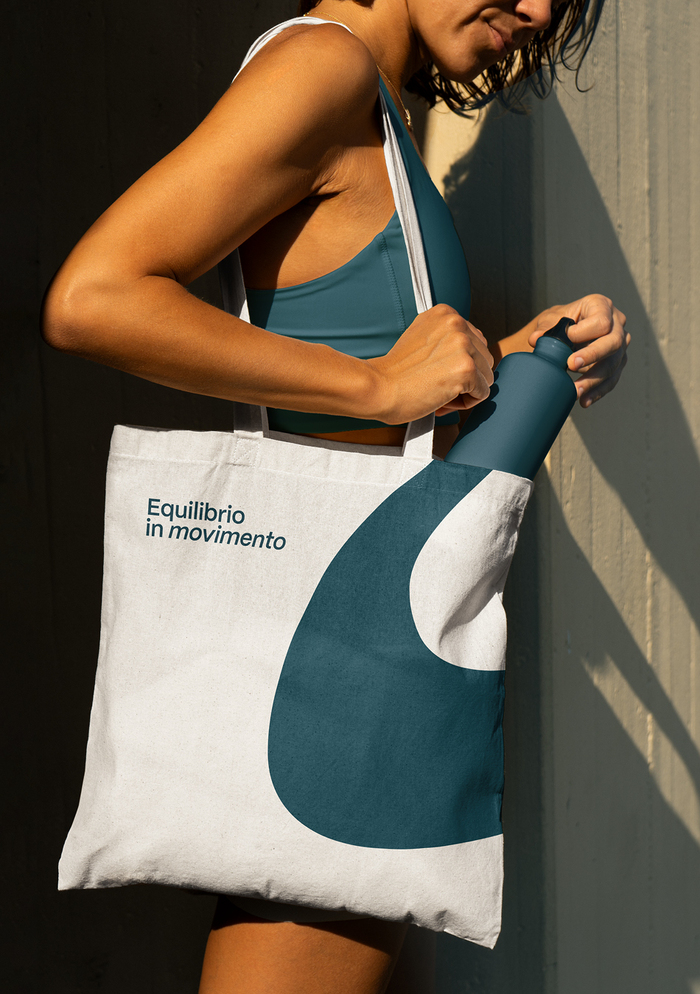
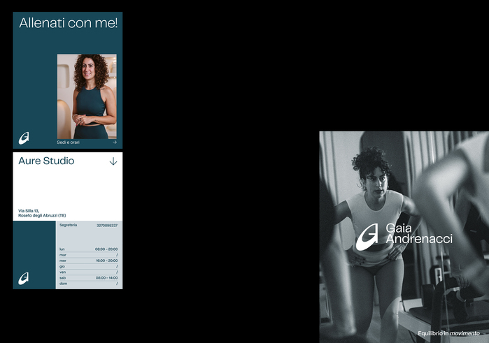
The mark is born from the union of Gaia’s initials, G and A, interpreted as a single circular gesture. Its primary form is a modulated circle: circularity symbolizes cycles, breath, and the perfection of movement. The symbol is the brand’s core identifying element. Inspired by the body’s movements in Pilates, it is built entirely from the circle, which gives it harmonious proportions and a sense of visual balance. The two initials merge fluidly, without interruption, creating a sign that suggests the idea of continuous motion. It is a dynamic yet stable symbol, able to embody energy, dynamism, and control at once.
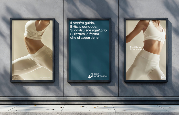
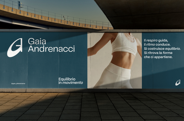
The payoff is conceived as an oxymoron—an encounter between two opposing concepts that together perfectly express Gaia’s philosophy. “Balance” represents stability, awareness, and bodily control; “movement,” on the other hand, evokes fluidity, adaptability, and growth. The word movement is written in italics to convey dynamism and progression, while balance retains a static, orderly form, symbolizing solidity. Together, they create a visual and conceptual contrast that becomes the heart of the brand message.
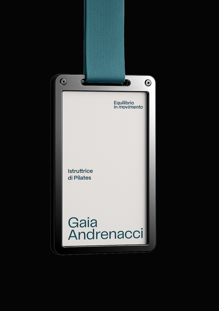
The fonts used are Telegraf for the logo and Mori for the payoff “Balanca in motion” and secondary typography.
Source: www.behance.net Emmesse. License: All Rights Reserved.
Source: www.behance.net Emmesse. License: All Rights Reserved.
Source: www.behance.net Emmesse. License: All Rights Reserved.
Source: www.behance.net Emmesse. License: All Rights Reserved.
Source: www.behance.net Emmesse. License: All Rights Reserved.
This post was originally published at Fonts In Use