Rotberg Realty
License: All Rights Reserved.


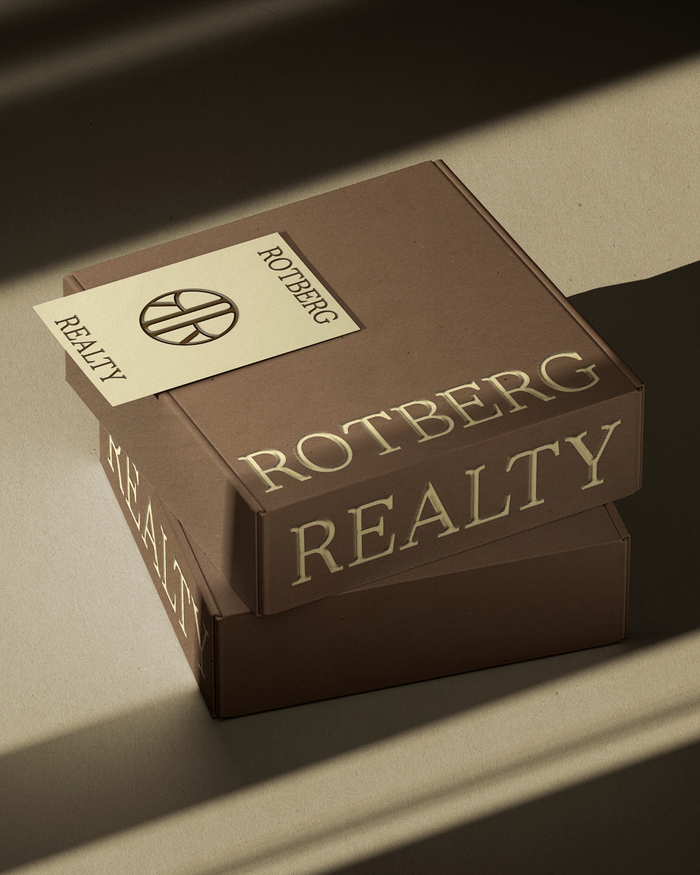
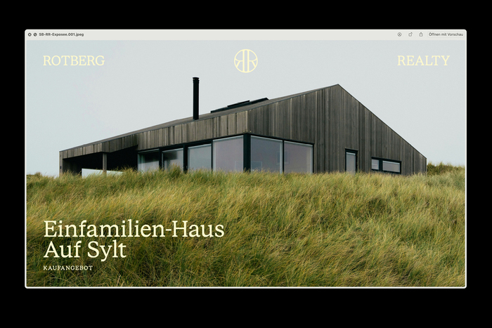
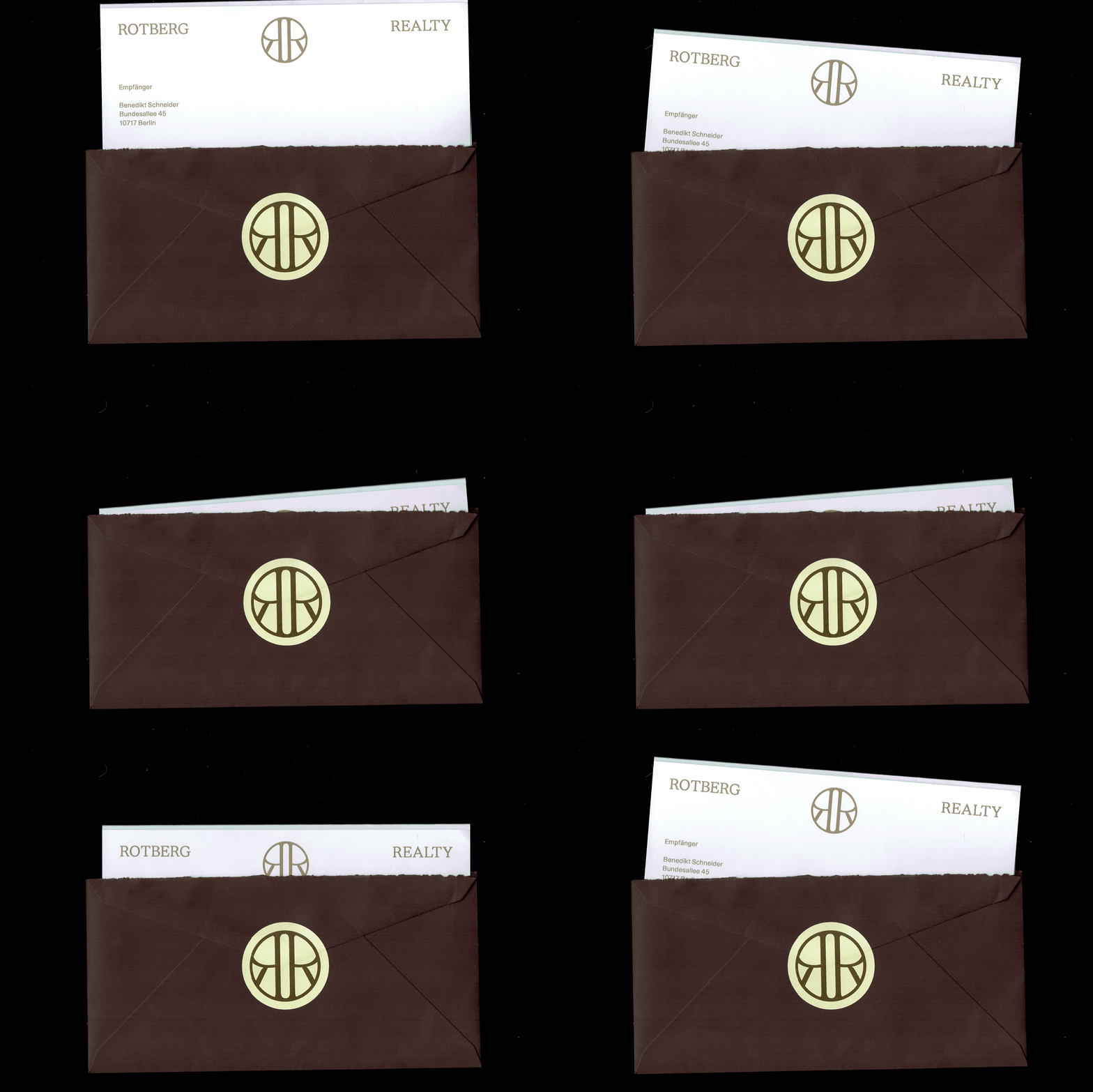
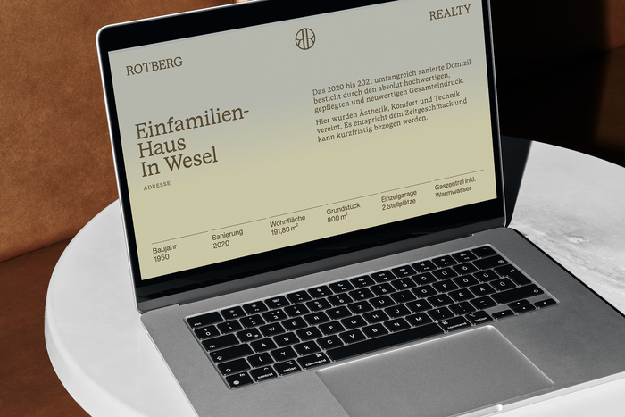
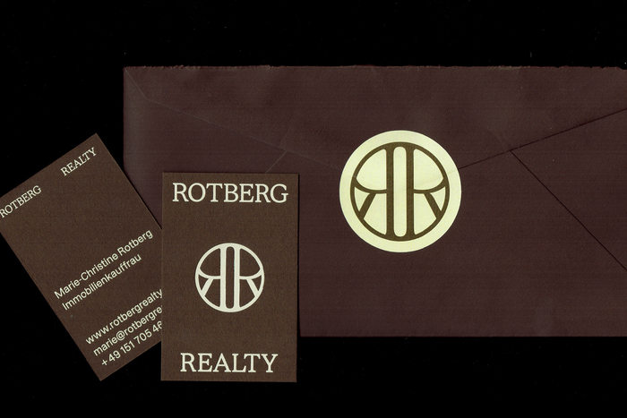
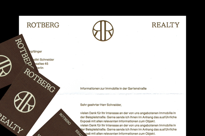
A real estate brand built on trust and connection. For Rotberg Realty, we developed a calm, confident visual identity rooted in human connection. At the center of the system is a custom RR monogram, designed as a symbolic gateway: open, balanced, and architectural. It represents opportunity and reliability at once—an emblem that quite literally stands for opening doors and bringing people together.
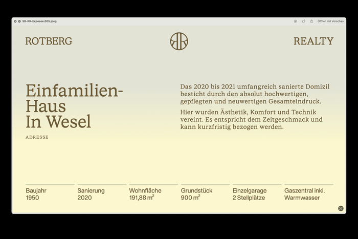
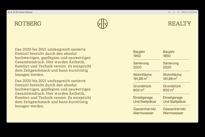
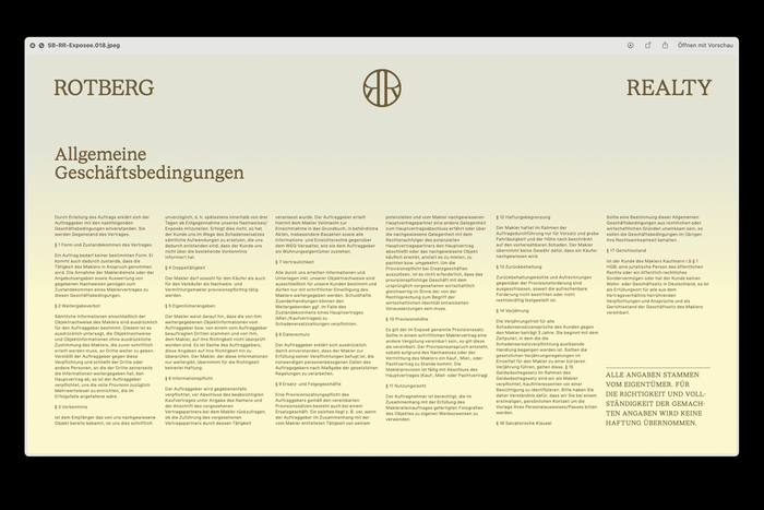
The typographic foundation combines STK Bureau Serif and STK Bureau Sans, creating a deliberate tension between tradition and clarity. The serif conveys stability and credibility, while the sans-serif adds precision and contemporary ease across digital and print applications. Together with a restrained color palette and tactile materials, the identity results in a clear, characterful real estate brand that feels established yet approachable.

Photo: Studio Böreck. License: All Rights Reserved.
License: All Rights Reserved.
License: All Rights Reserved.
License: All Rights Reserved.
License: All Rights Reserved.
License: All Rights Reserved.
License: All Rights Reserved.
License: All Rights Reserved.
License: All Rights Reserved.
This post was originally published at Fonts In Use