The Veldt Institute by Samuel M. Moss

License: All Rights Reserved.




The Veldt Institute by Samuel M. Moss, published by Double Negative, is a sanatorium novel in the tradition of Thomas Mann’s The Magic Mountain and Olga Tokarczuk’s The Empusium, updated for a new age of sound and movement therapies and with the impossible architectures and slippery time of books like Dino Buzzati’s The Stronghold and Franz Kafka’s The Castle.
The design was inspired by midcentury academic paperbacks designed by artists like Rudolph de Harak and J+M Condon, which favored clean sans serif fonts like Helvetica, Akzidenz-Grotesk, Tempo and Futura as well as more expressive, stylized fonts like Umbra. It can be uncanny reading cutting-edge and utopian philosophy, psychology, and sociology in such calm, plain, and diagrammatic fonts, a tone that defines the The Veldt Institute as well.
Another major influence on the project is austere and minimalist art across media, namely brutalist architecture, massive land art projects, and ambient, drone, new age, field recordings, and other underdetermined audio, especially on tape format. The design draws on this with fonts like Eurostile and Microgramma which were popular choices for labels on audio equipment in the 1970s and 1980s, such as like this Roland Midi interface.

License: All Rights Reserved.
The interior endpapers for The Veldt Institute featuring architect Jesse Chappelle's diagrams of the titular institute
License: All Rights Reserved.
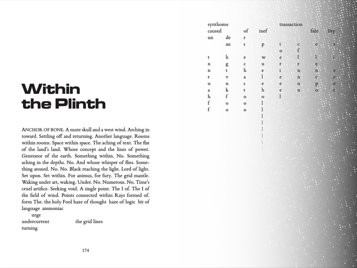
An interior spread of The Veldt Institute (2025) where standard text (set in Bembo) bleeds into design

Source: double--negative.com License: All Rights Reserved.
This post was originally published at Fonts In Use