Kröner & Starke website and visual identity

Source: kroener-starke.ch Kröner & Starke. License: All Rights Reserved.
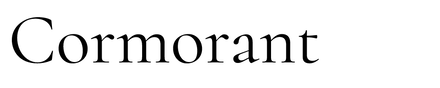

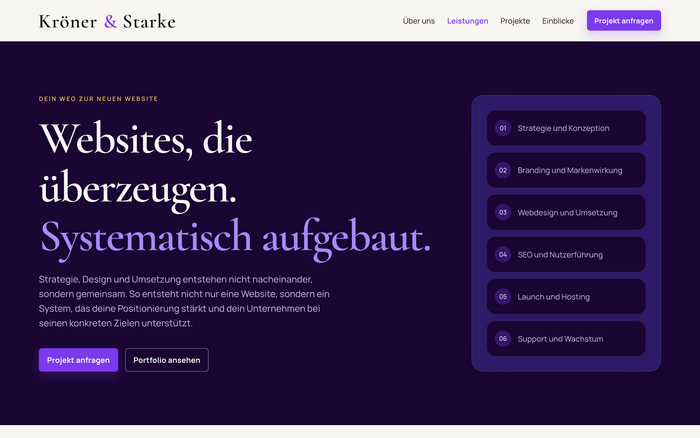
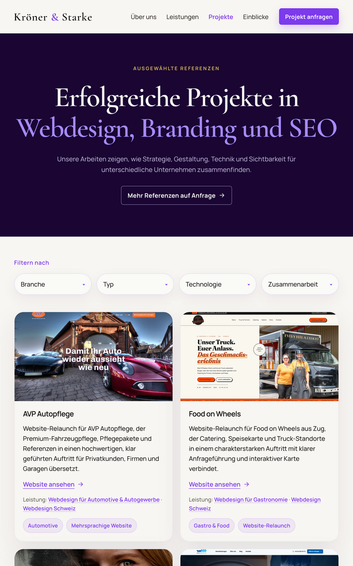
The Swiss-German agency Kröner & Starke pairs combines web design, branding and SEO. Our portfolio website combines the Garamond style of Cormorant for its wordmark and display headings with Manrope for navigation, body text and interface elements.
The contrast between the serif display type and the sans-serif text carries through cream surfaces, deep violet backgrounds and restrained gold accents. On the homepage, the serif wordmark sits over a violet landscape; the German tagline, navigation and enquiry controls use Manrope. The following cream section repeats the pairing in a large serif heading and a compact form.
Designed and developed by Kröner & Starke, with Simon Kröner working on strategy and branding and Per Starke on web design and development. Screenshots show the live site in October 2026.

Source: kroener-starke.ch Kröner & Starke. License: All Rights Reserved.
Source: kroener-starke.ch Kröner & Starke. License: All Rights Reserved.
Source: kroener-starke.ch Kröner & Starke. License: All Rights Reserved.
This post was originally published at Fonts In Use