V.H. Belvadi website (2025)
Source: vhbelvadi.com Photo: V.H. Belvadi. License: All Rights Reserved.


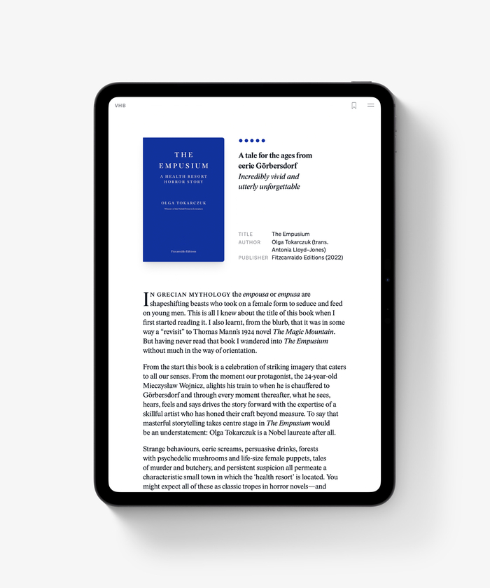
Updated since its previous iteration in 2023, the design of this text-heavy website remains centred primarily on its typography. This time it takes cues from book design, asking how the functional design elements that make up a book page might be translated into a webpage without simply mimicking a different format.
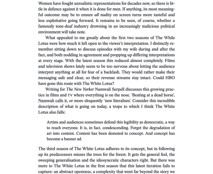
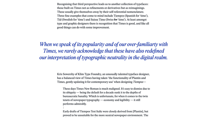
Tid by Letters from Sweden is used as the primary typeface. It allows for easy reading as well as effortless skimming, particularly considering the website frequently carries long form content. Uniform letter widths across weights in Tid allow for not only predictable design with dynamic layout changes (via the menu) but also a justified setting (pictured) for readers who might prefer it. Justification also indents paragraphs instead of adding spaces between them.
Tid is used in its Display optical sizing for drop caps and pull quotes.
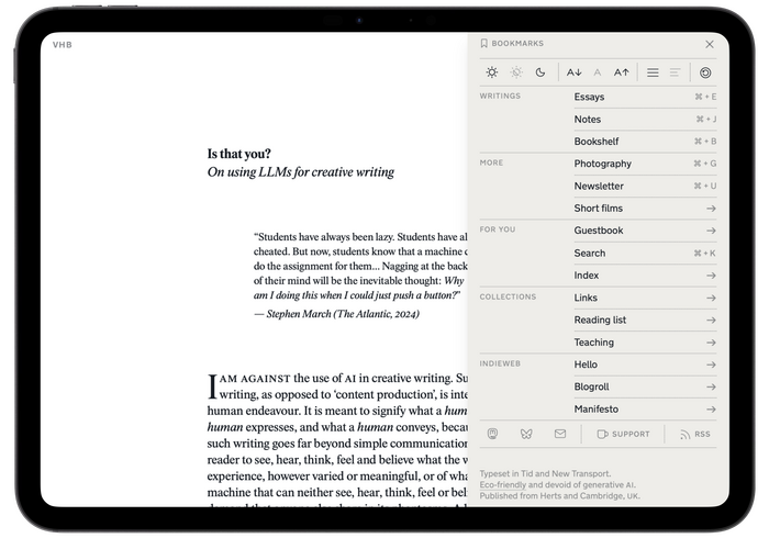
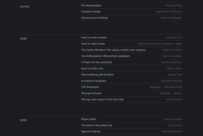
Side notes for essays are implemented next to the main body copy on wide screens and interspersed beneath paragraphs on mobile. These along with all UI elements, like the menu, are set in New Transport by A2-TYPE, including, in some cases, entire pages e.g. the ‘Index’ page and reading list (both pictured separately).
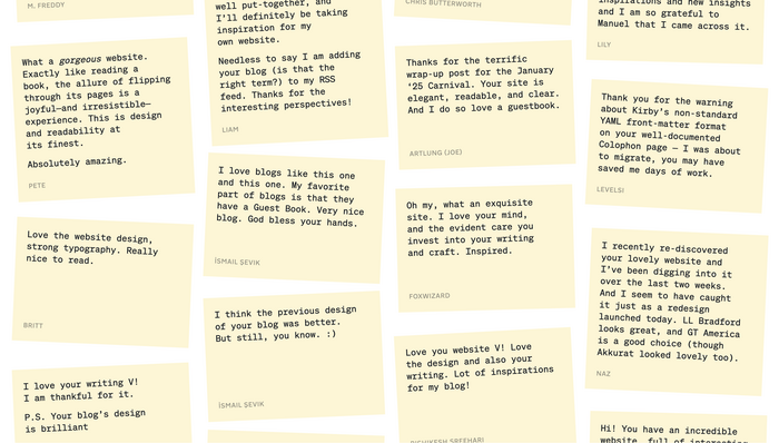
The use of Söhne Mono introduces a playful element to the website’s Guestbook (pictured) where it is used on sticky notes that carry messages from the website’s visitors.
Source: vhbelvadi.com Photo: V.H. Belvadi. License: All Rights Reserved.
Tid is the primary typeface with New Transport accompanying it. Tid is used in its Display optical size for drop caps.
Source: vhbelvadi.com Photo: V.H. Belvadi. License: All Rights Reserved.
The letter widths of Tid are forgiving enough to allow for a properly readable justified setting which is offered optionally to readers.
Source: vhbelvadi.com Photo: V.H. Belvadi. . License: All Rights Reserved.
The index page is set primarily in New Transport.
Source: vhbelvadi.com Photo: V.H. Belvadi. . License: All Rights Reserved.
Söhne Mono Buch is used on sticky notes on the Guestbook to add a playful element.
Source: vhbelvadi.com Photo: V.H. Belvadi. License: All Rights Reserved.
Tid is used in its Display optical sizing for pull quotes.
Source: vhbelvadi.com Photo: V.H. Belvadi. . License: All Rights Reserved.
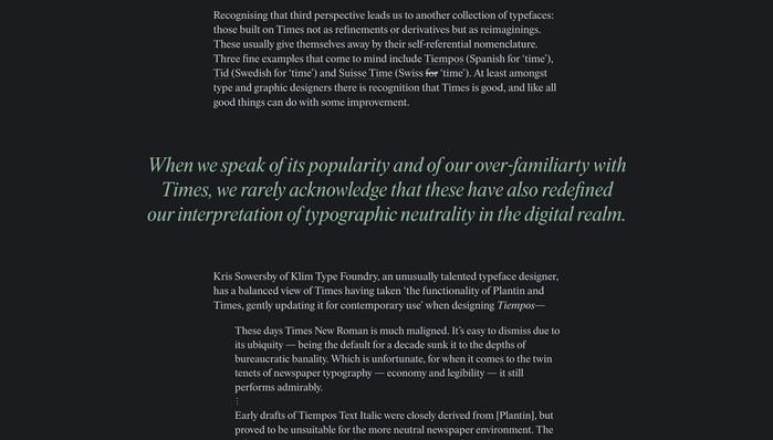
The dark mode uses an alternate accent colour.
Source: vhbelvadi.com Photo: V.H. Belvadi. License: All Rights Reserved.
This post was originally published at Fonts In Use