Kamprath-Skelett book series ad
Source: www.flickr.com Uploaded to Flickr by altpapiersammler and tagged with “signal”. License: All Rights Reserved.


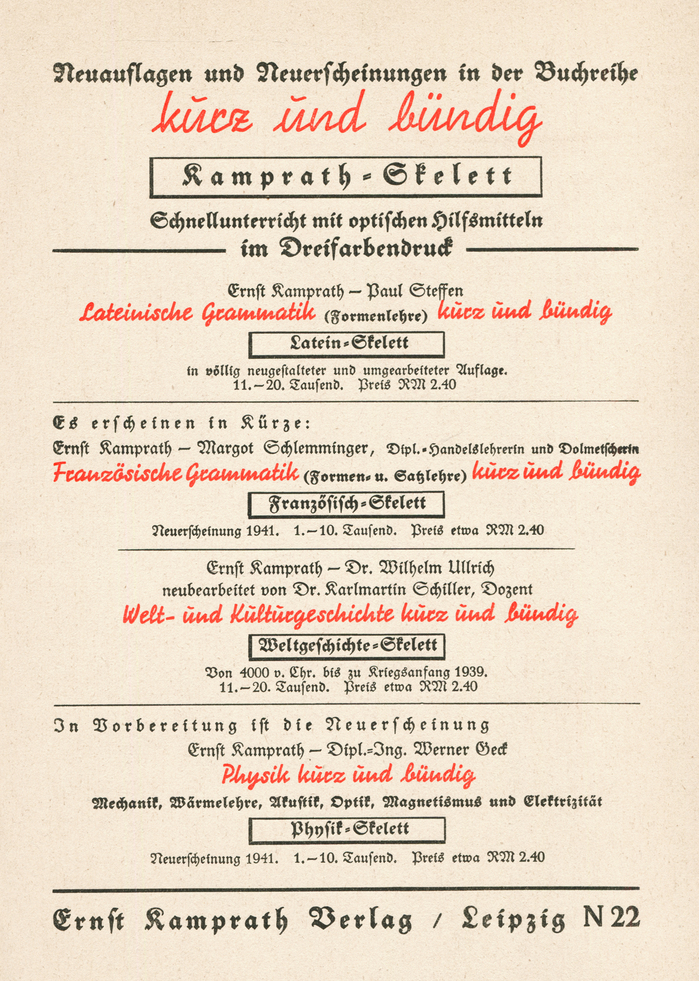
Print ad for new releases and reissues in the educational book series Kamprath-Skelett – kurz und bündig (“briefly and concisely”) by Ernst Kamprath Verlag, Leipzig. The listed titles include “quick lessons with visual aids in three-color printing” for Latin and French grammar, world and cultural history, and physics.
The design may look like a piece of multiscript typography at first, with its mix of disparate typefaces. And indeed scholars like young (dogmatic and chauvinistic) Jan Tschichold considered blackletter typefaces to be something fundamentally different than roman (incl. sans-serif and “Latin” script) type, denouncing them in die neue typographie from 1928 as “nationalism”, alongside actual non-Latin scripts like Greek, Cyrillic, Arabic, Chinese etc. But of course all text in this advert is in the Latin script – including the blackletter.
The typefaces are Walter Tiemann’s Tiemann-Fraktur (Klingspor, 1914/1918) and Walter Wege’s Signal (Berthold, 1931/1932). Both appear in two weights each: the large “kurz und bündig” at the top is in the light Script-Signal.
This post was originally published at Fonts In Use