TVGuide.com (2019–)
Source: logos-world.net Logos-World.net. License: All Rights Reserved.
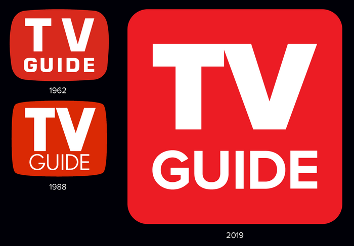
Earlier print edition logos (left) utilizing Eurostile and Futura; and current digital edition logo (right) set in Proxima Nova.

The logo and the entire website for TVGuide.com has used Proxima Nova since 2019—fitting for a brand that’s something of an institution. The logo for the print magazine used various sans serif typefaces over the decades (notably Eurostile and Futura), set in white on a bright red TV screen shape (a design heavily borrowed by YouTube).
The digital edition, reflecting the modern streaming era, drops the antiquated TV screen shape in favor of a simple internet-friendly round-cornered square in the classic red.
Proxima Nova, released in 2005, blends the geometric structure of Futura with the proportions of Akzidenz Grotesk. Its plain, straightforward design fits perfectly into the classic TV Guide aesthetic while giving it a more contemporary style.
For a legacy media brand now living primarily as a website—TVGuide.com has operated separately from TV Guide Magazine since 2013—it’s a reasonable choice: contemporary without being trendy, familiar without being dated.
Source: TVGuide.com TVGuide.com. License: All Rights Reserved.
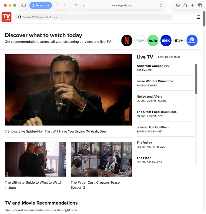
Current website design
This post was originally published at Fonts In Use