Slow Fast Food
Published December 3, 2023
By FontsInUse
Contributed by Florian Hardwig
Source: www.studio-oeding.com Studio Oeding. License: All Rights Reserved.


Source: www.studio-oeding.com Studio Oeding. License: All Rights Reserved.
Source: www.studio-oeding.com Studio Oeding. License: All Rights Reserved.
Source: www.studio-oeding.com Studio Oeding. License: All Rights Reserved.
Source: www.studio-oeding.com Studio Oeding. License: All Rights Reserved.
Source: www.studio-oeding.com Studio Oeding. License: All Rights Reserved.
This post was originally published at Fonts In Use
Source: www.studio-oeding.com Studio Oeding. License: All Rights Reserved.
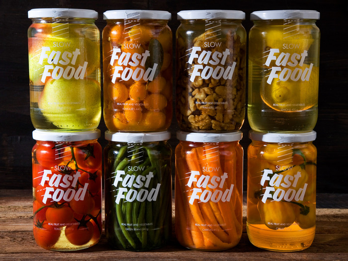
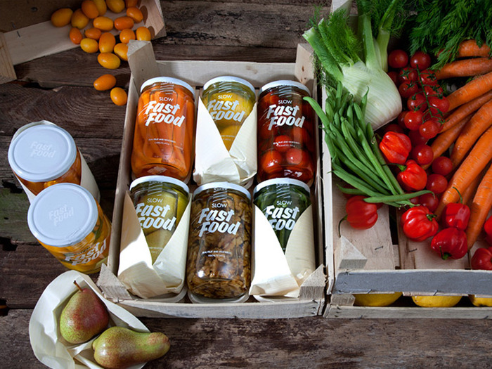
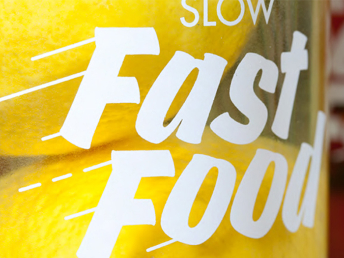
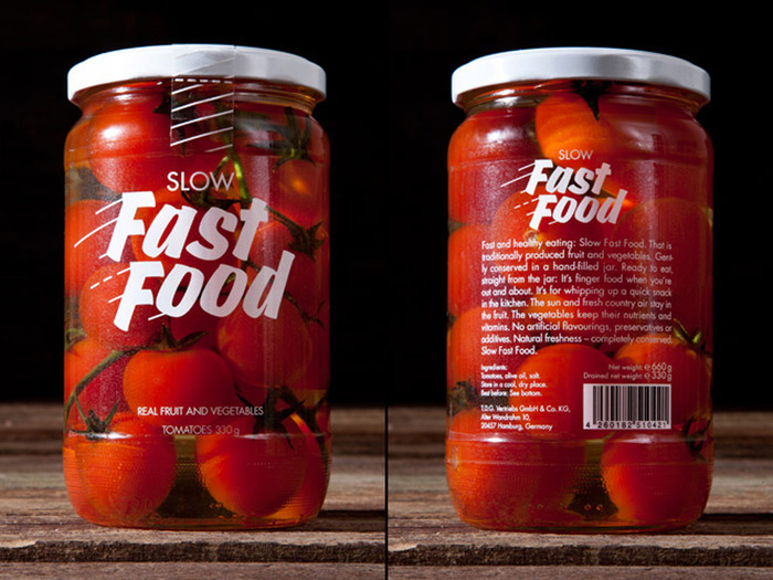
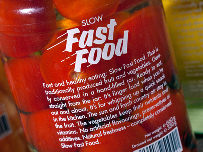
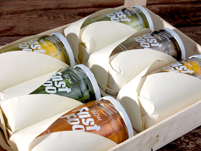
To Studio Oeding, “eating good food at a reduced speed means enjoying it.” The Hamburg-based studio developed the brand concept, naming, packaging and logo for Slow Fast Food. The minimal design – just white type printed on transparent labels, attached to reusable glass jars – combines two typefaces: Futura underpins the graphic minimalism. Churchward Brush is used in its Italic style. Its task is to visualize the fast aspect.
Source: www.studio-oeding.com Studio Oeding. License: All Rights Reserved.
Source: www.studio-oeding.com Studio Oeding. License: All Rights Reserved.
Source: www.studio-oeding.com Studio Oeding. License: All Rights Reserved.
Source: www.studio-oeding.com Studio Oeding. License: All Rights Reserved.
Source: www.studio-oeding.com Studio Oeding. License: All Rights Reserved.
This post was originally published at Fonts In Use
Read full story.
WRITTEN BY
FontsInUse
An independent archive of typography.