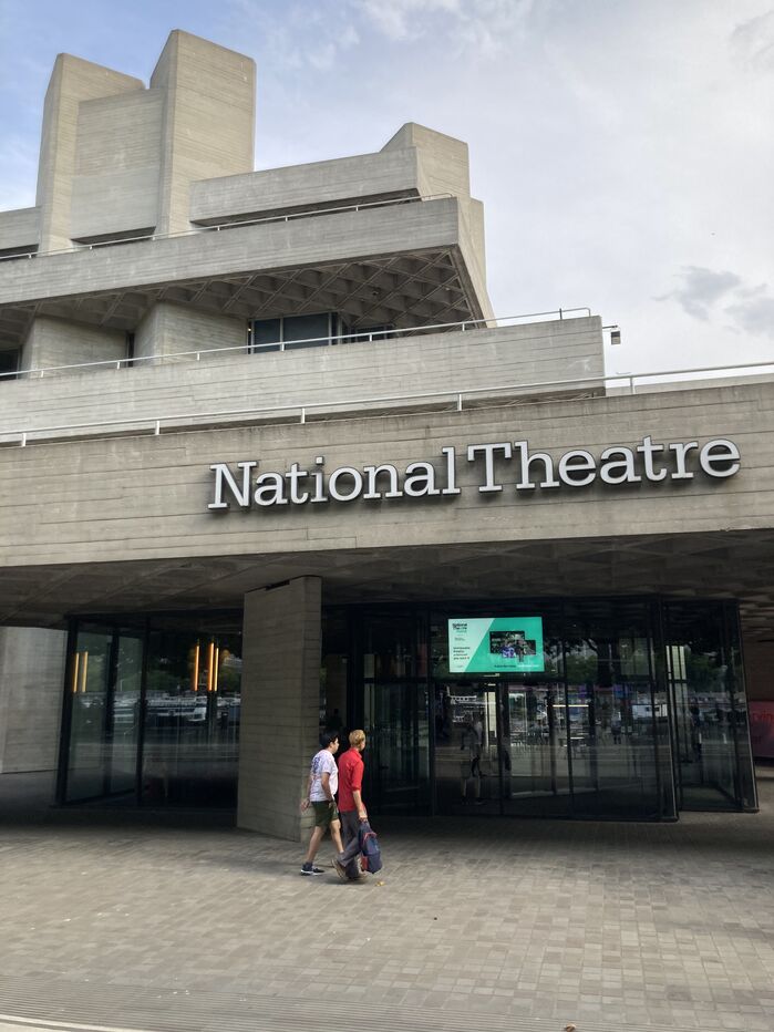
National Theatre signage
Published December 2, 2023
By FontsInUse
Contributed by Manuel Schmalstieg
Source: commons.wikimedia.org Stevekeiretsu. License: CC BY-SA.

Source: www.jaketilson.com Jake Tilson. License: All Rights Reserved.

Source: www.jaketilson.com License: All Rights Reserved.

Source: www.jaketilson.com Jake Tilson. License: All Rights Reserved.
Source: www.jaketilson.com Jake Tilson. License: All Rights Reserved.
Source: www.jaketilson.com Jake Tilson. License: All Rights Reserved.

Source: www.jaketilson.com Jake Tilson. License: All Rights Reserved.
Source: www.jaketilson.com Jake Tilson. License: All Rights Reserved.
Source: en.wikipedia.org Mattsjc. License: CC BY-SA.
This post was originally published at Fonts In Use
Source: commons.wikimedia.org Stevekeiretsu. License: CC BY-SA.
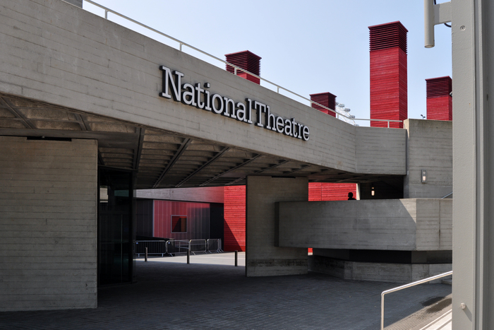
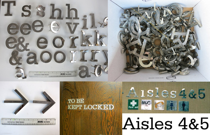
Architectural signage for London’s National Theatre, designed between 2012 and 2015 by Jake Tilson. According to Tilson, “a major focus of the work was to reintroduce some of the signage ideas devised by Ken Briggs in the 1970s”. This extended to the typeface used in Briggs’s signage, which had been stripped off in the 1990s. Tilson used Frutiger’s Serifa with a different ampersand – just like Briggs did.
See more images including some of the process on Tilson’s website.
Source: www.jaketilson.com Jake Tilson. License: All Rights Reserved.
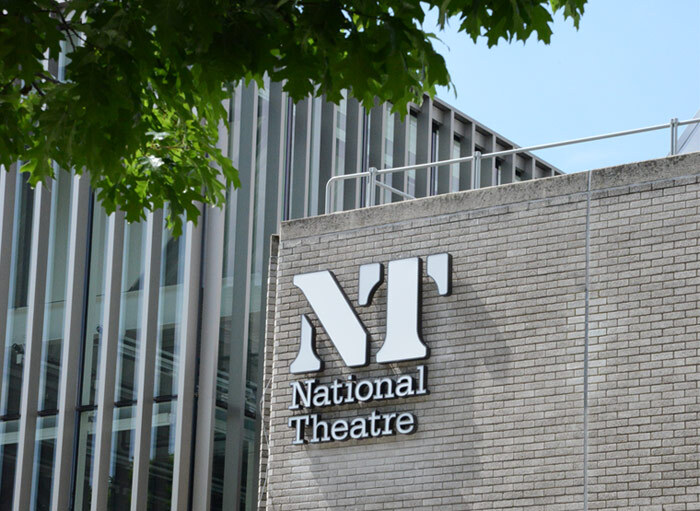
The NT logo in stencil letters was designed by Ian Dennis at FHK Henrion’s London studio, HDA International in 1974, and introduced in 1976.
Source: www.jaketilson.com License: All Rights Reserved.
Source: www.jaketilson.com Jake Tilson. License: All Rights Reserved.
Source: www.jaketilson.com Jake Tilson. License: All Rights Reserved.
Source: www.jaketilson.com Jake Tilson. License: All Rights Reserved.
Source: www.jaketilson.com Jake Tilson. License: All Rights Reserved.
Source: www.jaketilson.com Jake Tilson. License: All Rights Reserved.
Source: en.wikipedia.org Mattsjc. License: CC BY-SA.
This post was originally published at Fonts In Use
Read full story.
WRITTEN BY
FontsInUse
An independent archive of typography.
More from FontsInUse