Shaping Atmospheres symposium and exhibition


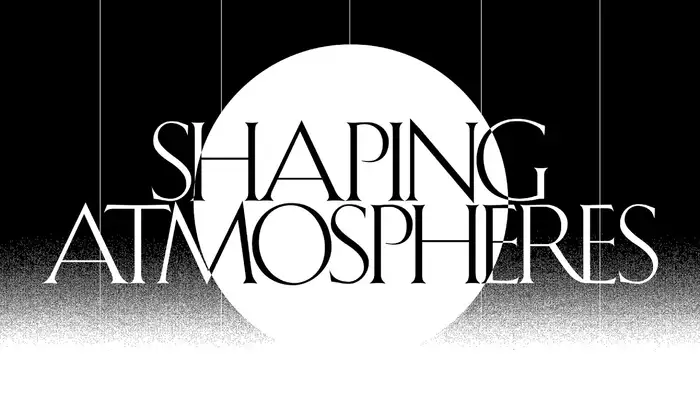
Shaping Atmospheres was a symposium and an exhibition concerned with geoengineering. It took place last November at the University of Toronto’s Daniels Faculty of Architecture, Landscape and Design, and brought together “technical, social-political, and philosophical perspectives to speculate on the significance and implications of shaping atmospheres”.

Raf Rennie’s identity for the event is based on a logo in tightly spaced caps from Shàngó, an uppercase-only typeface by CastleType. When additional formats like the schedule poster and the speaker slides required a more flexible typographic option, Rennie found it in Kessler by Production Type. Alaric Garnier’s typeface shares various stylistic traits with Shàngò (see the visual comparison below), but crucially offers lowercase characters.
The similarities aren’t coincidental: both designs have their roots in titling alphabets that originated in the book arts movement of the early 20th century, and can be described as period interpretations the classical Roman capital. Garnier’s primary inspiration was an alphabet designed by Eric Gill* in 1905 for the bibliophilic editions of Harry Kessler, founder of the Cranach Press in Weimar, initially published in cooperation with the Insel Verlag in Leipzig. Shàngó, on the other hand, is a revival of Schneidler Initials, drawn by F.H. Ernst Schneidler, proprietor of the short-lived Juniperus Press in Stuttgart, and first cast by the Bauer type foundry in Frankfurt in 1937. A precursor was included in the Wassermann, a voluminous portfolio of sheets for teaching lettering and type design started by Schneidler in 1925.

Production Type. License: All Rights Reserved.
Shàngó (top) and Kessler (bottom, here the Display cut) exhibit various similarities: both feature classical proportions with a narrow E and S, W is made from two overlapping V’s, J descends but has no full hook, and U is stemmed.
Other aspects are different: in Shàngó, the A has a lower bar and no top serif, the leg in R doesn’t meet the stem, and M has splayed stems. Shàngó offers swash caps, three weights, and Gothic, Sans and Chiseled variants. Kessler crucially has a lowercase – as well as optical sizes, italics, and a monospaced companion (not pictured here).
The typographic palette for Shaping Atmospheres is completed by Octave, Josh Finklea’s reconsideration of Frutiger’s Univers, released with Sharp Type.
*) Production Type is conscious of the contentious aspect of publishing a work that is in some way connected to child rapist Eric Gill. Proceeds of Kessler’s licensing are transferred to L’Enfant Bleu, an association providing protection, care, and information to children victims of ill-treatment.


Source: www.instagram.com License: All Rights Reserved.
Co-curator and organizer Ala Roushan of OCAD University presents the Shaping Atmospheres project.
This post was originally published at Fonts In Use