Albert Heijn – Allerhande
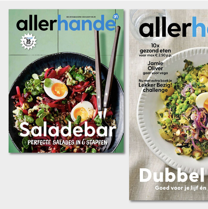
Allerhande. License: All Rights Reserved.


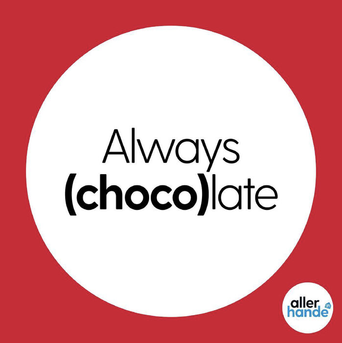
We loved spotting our Greycliff CF in the pages – and pixels – of Allerhande, the free magazine of Albert Heijn, of the major supermarkets in the Netherlands. Since November 2017 it has been used for the magazine and related socials and products, alongside Quadraat by Fred Smeijers and an ever-changing selection of guest typefaces.
Greycliff CF brings friendly strength and rock-solid clarity to every page and post. Built on the legacy of classic sans serifs, it takes inspiration from mid-century design’s clean, honest geometry, updated with soft corners and humanist touches that make it warm and welcoming. With a wide range of weights, matching italics, and excellent language support, it’s a workhorse with personality – ideal for branding, editorial, packaging, and more. In print, it’s bold and grounded; on screen, it’s crisp and easy to read. No wonder it fits so naturally into Allerhande’s vibrant and accessible voice!
Allerhande. License: All Rights Reserved.
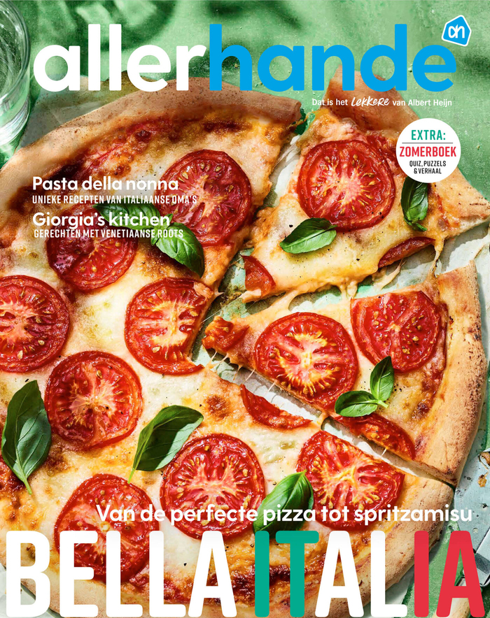
Source: view.publitas.com Allerhande. License: All Rights Reserved.
The summer issue, June 2025, features Rift Soft as a guest typeface
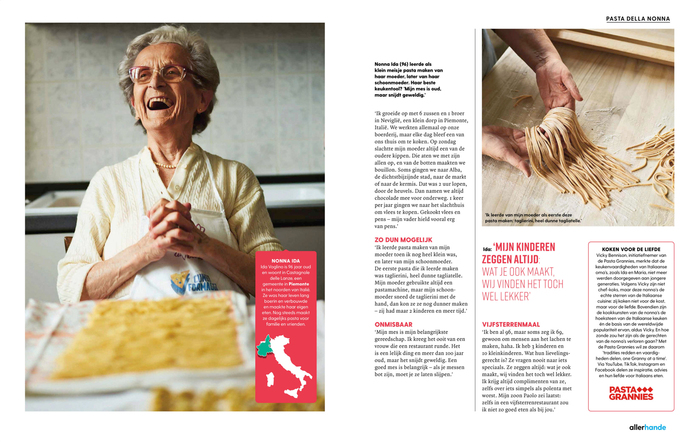
Allerhande. License: All Rights Reserved.
Spread from the June 2025 issue. Body text is set in Quadraat, while headlines use Greycliff and Rift Soft.
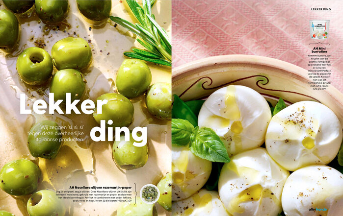
Source: view.publitas.com Allerhande. License: All Rights Reserved.
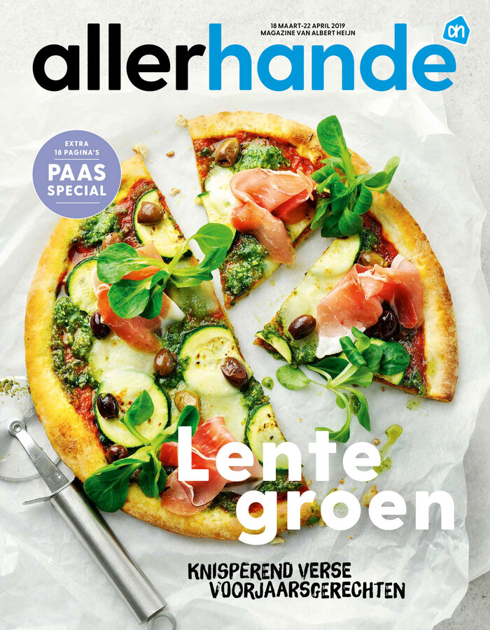
Allerhande. License: All Rights Reserved.
Cover for March/April 2019. The all caps brush typeface is Brush Up.

Source: view.publitas.com Allerhande. License: All Rights Reserved.
Spread from a 2019 issue, with body text set in Quadraat.
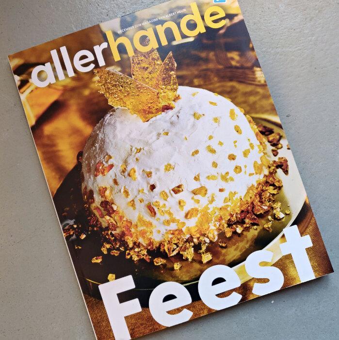
Allerhande. License: All Rights Reserved.
End-of-year issue 2018
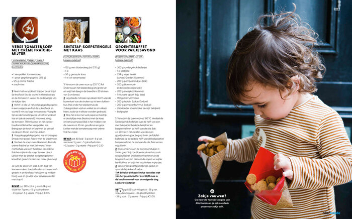
Source: view.publitas.com Allerhande. License: All Rights Reserved.
Spread from the first issue of Allerhande using Greycliff CF, November 2017

Allerhande. License: All Rights Reserved.
Allerhande. License: All Rights Reserved.
This post was originally published at Fonts In Use