Sapristi !!
Source: jeannetriboul.com Jeanne Triboul. License: All Rights Reserved.


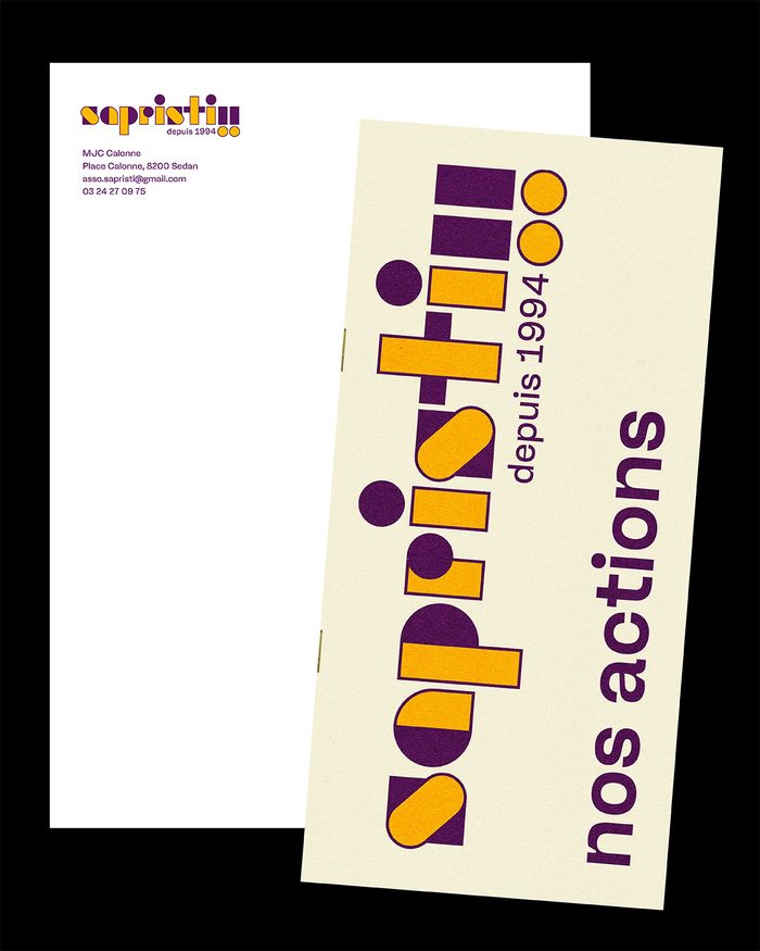
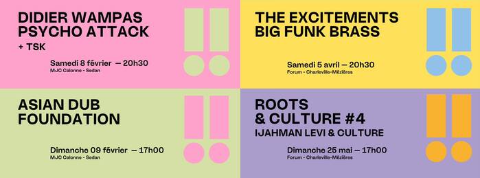
Visual identity for the Sapristi !! association, active since 1994 in the development of contemporary music in the Ardennes. It organizes concerts and plays an essential role in supporting the local scene. The association provides rehearsal and recording studios, organizes creative residencies, and supports regional artists in their projects. It also pays particular attention to arts education and cultural mediation for young audiences.
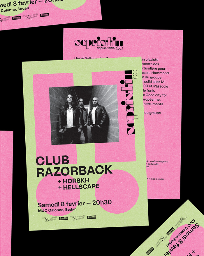
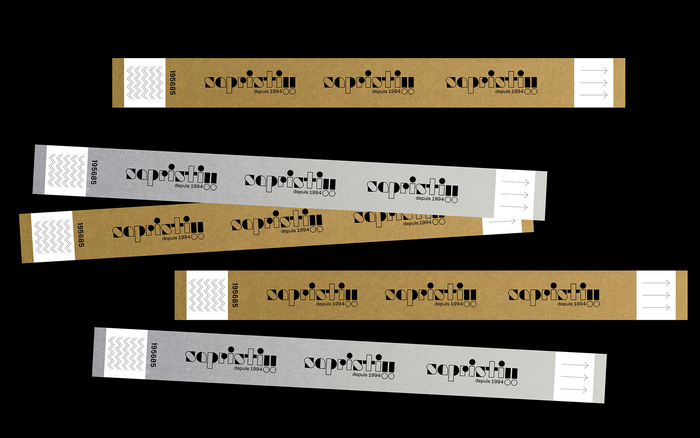
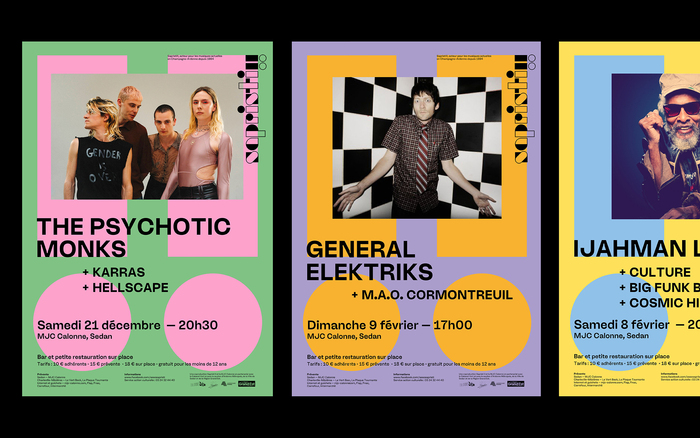
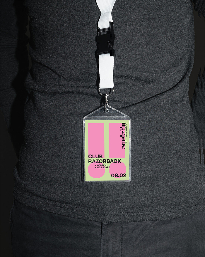
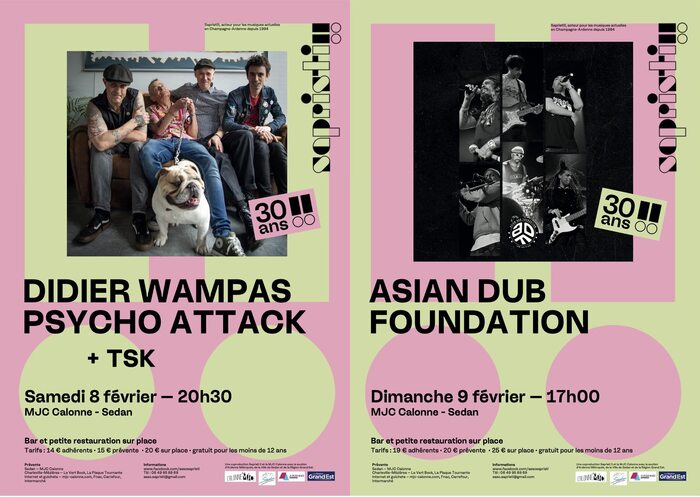
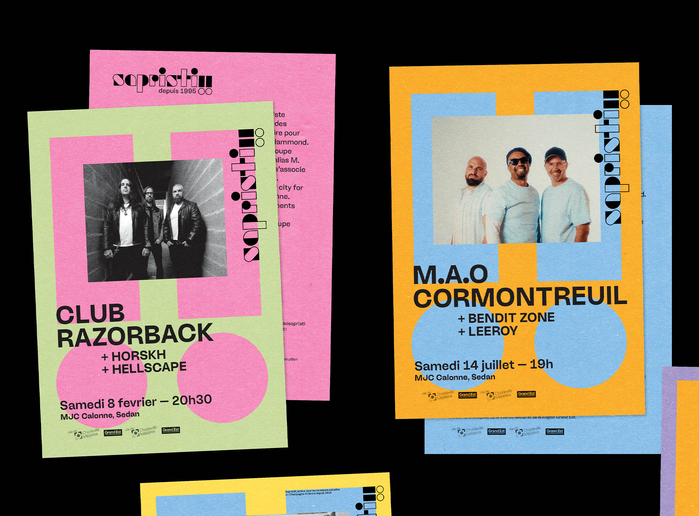
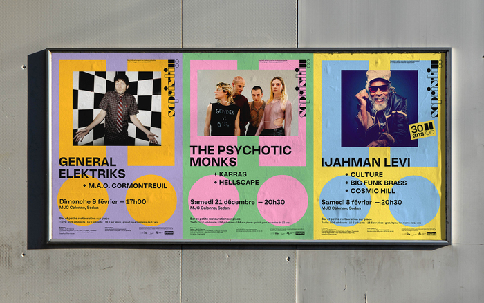
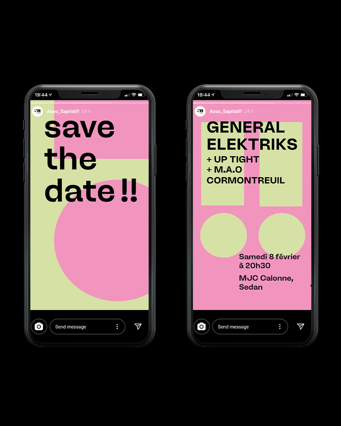
The visual identity of the association Sapristi !! revolves around a distinctive element of its name: the two exclamation marks – powerful and universal symbols that embody the joy, energy, and rhythm of live music. Incorporated as recurring graphic elements, they become visual markers that enliven the communication materials.
The wordmark is composed in Funksjon (from Store Norske Skriftkompani) and is accompanied by Ginka (from lift type) for all other text compositions.
Source: jeannetriboul.com Jeanne Triboul. License: All Rights Reserved.
Source: jeannetriboul.com Jeanne Triboul. License: All Rights Reserved.
Source: jeannetriboul.com Jeanne Triboul. License: All Rights Reserved.
Source: jeannetriboul.com Jeanne Triboul. License: All Rights Reserved.
Source: jeannetriboul.com Jeanne Triboul. License: All Rights Reserved.
Source: jeannetriboul.com Jeanne Triboul. License: All Rights Reserved.
Source: jeannetriboul.com Jeanne Triboul. License: All Rights Reserved.
Source: jeannetriboul.com Jeanne Triboul. License: All Rights Reserved.
Source: jeannetriboul.com Jeanne Triboul. License: All Rights Reserved.
This post was originally published at Fonts In Use