Gurudutt Perichetla’s portfolio website (2025)

Source: www.guruduttperi.com Photo: Gurudutt Perichetla. Gurudutt Perichetla. License: All Rights Reserved.
Homepage


I'm Gurudutt Perichetla – a creative with a background in digital product design and sound design. I apply systems thinking to build unified experiences across conversational channels, with a focus on customer support and sales.
My 2025 portfolio offers a personalized viewing experience through distinct themes (inspired by different types of food), each featuring unique color palettes and typography. Viewers can select their preferred visual style for viewing my work.
This website was built with Next.js, TailwindCSS, and Reshaped, aided by Claude and GitHub Copilot. It runs on Vercel with PostHog handling analytics and Clerk managing authentication. Typefaces are licensed from 10+ type foundries.
There’s also an AI messaging and voice experience powered by ElevenLabs.

Source: www.guruduttperi.com Photo: Gurudutt Perichetla. Gurudutt Perichetla. License: All Rights Reserved.
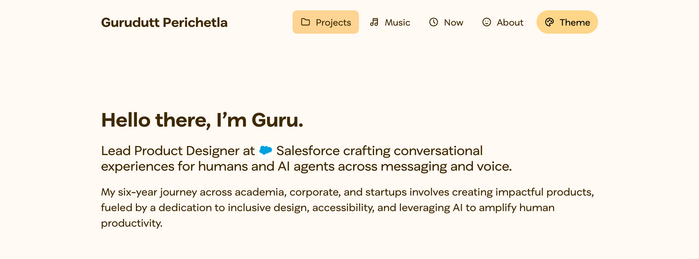
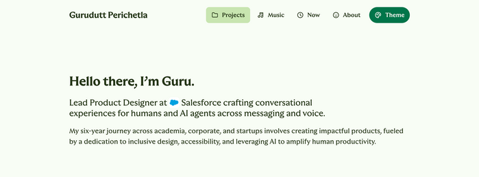
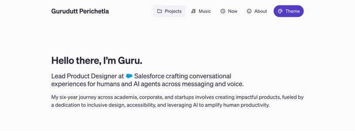
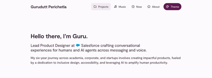
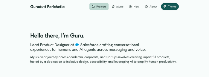
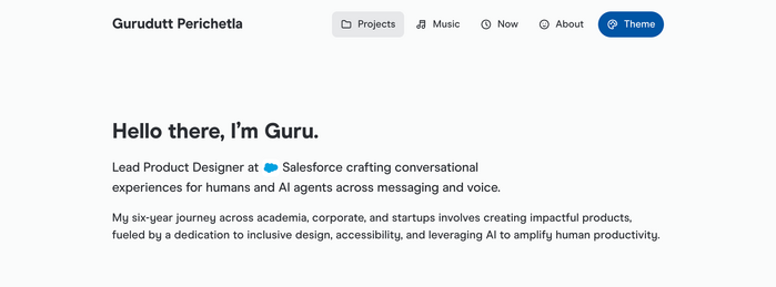
The theme switcher allows viewers to change website’s appearance.

Source: www.guruduttperi.com Photo: Gurudutt Perichetla. Gurudutt Perichetla. License: All Rights Reserved.
Dark mode support
Source: www.guruduttperi.com Photo: Gurudutt Perichetla. Gurudutt Perichetla. License: All Rights Reserved.
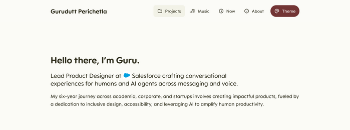
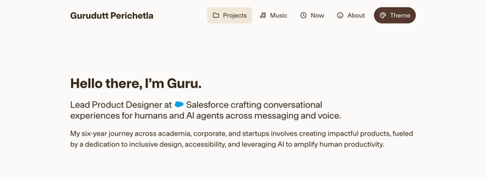
Hero section in “Tiramisu Éclair” theme. The typeface used here is ES Peak Rounded by Extraset. I used this typeface to invoke a playful feel due to its rounded and soft aesthetic.
Source: www.guruduttperi.com Photo: Gurudutt Perichetla. Gurudutt Perichetla. License: All Rights Reserved.
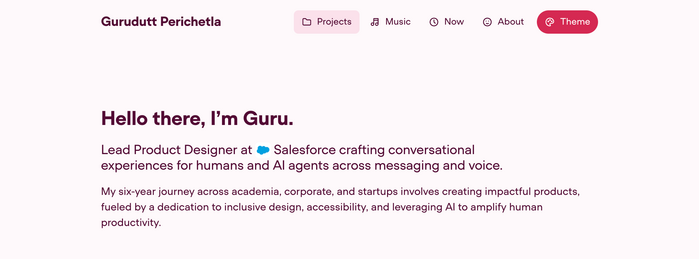
Hero section in “Red Berries” theme. The typeface used here is UCity Pro by Fatype. One of my favorite typefaces to invoke a futuristic aesthetic.
Source: www.guruduttperi.com Photo: Gurudutt Perichetla. Gurudutt Perichetla. License: All Rights Reserved.
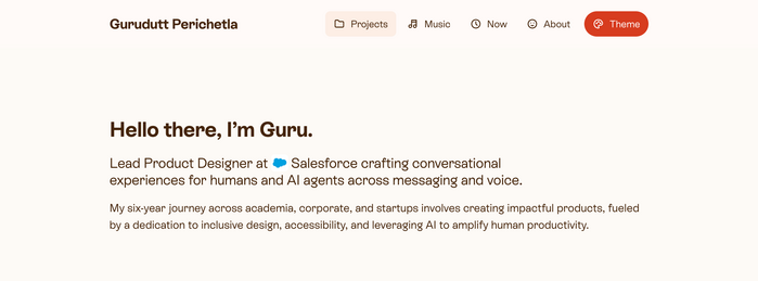
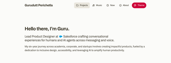
Hero section in “Pumpkin Spice” theme. The typeface used here is ES Rebond Grotesque by Extraset. The quirky design of the lowercase g and k especially stands out, perfectly capturing a sense of playfulness.
Source: www.guruduttperi.com Photo: Gurudutt Perichetla. Gurudutt Perichetla. License: All Rights Reserved.
Hero section in “Mango Lassi” theme. The typeface used here is Luma Sans by Faire Type. Its wide, perfectly geometric letterforms complement the cheerful, sunny yellows of the design.
Source: www.guruduttperi.com Photo: Gurudutt Perichetla. Gurudutt Perichetla. License: All Rights Reserved.
Hero section in “Holy Basil” theme. The typeface used here is Realm by Approximate Type. I’m a huge fan of its flared serif style, which draws inspiration from medieval and Old English aesthetics.
Source: www.guruduttperi.com Photo: Gurudutt Perichetla. Gurudutt Perichetla. License: All Rights Reserved.
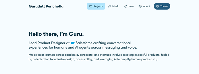
Hero section in “French Lavender” theme. The typeface used here is Söhne by Klim Type Foundry.
Source: www.guruduttperi.com Photo: Gurudutt Perichetla. Gurudutt Perichetla. License: All Rights Reserved.
Hero section in “Fig Jam” theme, showcasing the Moderat typeface by TIGHTYPE. This is one of the first fonts I bought, nearly five years ago.
Source: www.guruduttperi.com Photo: Gurudutt Perichetla. Gurudutt Perichetla. License: All Rights Reserved.
Hero section in “Dinosaur Kale” theme, showcasing the MNKY Maurice typeface by Monkey Type. Its geometric style, reminiscent of Futura, works perfectly alongside the vibrant teal palette.
Source: www.guruduttperi.com Photo: Gurudutt Perichetla. Gurudutt Perichetla. License: All Rights Reserved.
Hero section in “Caffè Mocha” theme, showcasing the Onsite typeface by Sociotype Foundry. I’m drawn to how sharply corporate this grotesk font feels—it evokes the business card scene from American Psycho.
Source: www.guruduttperi.com Photo: Gurudutt Perichetla. Gurudutt Perichetla. License: All Rights Reserved.
Hero section in “Blueberry Cookie” theme. The typeface used here is GT Walsheim by Grilli Type. Its playful character pairs perfectly with the blue color scheme.
Source: www.guruduttperi.com Photo: Gurudutt Perichetla. Gurudutt Perichetla. License: All Rights Reserved.
Hero section in “Blue Agave” theme. The typeface used here is Modern Era by Family Type.
Source: www.guruduttperi.com Photo: Gurudutt Perichetla. Gurudutt Perichetla. License: All Rights Reserved.
Hero section in “Apple Pie” theme. The typeface used here is MD System by Mass-Driver.
Source: www.guruduttperi.com Photo: Gurudutt Perichetla. Gurudutt Perichetla. License: All Rights Reserved.
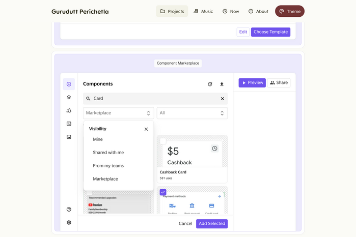
Interactive prototype of a component marketplace. The typeface used here is WT Saltburn by WiseType.
Source: www.guruduttperi.com Photo: Gurudutt Perichetla. Gurudutt Perichetla. License: All Rights Reserved.
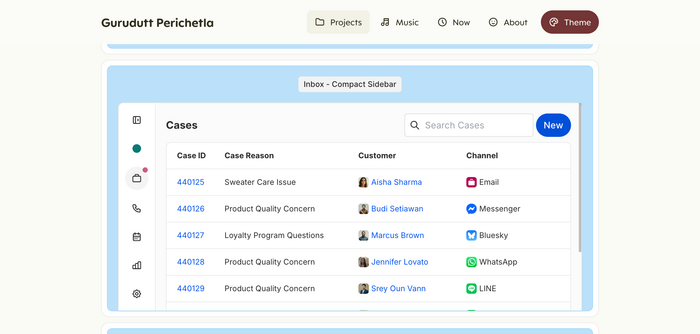
Interactive prototype of a CRM list view. The typeface used here is Inter by Rasmus Andersson.
This post was originally published at Fonts In Use