Harzverbunden Waldquartier
Source: www.ricardodesign.at Photo: Ricardo Gantschnigg. License: All Rights Reserved.


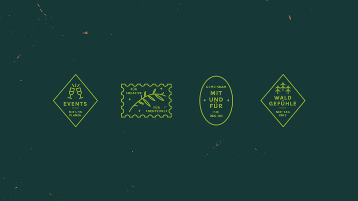
With great attention to detail and a gentle blend of natural elements, Nordic vibes, and warmth, Harzverbunden has created a truly special place of well-being with Waldquartier. If you're longing for unique experiences that give you a sense of freedom, vitality, and self-determination, you’ll find exactly that in the ten holiday apartments.
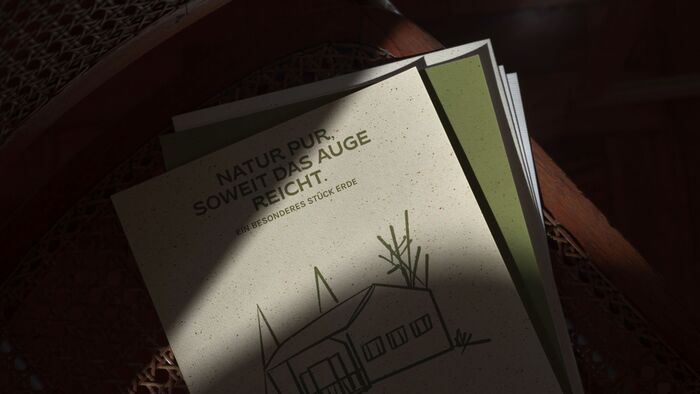
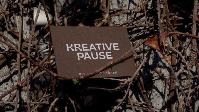
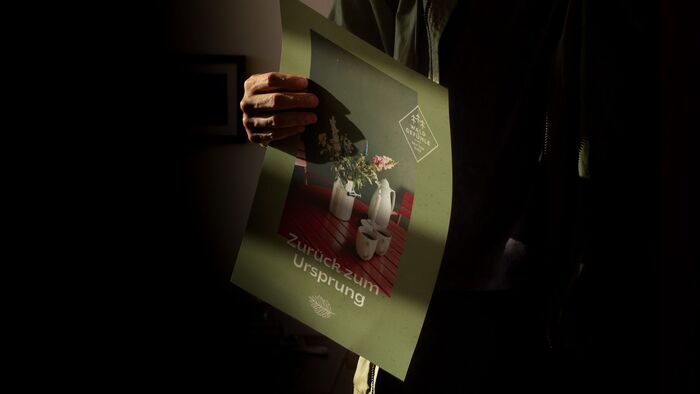
The chosen typefaces—Karla for body text and Brice for headings—perfectly complement the identity of Waldquartier.
Karla, a grotesque sans-serif with a humanist touch, provides clarity and readability while maintaining a soft, friendly tone. Its subtle curves and balanced proportions evoke a sense of simplicity and calmness, making it ideal for conveying warmth and approachability in longer texts—just like the cozy, grounded atmosphere of the forest retreat.
Brice, on the other hand, adds a bold, character-rich contrast. With its distinctive, slightly quirky details and robust presence, it captures the individuality and expressive spirit of Harzverbunden. Brice’s confident yet organic design lends visual strength to headlines, evoking the raw textures and untamed beauty of the Harz region—making it a fitting typographic voice for a brand rooted in nature and self-exploration.
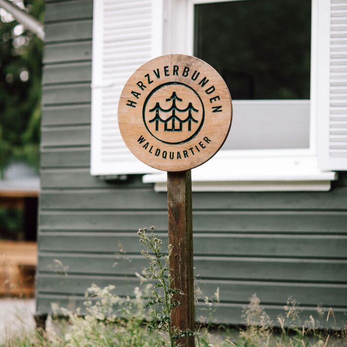
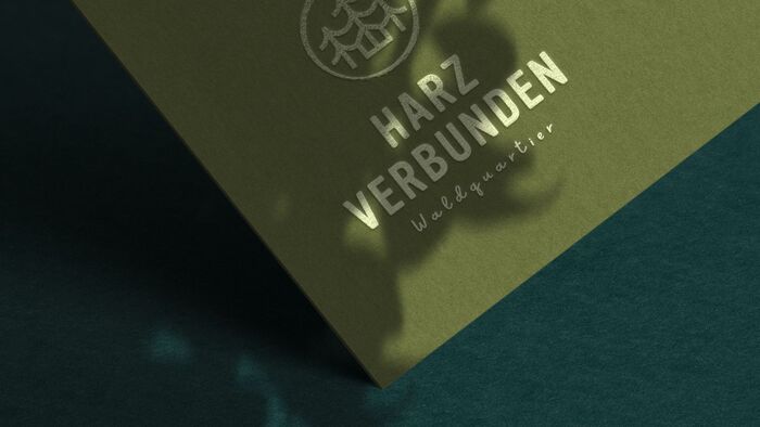
The logo uses all-caps Vinyl.
Source: www.ricardodesign.at License: All Rights Reserved.

Source: www.ricardodesign.at License: All Rights Reserved.
Source: www.ricardodesign.at License: All Rights Reserved.
The script font is Sweet Apricot.
Source: www.ricardodesign.at License: All Rights Reserved.
Source: www.ricardodesign.at License: All Rights Reserved.
Source: www.ricardodesign.at License: All Rights Reserved.
Source: www.ricardodesign.at License: All Rights Reserved.
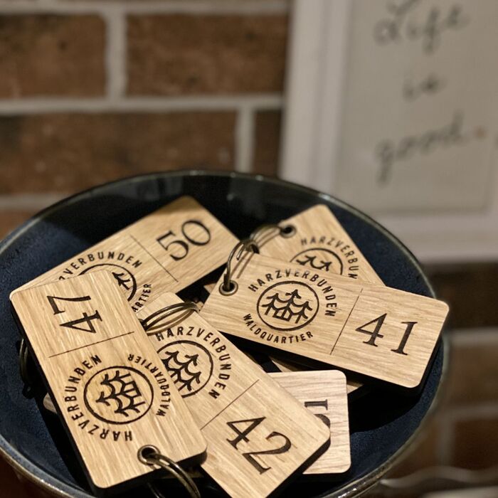
The room numbers on the key fobs are in Footlight.
This post was originally published at Fonts In Use