Oatsome

Source: www.facebook.com Oatsome. License: All Rights Reserved.


Omnes is one of the brand typefaces for Oatsome. The German food startup offers smoothie bowls, crunchy toppings, nut spreads and other products for a healthy diet, all with 100% natural ingredients and no additives or added sugar.
Darden Studio’s selectively rounded sans is available in four widths: Narrow, Condensed, Semicondensed, and Standard. The Oatsome designers work with several of them, in various styles including the italic. Omnes Condensed and Narrow are being used for the product descriptions. These space-saving fonts also come in handy for placing all relevant consumer info like nutrition facts on the packaging designs.
Omnes is combined with Stick-A-Round by PintassilgoPrints. The unicase sans is used with some of its playful ligatures and nested letter pairs for the product names. The Oatsome logo features Shinntype’s Aptly in lowercase letters.

Darden Studio. License: All Rights Reserved.
When Darden Studio introduced Omnes Widths, we designed promotional graphics with condiment packs. These demonstrated how dry information like lists of ingredients can still be presented in ways that are readable and appealing alike. We’re thrilled to see such an application in the wild!
Source: www.instagram.com Oatsome. License: All Rights Reserved.

Source: www.oatsome.de Oatsome. License: All Rights Reserved.
Banners from the Oatsome website, featuring Omnes Narrow Bold and Bold Italic for the large lines

Source: www.instagram.com Oatsome. License: All Rights Reserved.
Intro for the hazelnut-and-tonka smoothie bowl. Text in the speech bubble is in Omnes’s standard width.

Darden Studio. License: All Rights Reserved.
Trial packs with teasers in Omnes Narrow

Darden Studio. License: All Rights Reserved.
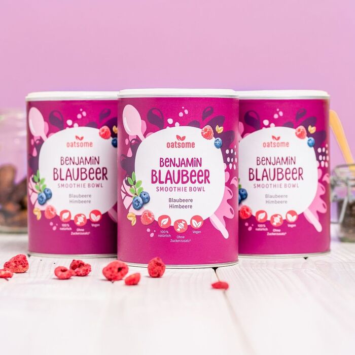
Stick-A-Round in combination with Omnes Narrow

Darden Studio. License: All Rights Reserved.
Ingredient lists can have nice typography, too!

Source: www.dm.de Oatsome. License: All Rights Reserved.
Jar labels for a hazelnut-cocoa spread

Source: www.facebook.com Oatsome. License: All Rights Reserved.
This post was originally published at Fonts In Use