Récit’Cité by Julien Staudt
Source: www.pascallienard.com Pascal Liénard. License: All Rights Reserved.


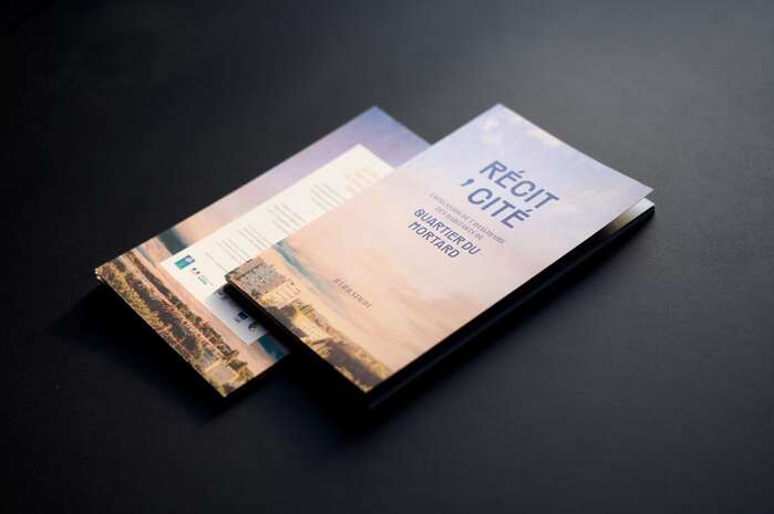
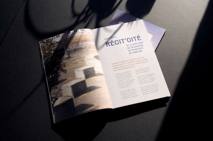
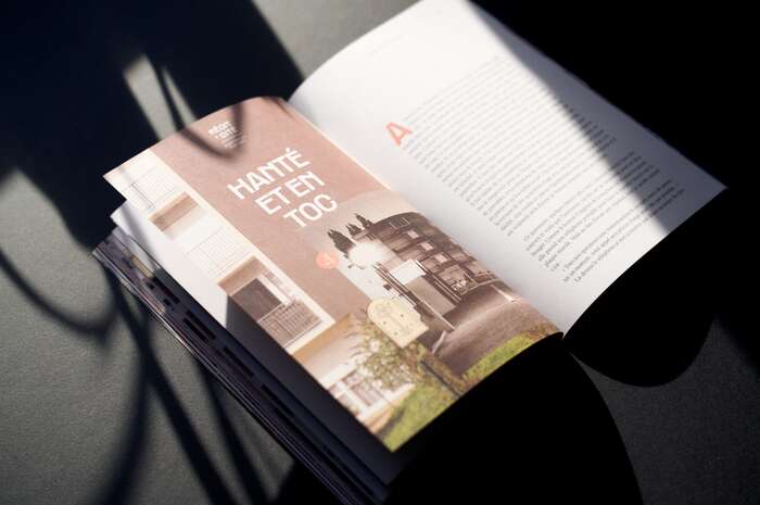
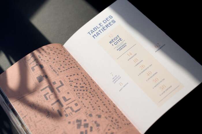
Récit’Cité is a collection of tales written by storyteller Julien Staudt (Brussels), drawn from three years of residency in the Mortard neighbourhood, a working-class area of tower blocks and social housing in Lure, France. The book was commissioned with support from the City of Lure and the French Ministry of Culture.
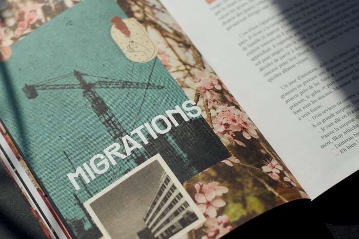
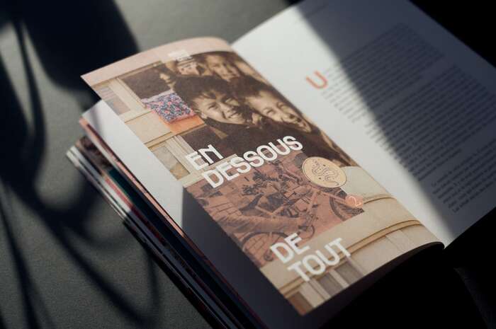
The typographic system holds a tension between weight and light, pairing three typefaces from Pangram Pangram. Räder Bold carries the main titles – solid, rigid, a typeface whose origins in infrastructure and public space resonates with the urban fabric of the neighbourhood. It is accompanied by Acma Semibold: thinner, more luminous, with a quietly oriental quality that softens and complements Räder’s density. The body text runs in Writer Light – a serif with subtle luminous details, quiet and readable. Chapter numbers use Writer Thin, almost weightless. Drop caps return to Räder Bold, but in a soft tone, anchoring the chapter openings without dominating.
The whole is unified by a matte, slightly textured Munken Lynx paper stock that softens contrasts and reinforces the memorial dimension.
See the full case study on Pascallienard.com
Source: www.pascallienard.com Pascal Liénard. License: All Rights Reserved.
Source: www.pascallienard.com Pascal Liénard. License: All Rights Reserved.
Source: www.pascallienard.com Pascal Liénard. License: All Rights Reserved.
Source: www.pascallienard.com Pascal Liénard. License: All Rights Reserved.
Source: www.pascallienard.com Pascal Liénard. License: All Rights Reserved.
This post was originally published at Fonts In Use