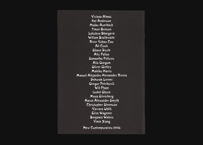
New Contemporaries 2026
Source: ashleykinnard.com Photo: Ashley Kinnard Studio. License: All Rights Reserved.


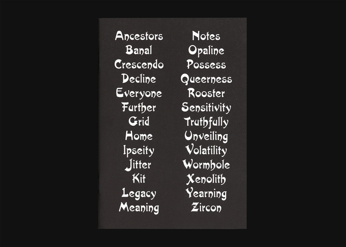
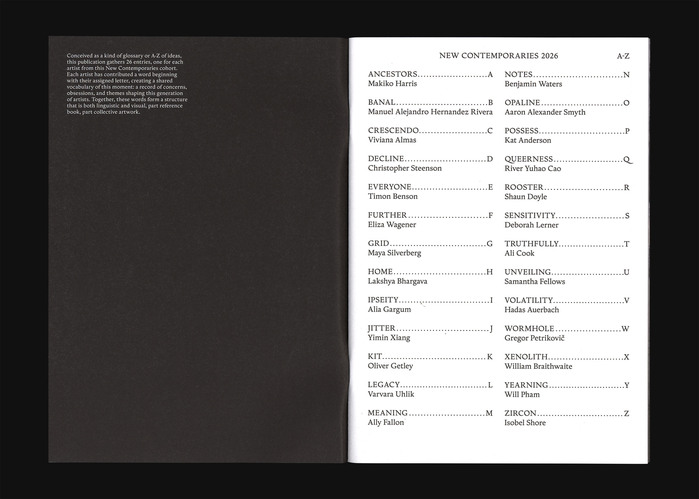
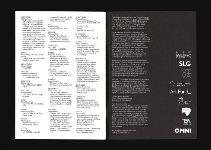
The publication New Contemporaries 2026 was conceived as a continuation of the eponymous exhibition at South London Gallery rather than a record of it. Structured as an A–Z, it brings together 26 entries, one from each artist, forming a shared vocabulary of ideas, concerns, and positions emerging from this generation. Part reference book, part collective artwork.
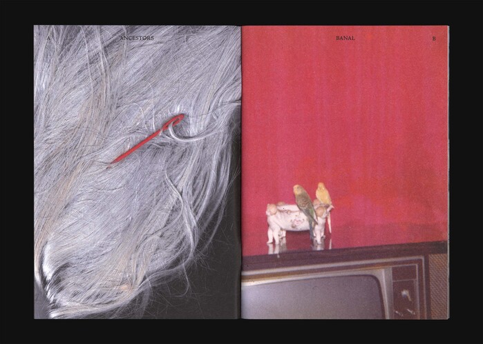
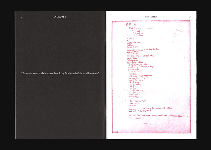
The design follows this A–Z logic throughout. Two typefaces, Artistik and Zénith, were chosen to embody the span typographically: one expressive and unfamiliar, the other stable and readable. The idea of A–Z is also resolved through colour. The book is printed in registration black, using 100% of each C, M, Y and K plate. For New Contemporaries, where colour is usually prominent, this produces a deliberate shift: all colours present, but resolved into black.
The format sits between A5 and A4, giving the publication a familiar scale while allowing it to feel more substantial than a typical zine. Letters replace page numbers, the contents move onto the cover, and the typography carries the structure across the book.
The result is a publication that functions as index, object, and artwork at once, extending the exhibition while standing on its own.
Source: ashleykinnard.com Photo: Ashley Kinnard Studio. License: All Rights Reserved.
Source: ashleykinnard.com Photo: Ashley Kinnard Studio. License: All Rights Reserved.
Source: ashleykinnard.com Photo: Ashley Kinnard Studio. License: All Rights Reserved.
Source: ashleykinnard.com Photo: Ashley Kinnard Studio. License: All Rights Reserved.
Source: ashleykinnard.com Photo: Ashley Kinnard Studio. License: All Rights Reserved.
This post was originally published at Fonts In Use