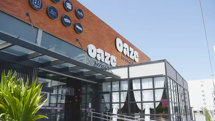
Oaze foodhall
Source: www.ajnadesign.com.br License: All Rights Reserved.


Oaze is a foodhall, based in Palhoça, Brazil. The naming and visual identity of the business was handled by design studio Ajna:
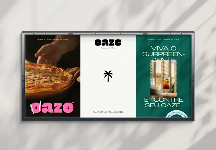
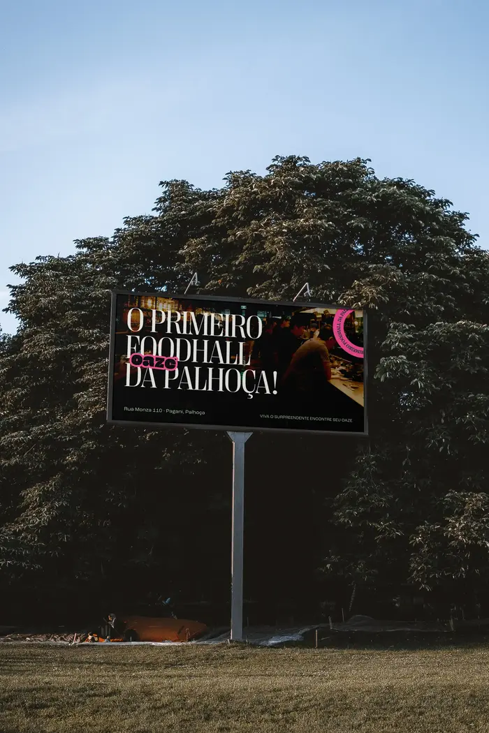
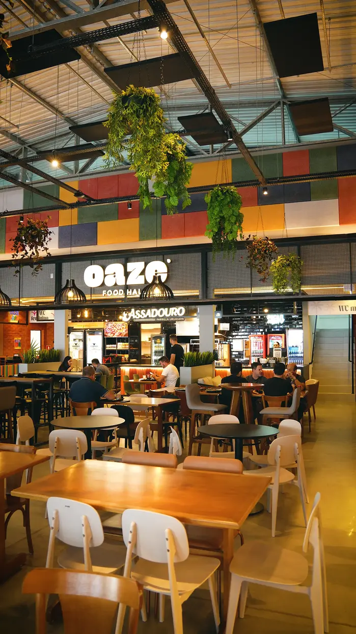
Oaze was born as a new food hall concept: a sophisticated, diverse, and open-air food court located in the heart of a large entertainment hub. The challenge was to create a brand with a strong presence and memorable visuals, capable of communicating variety without losing unity.
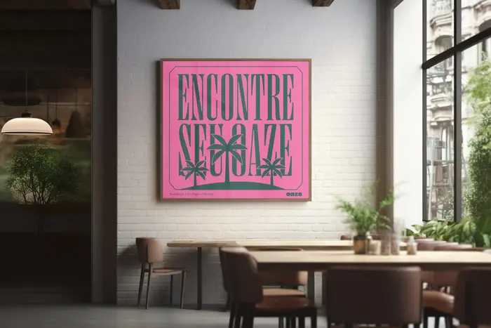
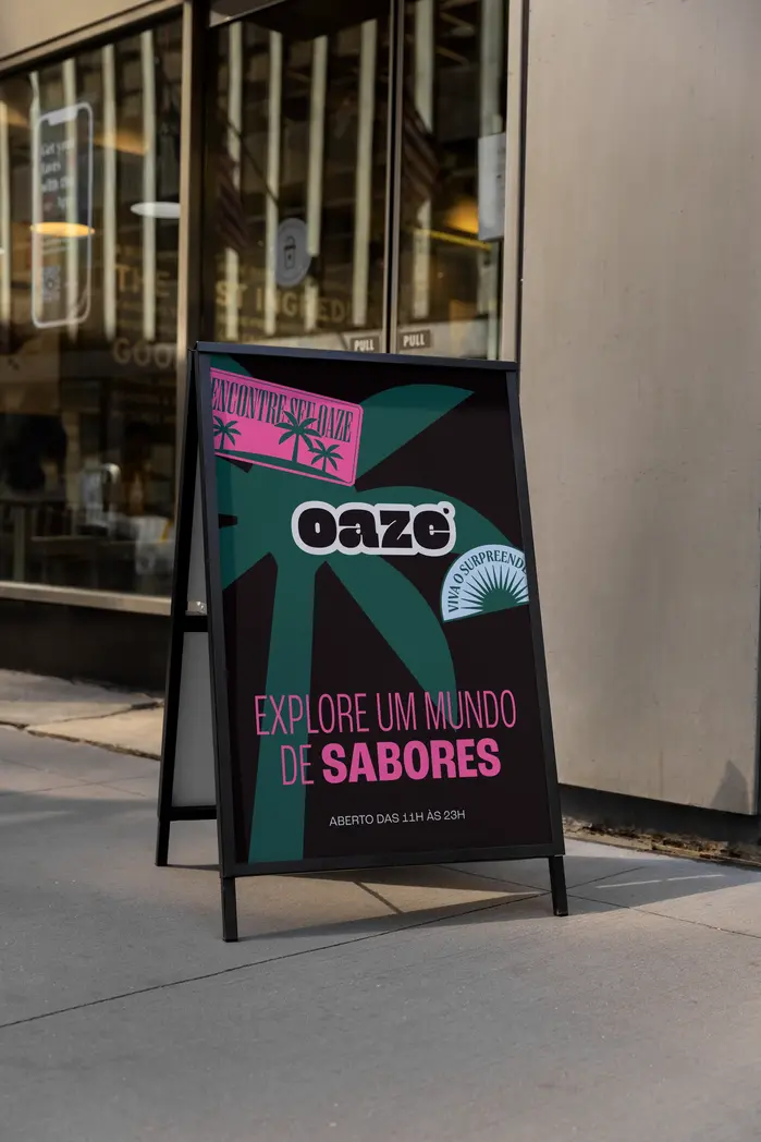
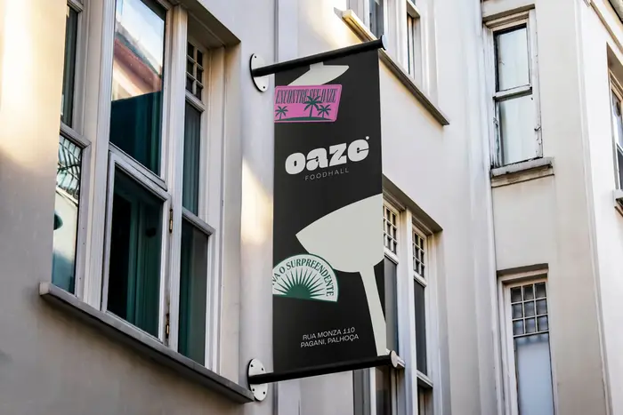
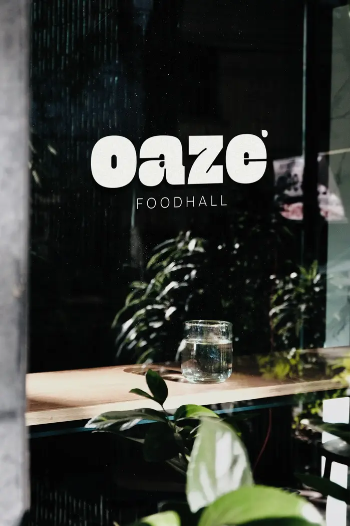
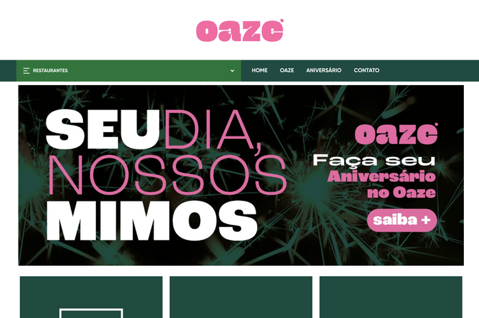
Inspired by the concept of an “oasis,” we created a visual and verbal identity that reinforces Oaze Foodhall as a place of pleasure. Through the naming, we evoked the idea of a refuge amidst urban chaos, conveying the proposal to offer a rich and diverse gastronomic experience, with different restaurants and establishments in one place. The vibrant color palette brings life, while the bold logo carries personality for a sophisticated and welcoming environment.
The identity pairs typefaces in contrasting weights and widths. Roc Grotesk from Kostic is used in consensed, regular and extended widths, and in lihjter and heavier weights. Its Heavy style served as a basis for the logo. The sans serif is juxtaposed with a few weights of Right Didone from Pangram Pangram. The less showy Gilroy from Radomir Tinkov is used for small type.
Source: www.ajnadesign.com.br License: All Rights Reserved.
Source: www.ajnadesign.com.br License: All Rights Reserved.
Source: www.ajnadesign.com.br License: All Rights Reserved.
Source: www.ajnadesign.com.br License: All Rights Reserved.
Source: www.ajnadesign.com.br License: All Rights Reserved.

Source: www.ajnadesign.com.br License: All Rights Reserved.
Source: www.ajnadesign.com.br License: All Rights Reserved.
Source: www.ajnadesign.com.br License: All Rights Reserved.
Source: oazefoodhall.com.br License: All Rights Reserved.
This post was originally published at Fonts In Use