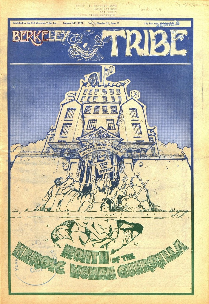
Berkeley Tribe, Vol. 2, No. 25, Issue 77
Source: archive.org License: All Rights Reserved.


The Berkeley Tribe is possibly the most famous “New Left” newspaper. Centered in Berkeley, California, it (like other publications) focused on revolutionary subject matter (Black/Women's Liberation, Gay rights, Antiwar Movements, etc.). Their headquarters were at multiple times bombed or shot, with the FBI surveilling their operation.
The masthead, like with many famous magazines, such as TIME, is a custom lettering.
Crediting designers for each issue can be tricky, as intimidation from attacks and police prompted staff to remove their names from the masthead. However, East Bay Media is noted to have served the tribe's publishing and at least some graphic design from 1971, the time of this issue here (it is possible other Berkeley area shops filled a similar role during the paper's run, too).
Early covers and hand lettering are credited to designer Gary Grimshaw, who possibly did not work on this particular specimen.
Shown here are the cover and a selection of eleven of the twenty-four pages, featuring most of the display fonts used in the editorial design at least once. Text is set in Univers and Century Schoolbook.
Source: archive.org License: All Rights Reserved.
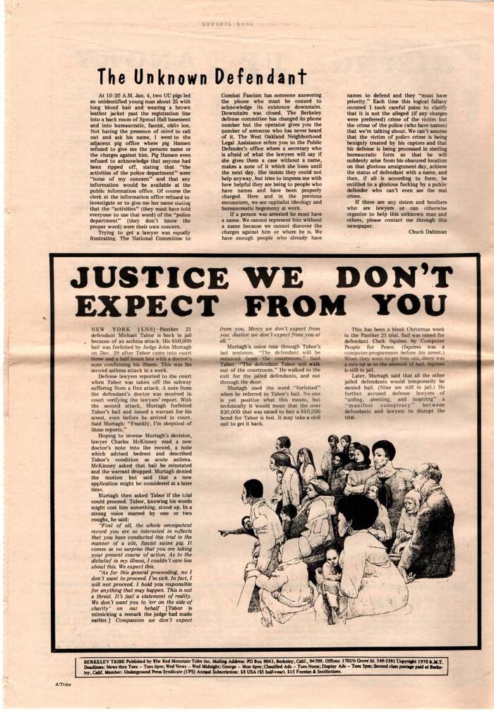
Headlines in Dom Casual (“The Unknown Defendant”) and Clarendon (“Justice We Don’t Expect From You”)
Source: archive.org License: All Rights Reserved.
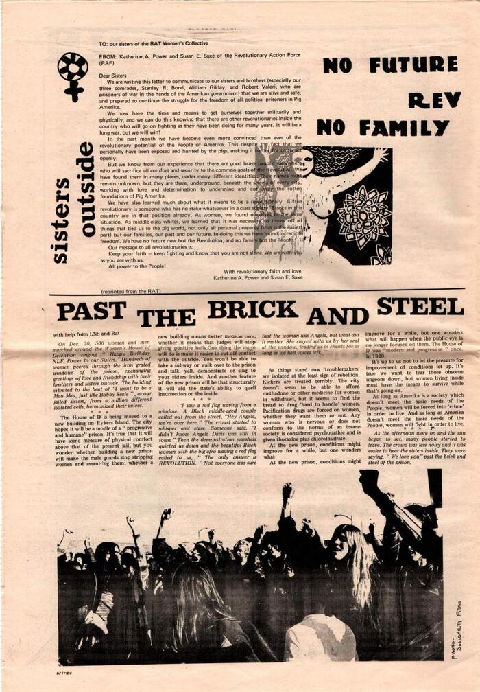
Publicity Gothic (“No Future Rev No Family”) and Clarendon
Source: archive.org License: All Rights Reserved.
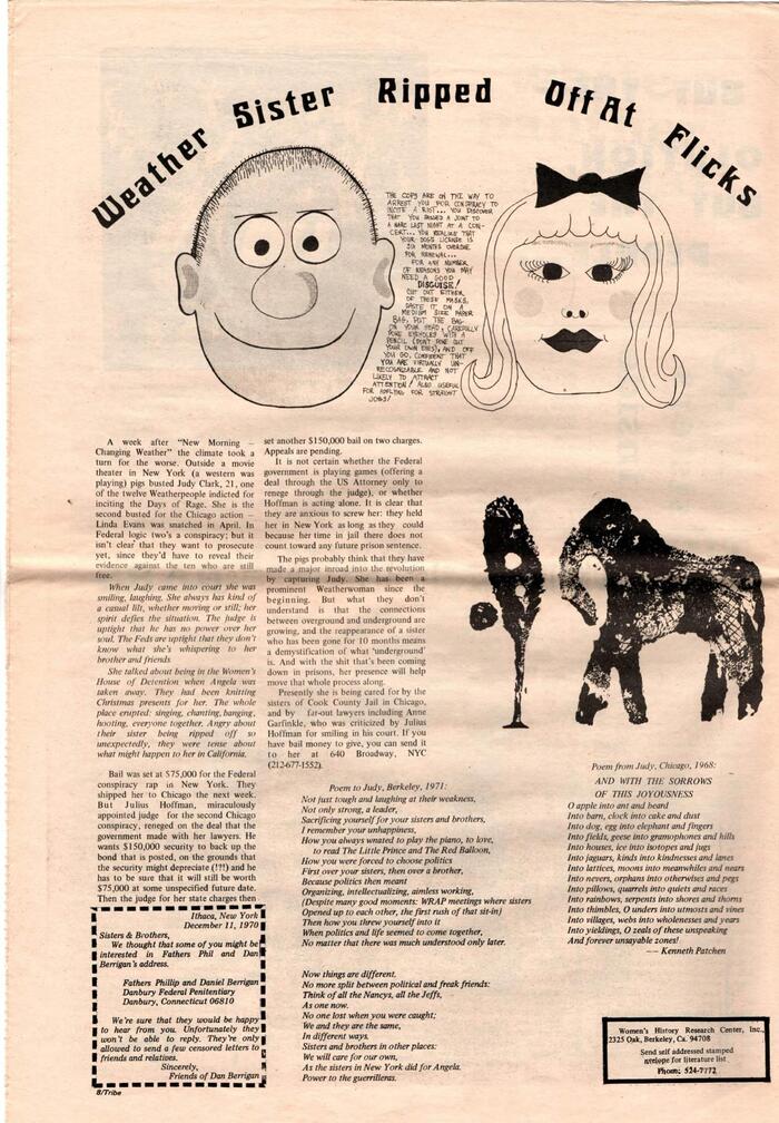
“Weather Sister Ripped Off At Flicks” is in Roberta.
Source: archive.org License: All Rights Reserved.
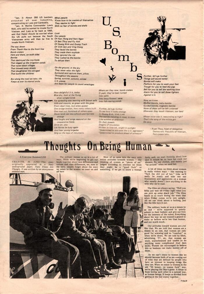
Headlines in Antikva Margaret (“U.S. Bombs”) and Windsor Elongated (“Thoughts On Being Human”)
Source: archive.org License: All Rights Reserved.
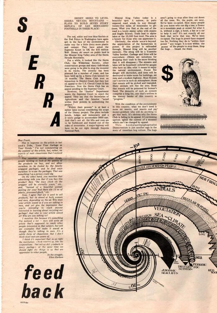
Grotesque No. 9 for “SIERRA” and “feedback”
Source: archive.org License: All Rights Reserved.
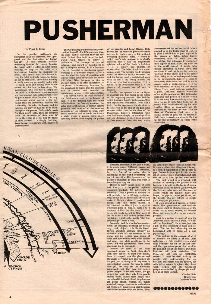
Franklin Gothic for the “Pusherman” headline, De Vinne for “Human Culture Time-Line”
Source: archive.org License: All Rights Reserved.
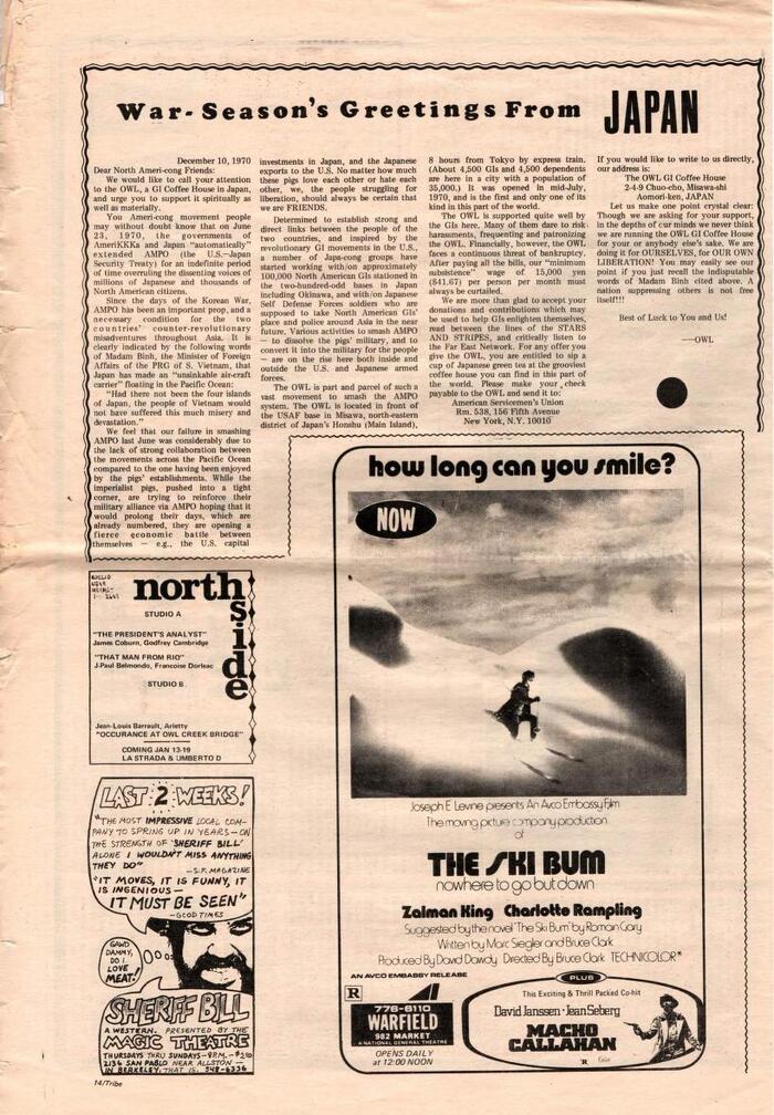
Cooper Black and Haas Inserat Grotesk for “War-Season’s Greetings from JAPAN” . The ad below features two weights of Blippo (equivalent to Burko and Harry) and City.
Source: archive.org License: All Rights Reserved.
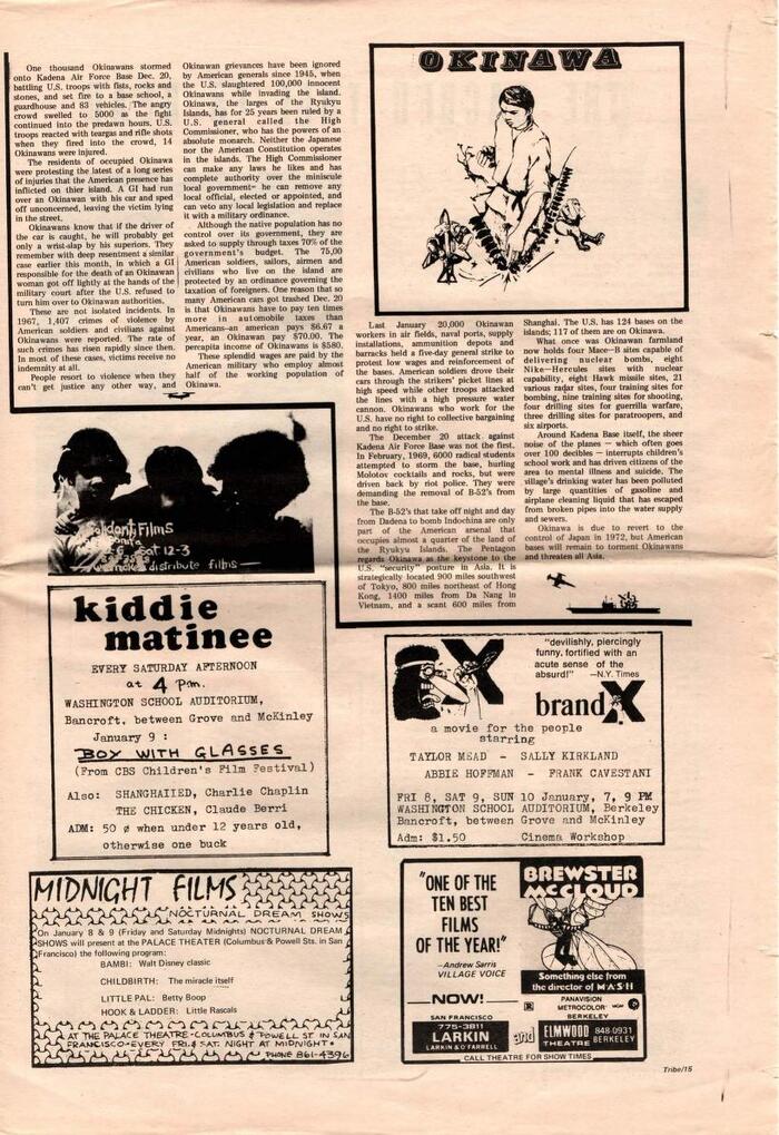
Profil for “OKINAWA”. The ad for Midnight Films uses Mistral.
Source: archive.org License: All Rights Reserved.
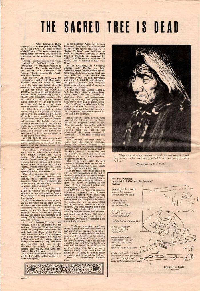
More Inserat-Grotesk for “The Sacred Tree is Dead”. Times New Roman is used for the poem at the bottom right.
Source: archive.org License: All Rights Reserved.
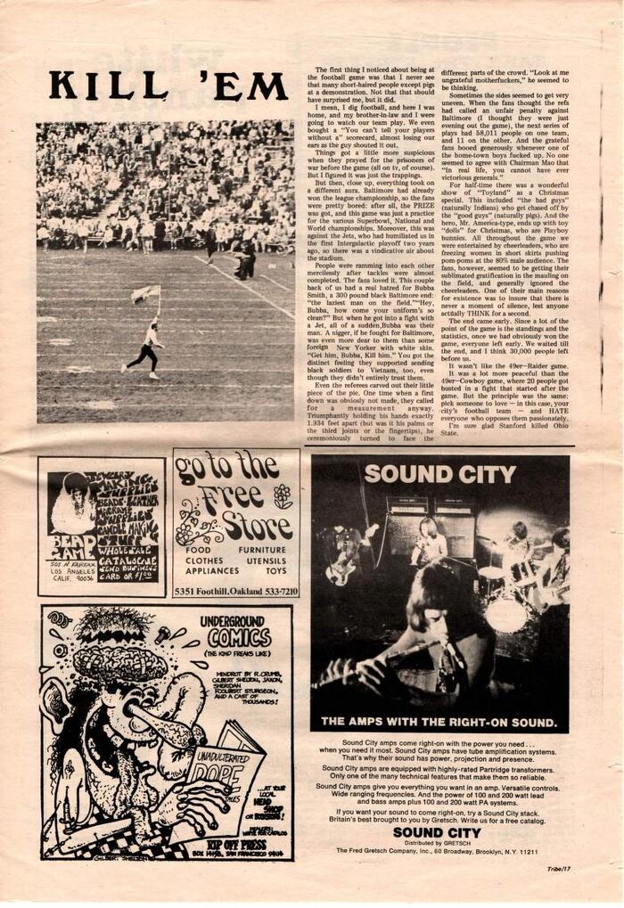
The “KILL ’EM” headline is set in Windsor. Smoke and Futura feature for the Free Store ad and Helvetica for the one by Sound City.
Source: archive.org License: All Rights Reserved.
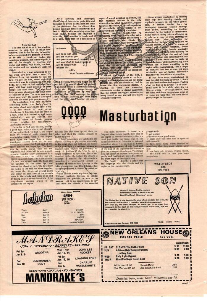
The “Masturbation” headline is in Jay Gothic. Fonts used in the ads include Flash (“Native Son”) and Commercial Script (“MANDRAKE’S).
This post was originally published at Fonts In Use