Third Rail Advisors logo and identity

Source: www.katieehrlich.com Katie Ehrlich. License: All Rights Reserved.

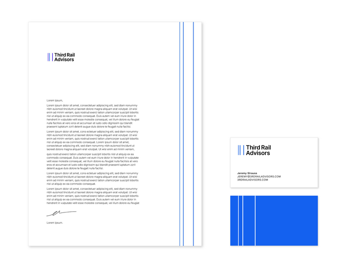
The founder of Third Rail Advisors approached me to create a simple but bold logo for his new business. The name “Third Rail” was inspired by the electrified rail on a subway track: they aim to empower and embolden their clients’ business strategies. Their new logo needed to work for more serious business documents, while also being contemporary and dynamic.
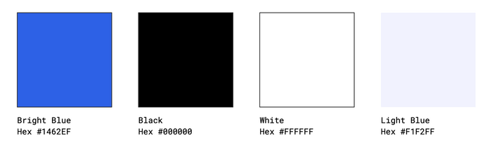
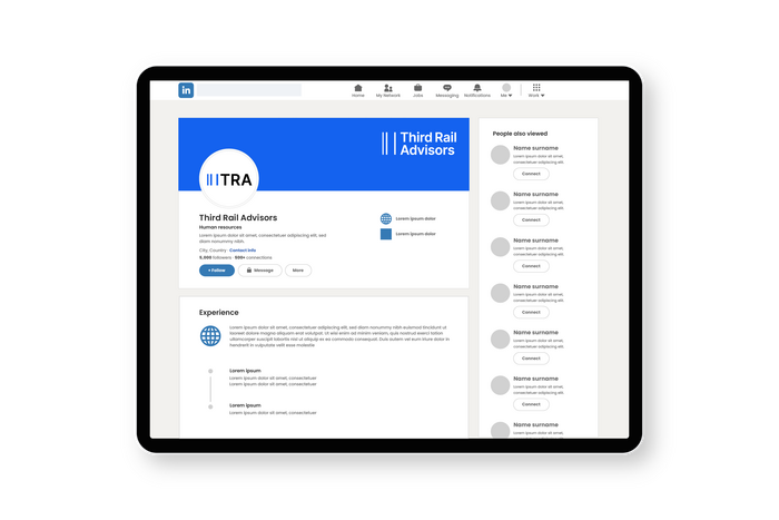
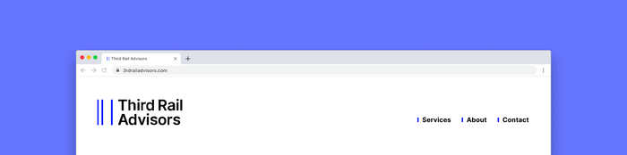
I looked to NYC’s iconic subway identity for inspiration. Three vertical lines form a subtle abstract graphic representing the subway tracks. The stripes can live alongside the logomark, on their own as an icon, or can be extended to form a super graphic. The logomark uses the typeface Inter, similar to the MTA’s Helvetica, with added legibility for digital use. The letterforms’ verticality complements the rail graphic. The chosen shade of blue is vibrant, high contrast, and bold while still functioning well in a professional context.
Source: www.katieehrlich.com Katie Ehrlich. License: All Rights Reserved.
Source: www.katieehrlich.com Katie Ehrlich. License: All Rights Reserved.
Source: www.katieehrlich.com Katie Ehrlich. License: All Rights Reserved.
Source: www.katieehrlich.com Katie Ehrlich. License: All Rights Reserved.
This post was originally published at Fonts In Use