Garnier rebrand (ArtCenter College of Design project)
Source: basilhts.framer.website Minh Tran. License: All Rights Reserved.


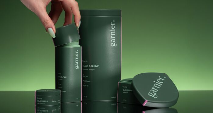
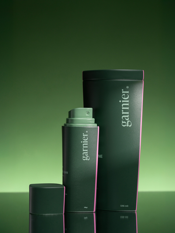
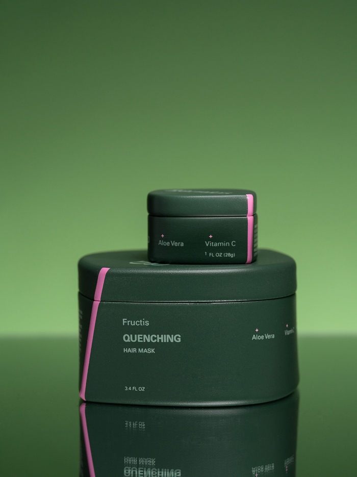
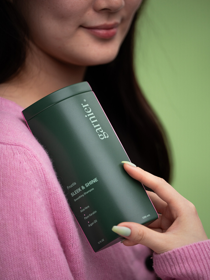
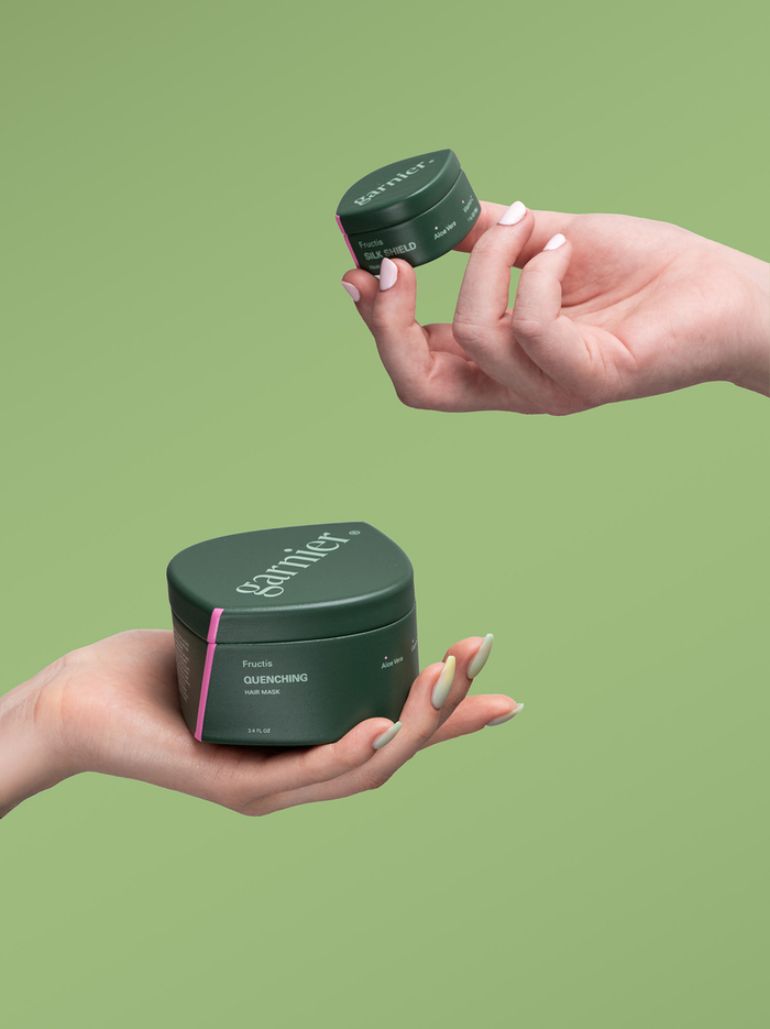
“Garnier – Everyday Touch” is a student rebrand identity project made as part of the Packaging Design 2 class taught by Ania Borysiewicz. It reimagines the brand through the lens of ritual, sensuality, and evolving heritage.
Hair is a ritual, evolving with every new chapter and reflecting our heritage. Infused with nourishing botanical ingredients, each formula transforms the everyday into an intimate act of care. More than maintenance, this is a return—to touch, to tradition, to the quiet sensuality woven into daily life.
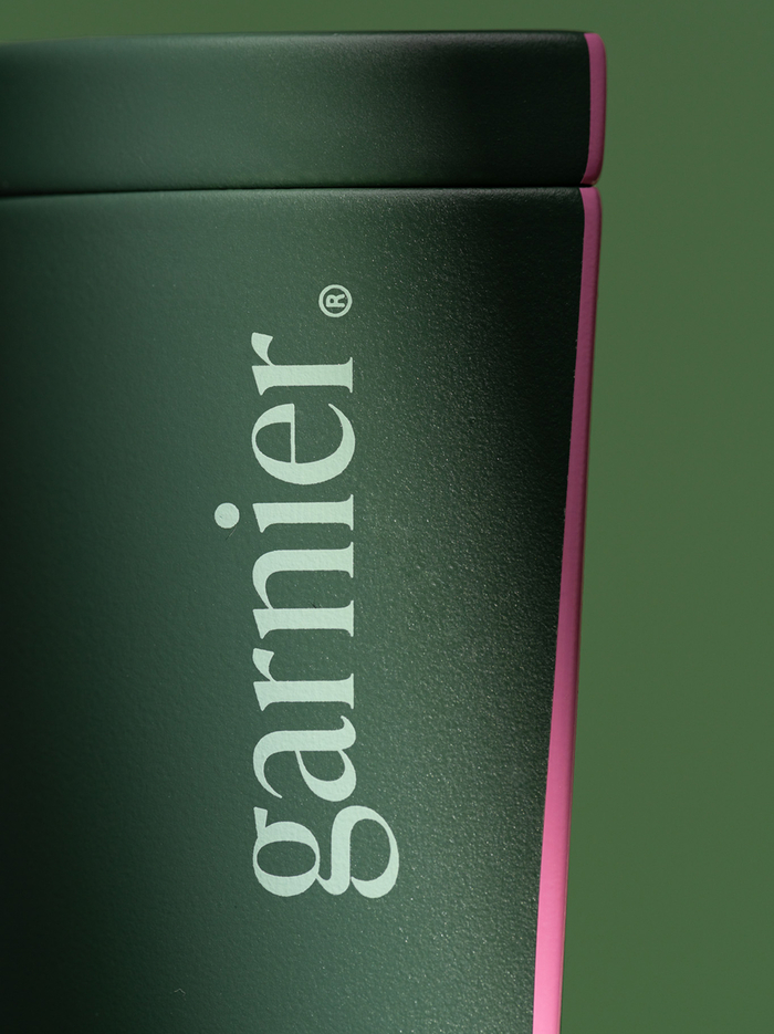
The identity uses Univers as the primary typeface for its clean, modern precision and structural clarity across the system. IvyPresto is used exclusively for the logotype, its expressive serif forms introducing elegance and softness that echo the brand’s botanical heritage and refined sensuality.
Source: basilhts.framer.website Minh Tran. License: All Rights Reserved.
Source: basilhts.framer.website Minh Tran. License: All Rights Reserved.
Source: basilhts.framer.website Minh Tran. License: All Rights Reserved.
Source: basilhts.framer.website Minh Tran. License: All Rights Reserved.
Source: basilhts.framer.website Minh Tran. License: All Rights Reserved.
This post was originally published at Fonts In Use