FERMO
hellofarm. License: All Rights Reserved.

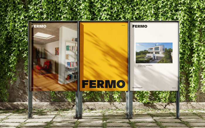
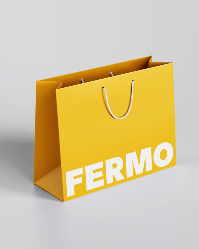
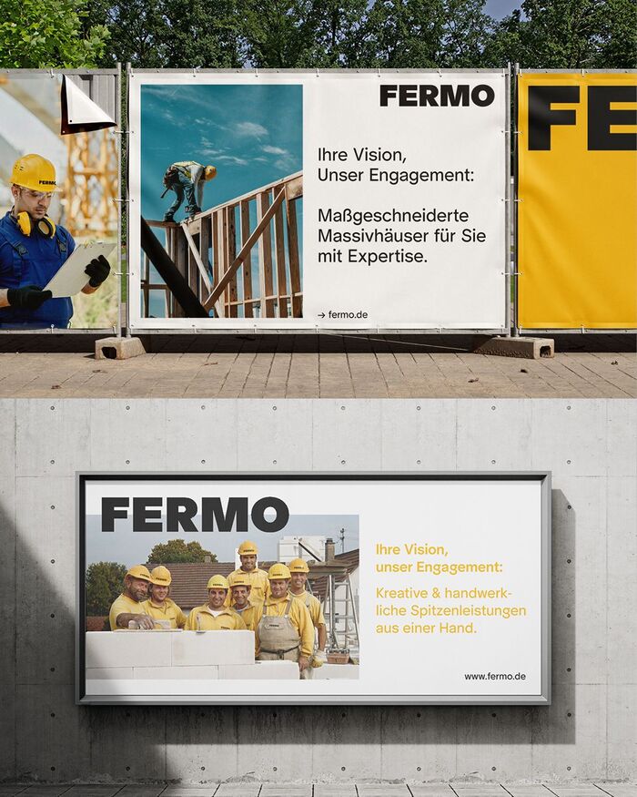
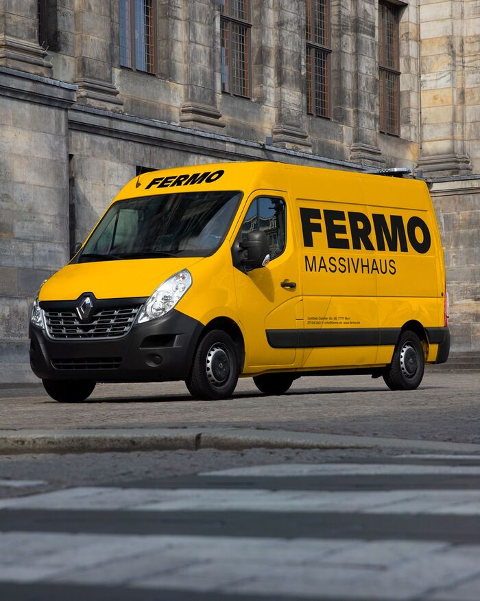
A company that has been building houses meant to last for generations now has a visual identity that holds itself to the same standard. hellofarm has redesigned the brand identity of FERMO Massivhaus. Restrained, considered, and built around a clear typographic core.
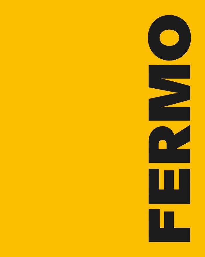
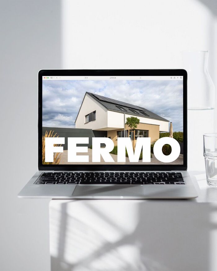
The choice of typeface fell on Protest Grotesk, designed by Mark Julien Hahn and distributed by Softdrive Foundry. The geometric grotesque is rooted in a strict constructive skeleton that draws on German typography of the late 1920s: Futura, Kabel, and the visual clarity of early modernism. Over the years the typeface has been carefully refined: less dogmatic in its geometry, but carrying the spirit of that era. Available as a variable font with eight weights, it works equally well at large display sizes and in body text.
What makes the typeface a fitting choice for this project is not just its formal quality. It is clear without being cold, and it has a point of view without being loud, qualities that align closely with what FERMO has stood for over six decades. The company works without subcontractors, without hidden costs, without the usual compromises of volume housebuilding. hellofarm has translated that attitude into a visual language that explains as little as necessary. The typeface does the work.
hellofarm. License: All Rights Reserved.
hellofarm. License: All Rights Reserved.
hellofarm. License: All Rights Reserved.
hellofarm. License: All Rights Reserved.
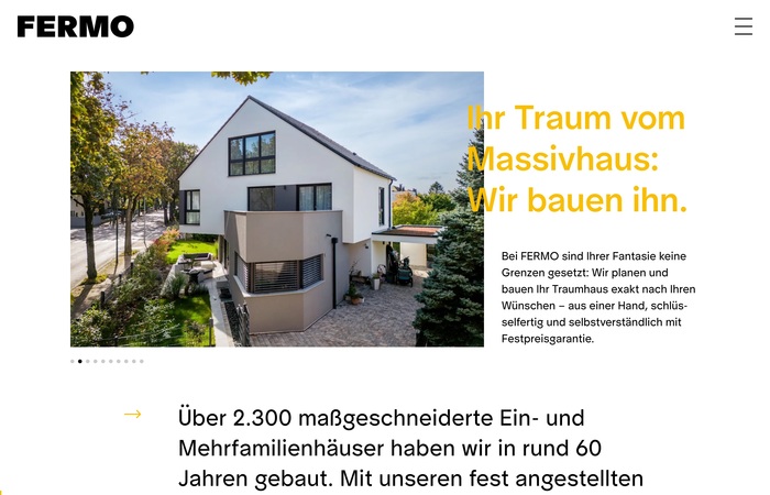
Source: www.fermo.de hellofarm. License: All Rights Reserved.
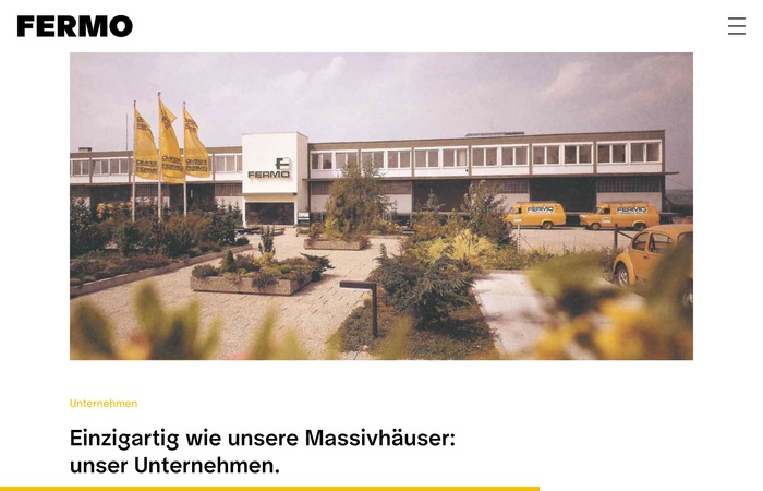
Source: www.fermo.de hellofarm. License: All Rights Reserved.
hellofarm. License: All Rights Reserved.
This post was originally published at Fonts In Use