Boston Book Festival (2016–)
Source: elizabethcarter.design Elizabeth Carter. License: All Rights Reserved.

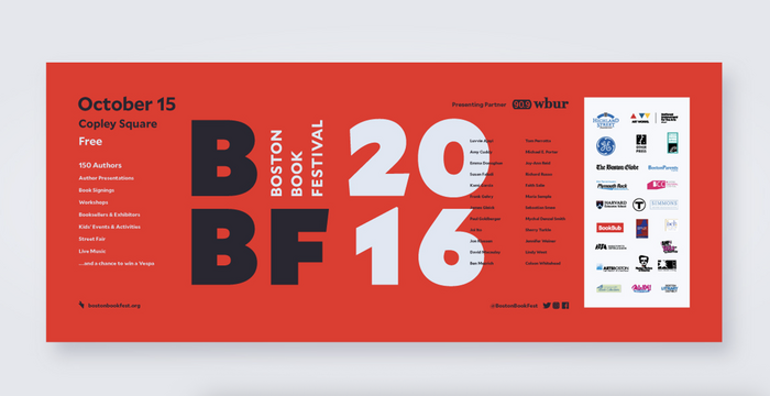
The Boston Book Festival rebrand in 2016 was designed by Elizabeth Carter at Corey McPherson Nash, using Mallory by Frere-Jones Type.
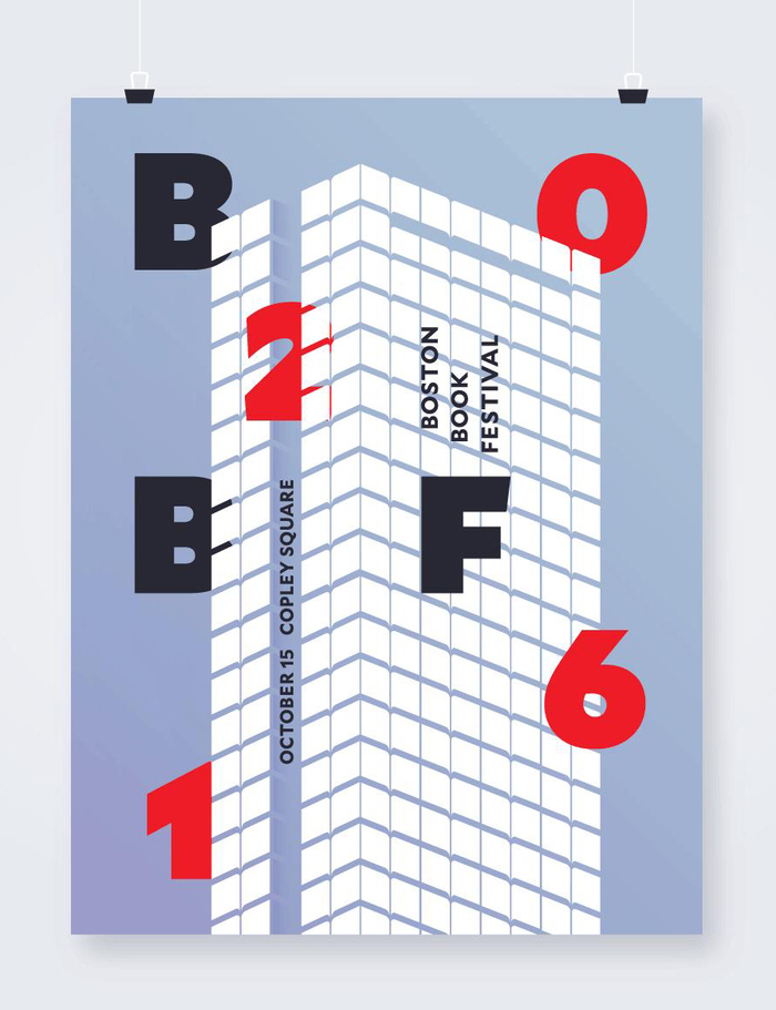
The annual festival is a day-long celebration of literature and arts centered in Copley Square, Boston. Founded in 2009, the festival features authors from around the world and has an approximate attendance of 30,000 each year.
From Elizabeth Carter’s portfolio website:
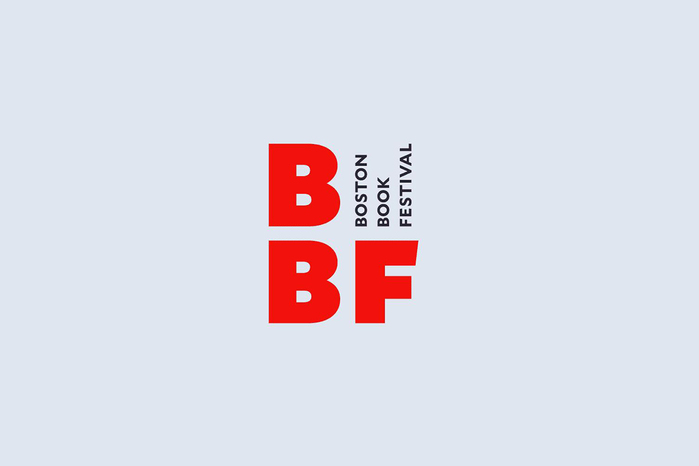
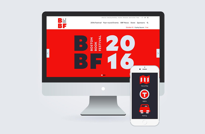
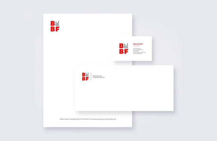
The festival rebranding included design concepts for a new identity with a flexible and adaptable logo. The visual approach to the logo took inspiration from the recognizable previous identity system, from book design, and from typography found in Boston. The full project included the design and production of promotional materials for the festival, responsive website, merchandise, venue signage and materials, a program guide and a promotional social media campaign.
Source: elizabethcarter.design Elizabeth Carter. License: All Rights Reserved.
Source: elizabethcarter.design Elizabeth Carter. License: All Rights Reserved.
Source: elizabethcarter.design Elizabeth Carter. License: All Rights Reserved.
Source: elizabethcarter.design Elizabeth Carter. License: All Rights Reserved.
This post was originally published at Fonts In Use