The Onion website
Source: theonion.com License: All Rights Reserved.


Founded in 1988, The Onion remains one of the most recognizable satirical news outlets in the world. Its visual design cleverly mirrors that of a traditional newspaper—anchored by its choice of type—giving it a real sense of newsy legitimacy.
Headlines are set in Rocky Compressed, designed by Matthew Carter and available from Carter & Cone. Carter’s long association with newspaper typography makes this choice especially fitting, giving the digital publication a confident, print-like presence.
Tablet Gothic Condensed and Semi-Condensed, designed by José Scaglione and Veronika Burian, foundry partners at TypeTogether, appear in subheads and smaller section titles. This crisp, space-saving sans serif family acts as a good visual foil for the two serif families.
Body copy uses Utopia, designed by Robert Slimbach for Adobe and their Adobe Originals program, providing a balanced, readable serif ideal for long-form journalism—real or imagined.
The logo is based on Eagle, David Berlow’s interpretation and expansion of ATF’s Eagle Bold, with modifications.
In a time when real news can feel stranger than satire, The Onion’s typographic choices reinforce its role as both parody and institution.
Source: theonion.com License: All Rights Reserved.
Source: theonion.com License: All Rights Reserved.
Source: theonion.com License: All Rights Reserved.

Source: theonion.com License: All Rights Reserved.
Source: theonion.com Photo: Tiffany Wardle. License: All Rights Reserved.
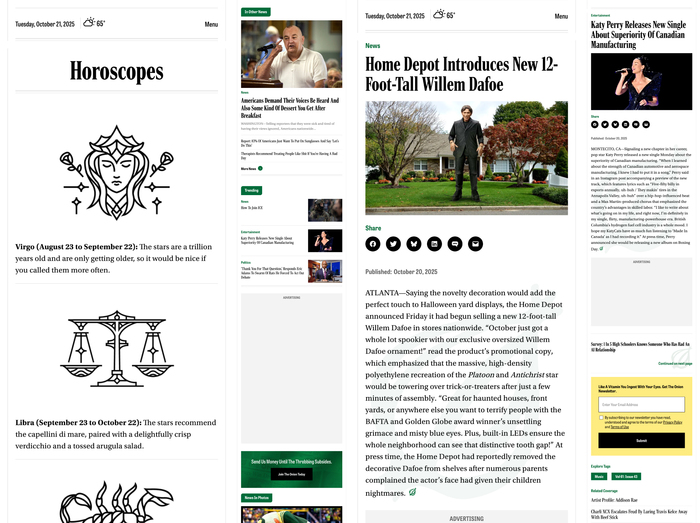
Various pages viewed through a narrower viewport demonstrates that the typography holds up even on smaller devices.
This post was originally published at Fonts In Use