Common Architecture
Source: faena-studio.org FAENA Studio. License: All Rights Reserved.

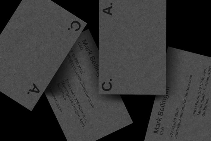
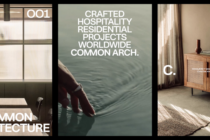
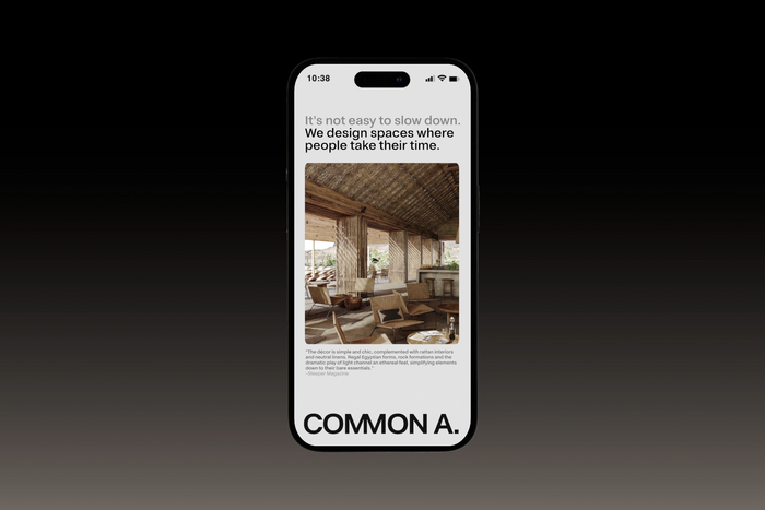
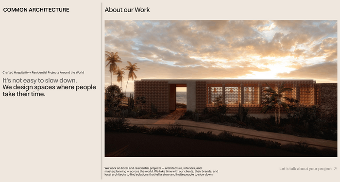
Common Architecture is an architecture firm in South Africa whose approach is based on a simple yet powerful idea: the common as a method. Its brand identity is functional, direct, and designed to work; it accompanies the project, not compete with it.
Beyond the logo, what defines Common Architecture is its operating criteria: clarity, legibility, and consistency. Every decision serves the content and readability of the project, reducing noise and avoiding unnecessary gestures.
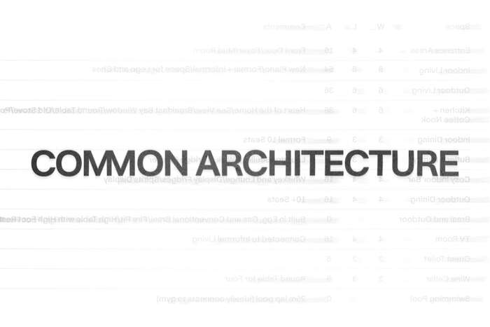
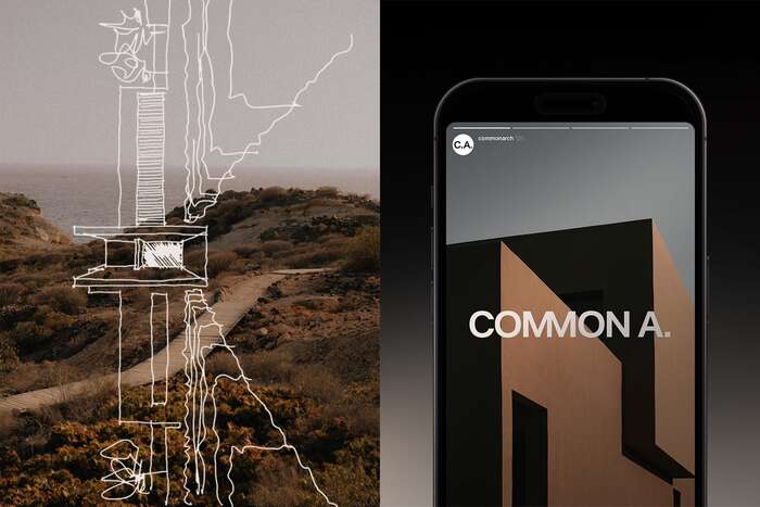
The graphic system is sober and utilitarian: neutral typography, clear hierarchies, and a modular structure that organizes without imposing itself. The color palette is discreet so as not to detract from the images and plans. The identity is designed to work equally well on the web, in print, and on signage. In digital media, it prioritizes readability and accessibility; in physical pieces, honest materials and minimal finishes reinforce the idea of durability and real use.
Source: faena-studio.org FAENA Studio. License: All Rights Reserved.
Source: faena-studio.org FAENA Studio. License: All Rights Reserved.
Source: faena-studio.org FAENA Studio. License: All Rights Reserved.
Source: faena-studio.org FAENA Studio. License: All Rights Reserved.
Source: faena-studio.org FAENA Studio. License: All Rights Reserved.
Source: common.archi FAENA Studio. License: All Rights Reserved.
This post was originally published at Fonts In Use