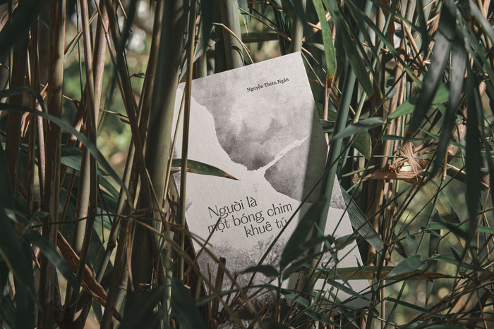
The silhouette of a noble crane by Nguyễn Thiên Ngân
Source: chaofins.com License: All Rights Reserved.


After seven years, poet Nguyễn Thiên Ngân returns with a new poetry collection, Người là một bóng chim khuê tú (“The silhouette of a noble crane”). This book isn’t just a collection of her poems, it’s a deeply personal journey.
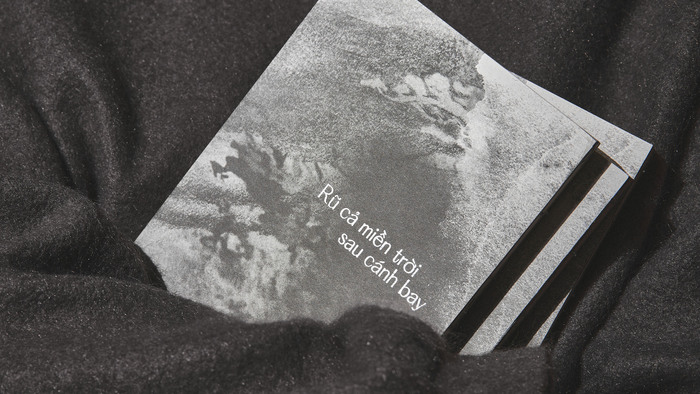
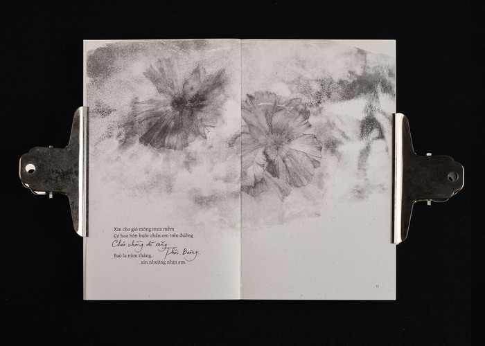
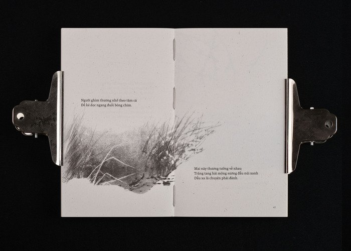
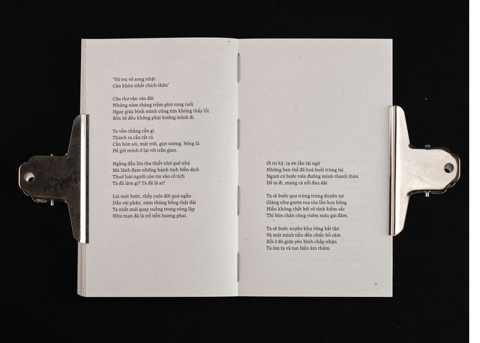
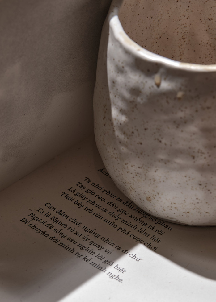
The collection includes 47 poems, edited and arranged with great care so their emotional rhythm guides the reader through four distinct phases. This structure shaped the layout from the beginning. Each poem was placed with intention, allowing transitions between sections to feel natural and continuous. Nguyễn Thiên Ngân’s poems are often brief – many only two to four lines – while the longer pieces carry deeper, heavier contemplations. To honor this rhythm, we used generous white space, giving each line a moment of stillness. The spacing, pacing, and placement of every poem were designed to create gentle breathing room, inviting readers to move through the book at the same thoughtful cadence as the writing itself. The result is a subtle visual tempo: each page turn becomes a quiet pause, a shift, or a continuation of thought.
Typography plays a central role in shaping this experience. For the primary text, we selected Labrada, a serif typeface with edges that feel grounded and honest, neither too polished nor overly ornate. Its sturdy, decisive strokes echo the rawness of the emotions carried through the poems. For the key two-line poem that gives the collection its title, we introduced Hatton. Its refined, elevated forms offer a contrast, a gentle nod to the grace and nobility associated with the demoiselle crane, and a reminder of the dignity found in embracing one’s truest self.
Through this careful orchestration of structure, typography, and space, the book becomes more than a vessel for poetry. It becomes a landscape shaped by rhythm, silence, and emotion, guiding readers through the poet’s emotional journey.
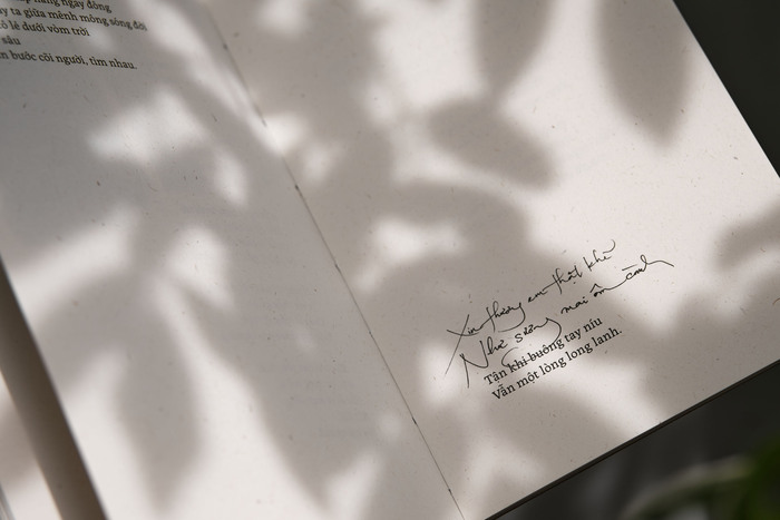
We also decided to incorporate the poet’s handwritten poems an intimate gesture that adds authenticity to the reading experience. Ngân’s handwriting appears at key moments. The first poem opens in her handwriting, immediately drawing readers into her world and signaling that they are entering something deeply personal. It returns again at the end, closing the book the way it began: with the poet’s own hand. These moments act as quiet markers of presence, reinforcing the idea that this journey isn’t just hers. It’s one each of us takes in our own way.
The illustrations are by Hadée Atelier.
License: All Rights Reserved.
License: All Rights Reserved.
License: All Rights Reserved.
License: All Rights Reserved.

License: All Rights Reserved.

License: All Rights Reserved.
License: All Rights Reserved.
License: All Rights Reserved.

License: All Rights Reserved.
This post was originally published at Fonts In Use