“Are your ads living in the past?” ad by Advertising Typographers Association
Source: archive.org License: All Rights Reserved.


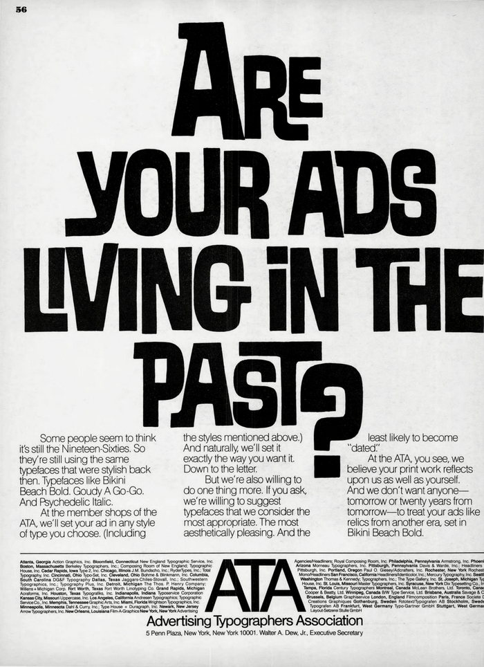
This ad by the Advertising Typographers Association (ATA) appeared in U&lc magazine, vol. 11, no. 2, from August 1984. It makes fun of ads that use typefaces which had long fallen out of fashion.
Some people seem to think it’s still the Nineteen-Sixties. So they’re still using the same typefaces that were stylish back then. Typefaces like Bikini Beach Bold. Goudy A Go-Go. And Psychedelic Italic.
At the member shops of the ATA, we'll set your ad in any style of type you choose. (Including the styles mentioned above.) And naturally, we’ll set it exactly the way you want it. Down to the letter.
But we’re also willing to do one thing more. If you ask, we’re willing to suggest typefaces that we consider the most appropriate. The most aesthetically pleasing. And the last likely to become “dated.”
At the ATA, you see, we believe your print work reflects upon us as well as yourself. And we don’t want anyone—tomorrow or twenty years from tomorrow—to treat your ads like relics from another era, set in Bikini Beach Bold.
The bouncy face with nested letter pairs that’s here dubbed Bikini Beach Bold is actually named Safari Bold (Headliners, 1960). I wonder which typefaces hide behind the other monikers. Goudy A Go-Go might refer to Goudy Fancy. And Psychedelic Italic probably stands for Smoke or something in that vein.
This post was originally published at Fonts In Use