Lisp Style & Design by Molly M. Miller and Eric Benson
Source: archive.org Internet Archive. License: All Rights Reserved.

This would have been a classic Lisp text in the 1990s and while it seems to be quite well regarded, it doesn’t seen to be well known or available. A scan recently became available on archive.org.
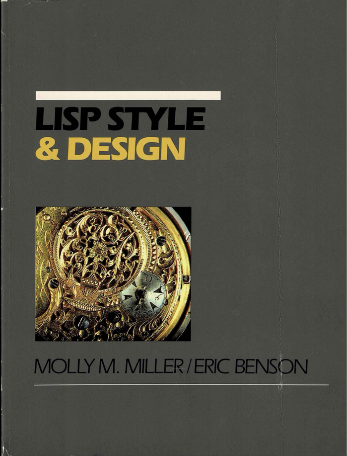
A grey cover with the left-aligned title and author list in two weights of Eras. It is not a coincidence that the cover is reminiscent of another Lisp book I’ve put on Fonts In Use, it’s the same publisher and cover designer. This time the designer David Ford avoids the “weird typeface pairing” prize (see comment by Mark Simonson) by sticking to just one typeface.
The authors were staffers at Lucid Inc. which was one of the major Lisp players of the time; the company went bankrupt in 1994 largely as a result of the AI Winter.
Thanks to Paolo Amoroso on the fediverse for a pointer to the online version.
This post was originally published at Fonts In Use