VfB Stuttgart 1893 rebrand
Source: www.societas.club © SOCIETAS / VfB 1893. License: All Rights Reserved.


Branding agency Societas worked with football club VfB Stuttgart 1893 on updating the club’s brand identity. From their case study:
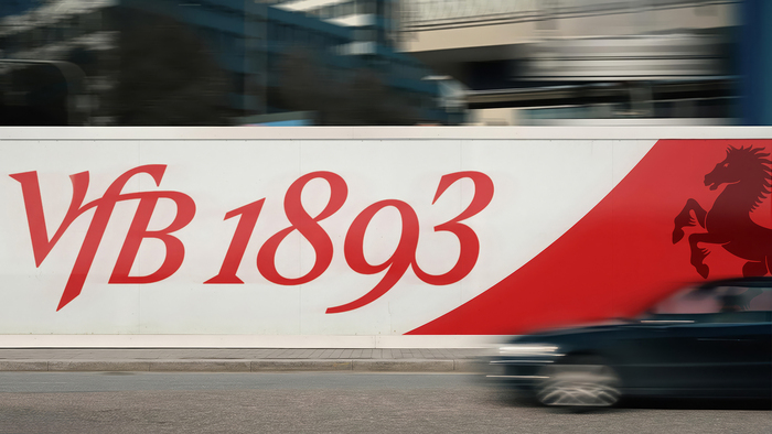
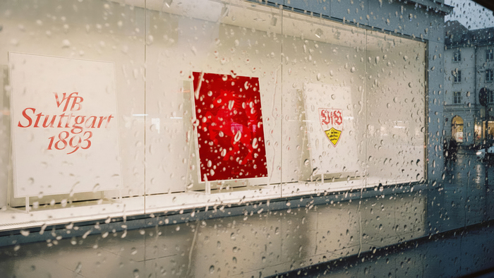
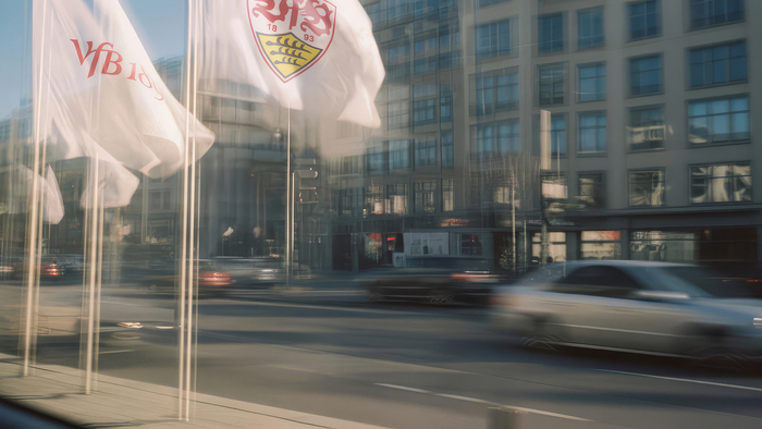
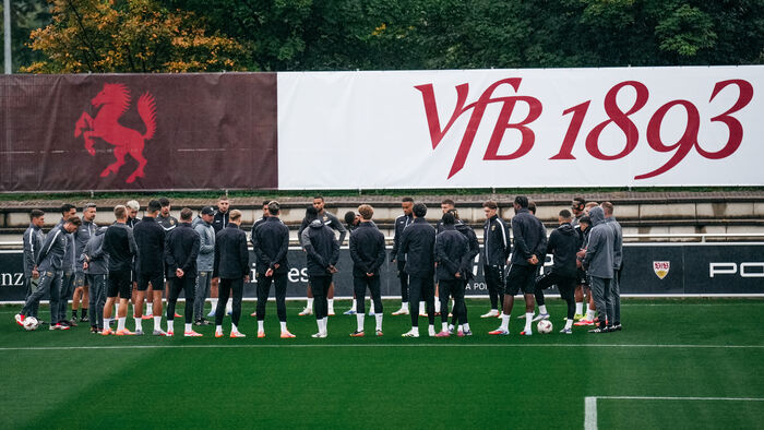
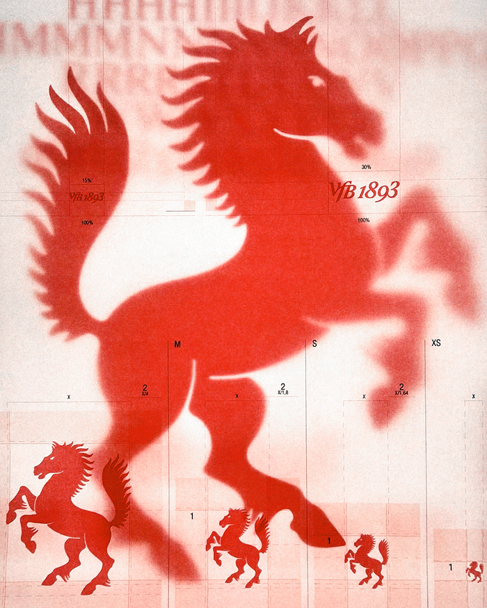
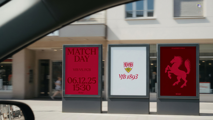
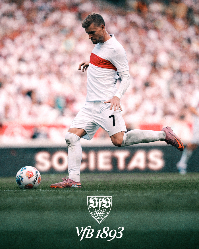
At the heart of the project was the ambition to reconnect the club’s DNA – Verein für Bewegungsspiele (Association for Movement Games in English) – with a contemporary visual system that reflects both tradition and progress. Together with VfB, we worked on the brand strategy, design principles, and a refreshed visual language that gives movement a clear direction, while leaving core elements like the crest, club colors, and red hoop untouched.
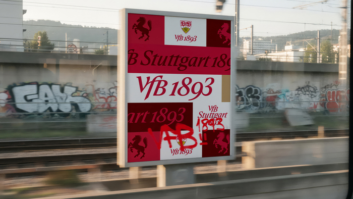
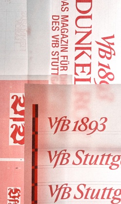
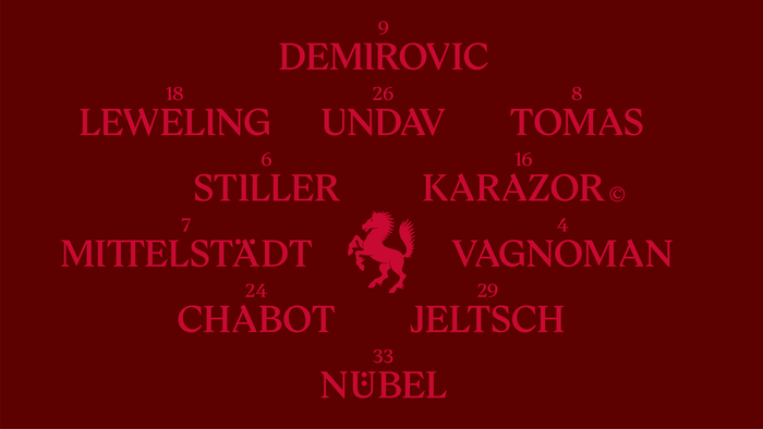
The new identity introduces a custom typeface (“TWK Concordia”), a new wordmark “VfB 1893,” and a refined use of the horse, Stuttgart’s heraldic symbol. These elements are rooted in the club’s history and values while creating a system that strengthens clarity, cultural relevance, and adaptability across platforms — from the stadium to the city and beyond.
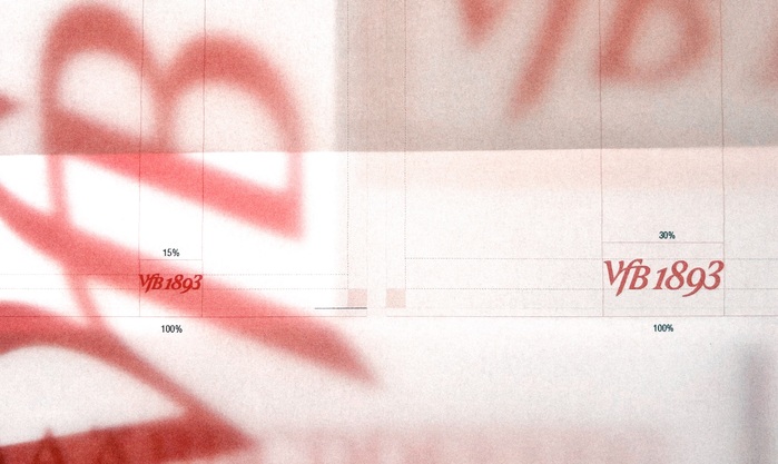
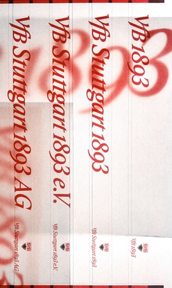
The VfB’s new brand identity was designed by Societas with the help of Friends & Foxes for the social media part, and Frederik Mair for the type animations. The brand typeface TWK Concordia is a customised version of TWK Ghost, designed by Nolan Paparelli and Nina Faulhaber. It is an all-caps font with alternates featuring cut serifs and a few additional ligatures. The wordmarks features the VfB ligature with oldstyle figures, set on a steeper italic angle.
Source: www.societas.club © SOCIETAS / VfB 1893. License: All Rights Reserved.
Source: www.societas.club © SOCIETAS / VfB 1893. License: All Rights Reserved.
Source: www.societas.club © SOCIETAS / VfB 1893. License: All Rights Reserved.
Source: www.societas.club © SOCIETAS / VfB 1893. License: All Rights Reserved.
Source: www.societas.club © SOCIETAS / VfB 1893. License: All Rights Reserved.
Source: www.societas.club © SOCIETAS / VfB 1893. License: All Rights Reserved.
Source: www.societas.club © SOCIETAS / VfB 1893. License: All Rights Reserved.
Source: www.societas.club © SOCIETAS / VfB 1893. License: All Rights Reserved.
Source: www.societas.club © SOCIETAS / VfB 1893. License: All Rights Reserved.
Source: www.societas.club © SOCIETAS / VfB 1893. License: All Rights Reserved.
Source: www.societas.club © SOCIETAS / VfB 1893. License: All Rights Reserved.

Source: www.societas.club © SOCIETAS / VfB 1893. License: All Rights Reserved.
Source: www.societas.club © SOCIETAS / VfB 1893. License: All Rights Reserved.
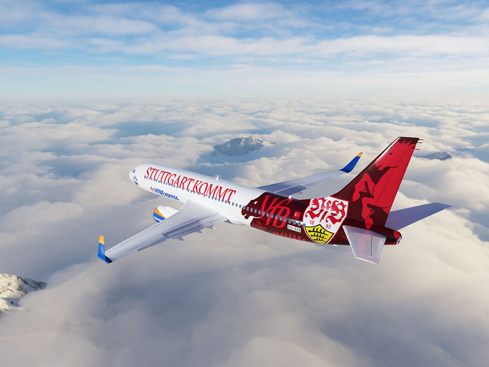
VfB Stuttgart 1893 will receive a SunExpress aircraft with special livery in the club’s design.
This post was originally published at Fonts In Use