The Center of Gravity website
Source: the-center-of-gravity.com Ana Carvalho/The Center of Gravity. License: All Rights Reserved.


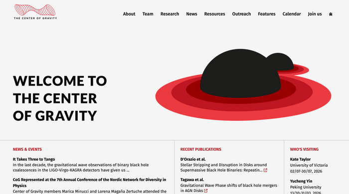
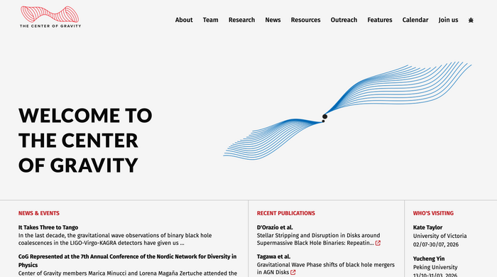
The Center of Gravity (CoG) is a newly formed DNRF Center of Excellence at the Niels Bohr Institute in Copenhagen. The Center focuses on the understanding of gravity: what lies within black holes, how do they move or behave dynamically, how they are affected by matter and quantum effects, and what information can we gain via gravitational waves. The CoG is perhaps the largest and most active Center in the field in Europe.
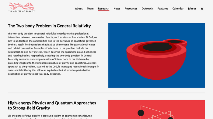
The main requirement for the website was to showcase the CoG’s work for the public at large, and to make it exciting to learn about gravity, as well as to be a fundamental resource for members of the physics community. The need to convey very complex information in as clear and concise manner as possible, dictated the need to find a set of fonts capable of conveying those qualities. The choice fell on two sets of fonts that are visually appealing, versatile and, crucially, extremely legible in a variety of digital environments: The main titles use Lato Bold (designed by Łukasz Dziedzic), while Fira Sans (by Carrois Apostrophe) carries the rest of the typographic work in the secondary titles (Fira Sans Bold) and copy text (Fira Sans Regular).
Source: the-center-of-gravity.com Ana Carvalho/The Center of Gravity. License: All Rights Reserved.
Source: the-center-of-gravity.com Ana Carvalho/The Center of Gravity. License: All Rights Reserved.
Source: the-center-of-gravity.com Ana Carvalho/The Center of Gravity. License: All Rights Reserved.
Source: the-center-of-gravity.com Ana Carvalho/The Center of Gravity. License: All Rights Reserved.
Source: the-center-of-gravity.com Ana Carvalho/The Center of Gravity. License: All Rights Reserved.
This post was originally published at Fonts In Use