Mont-Saint-Michel
Source: grapheine.com Graphéine. License: All Rights Reserved.

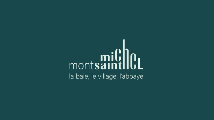
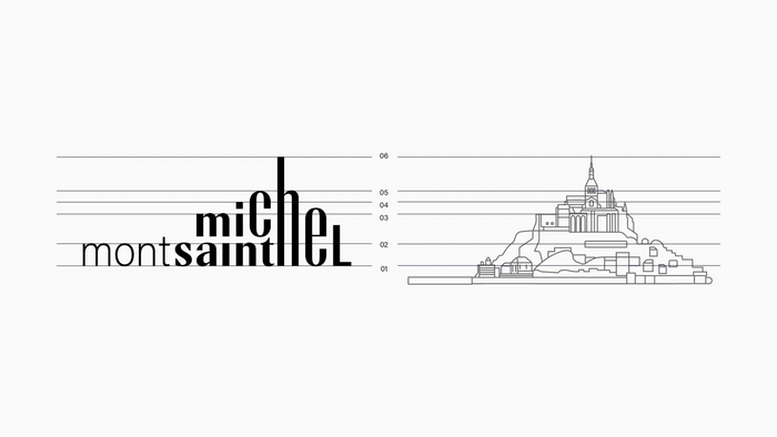
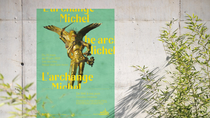
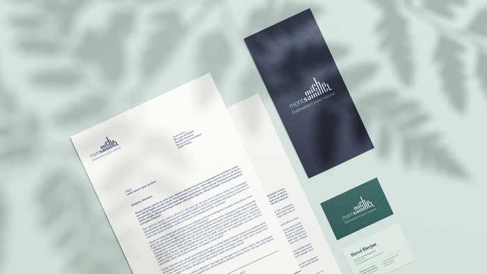
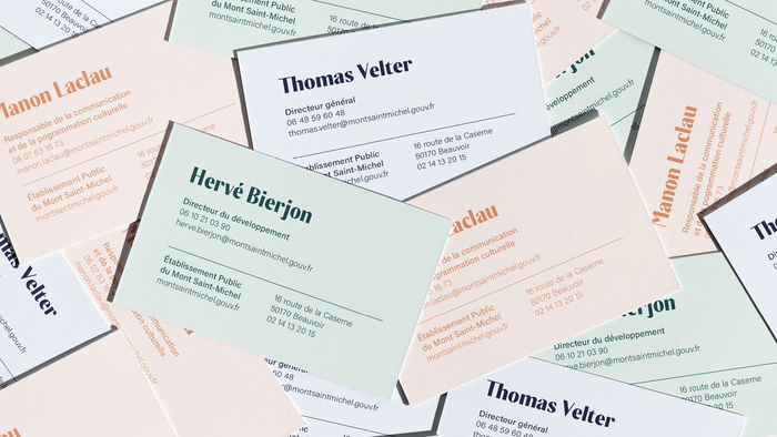
To accompany the creation of the Établissement public national du Mont-Saint-Michel, Graphéine designed a visual identity intended to give a clear and lasting form to a previously fragmented governance. The challenge was to move beyond the saturated “postcard” imagery of the Mont while preserving immediate legibility for a site welcoming over 2.5 million visitors each year. Rather than adding another figurative symbol, the project is built around a typographic logotype conceived as an image in itself, where the name becomes the place. This choice places typography at the very heart of the identity, not as a simple graphic layer but as a true narrative foundation.
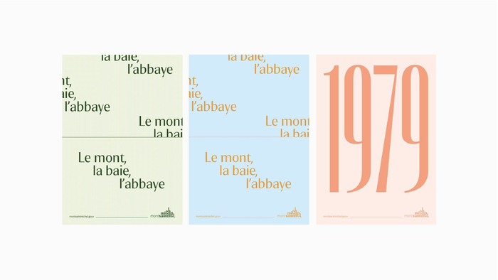
Within this framework, Blaze Type was commissioned to develop an original typeface based on the drawing of the logotype. Its references draw on the medieval scripts found at the Mont – Carolingian and Gothic – reinterpreted through a resolutely contemporary language. The verticality of the letters echoes the upward thrust of the abbey, while certain forms subtly recall ancient manuscripts without ever slipping into decorative quotation. Blaze Type’s work thus seeks a balance between historical heritage and modern efficiency, resulting in a typeface that is expressive, readable, and capable of structuring the entire identity.
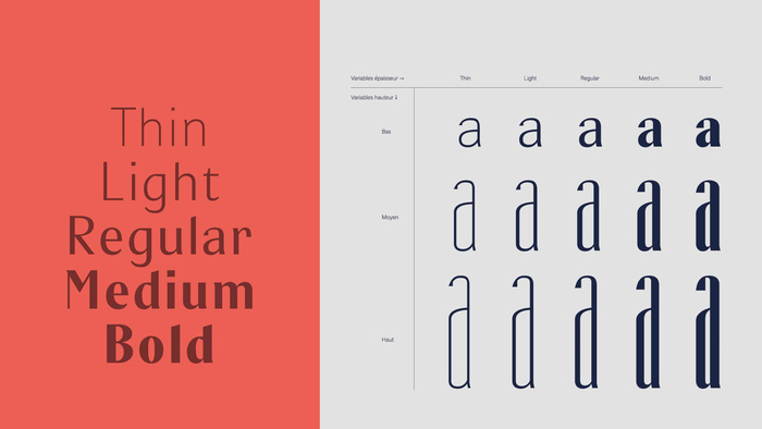
Beyond its design, this typeface plays a central role throughout the visual system. Deployed in several weights and conceived to stretch vertically, it extends into use what makes the logotype distinctive: a form of writing designed to rise, to converse with the architecture, and to open the gaze toward the landscape of the bay. Typography thus becomes far more than a functional tool: it sets the tone, establishes a restrained elegance, and connects the heritage of Mont-Saint-Michel with a contemporary graphic vision. A collaboration that aptly illustrates the strategic role a foundry like Blaze Type can play today in shaping public identities.
Source: grapheine.com License: All Rights Reserved.
Source: grapheine.com License: All Rights Reserved.
The typeface’s scope with five weights and three widths, or heights
Source: grapheine.com License: All Rights Reserved.
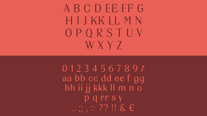
Glyph set with stylistic alternates
Source: grapheine.com License: All Rights Reserved.
Source: grapheine.com License: All Rights Reserved.
Source: grapheine.com License: All Rights Reserved.
Source: grapheine.com License: All Rights Reserved.
Source: grapheine.com License: All Rights Reserved.
Source: grapheine.com License: All Rights Reserved.
Source: grapheine.com License: All Rights Reserved.
Source: grapheine.com License: All Rights Reserved.
Source: grapheine.com License: All Rights Reserved.
Source: grapheine.com License: All Rights Reserved.
Source: grapheine.com License: All Rights Reserved.
This post was originally published at Fonts In Use