Unrivaled Basketball
Source: www.unrivaled.basketball License: All Rights Reserved.

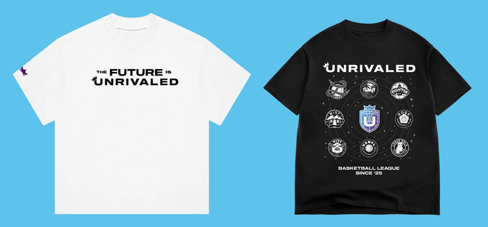
For Unrivaled Basketball, Wheelhouse built a bold, cohesive identity grounded by a single typographic voice: Sequel Sans. The typeface appears everywhere – starting with the league logo and extending seamlessly across merchandise, advertising, marketing materials, and an extensive social media presence.
Designed by Oliver Jeschke for OGJ Type, the typeface brings the same level of clarity and authority as the players in the league. While its range of weights and widths would allow any system to flex effortlessly across formats, Unrivaled appears to only use a single style: Sequel Sans Extended Bold. This keeps the typographic palette tight and focussed. Set large, fast, and often in motion, the type reinforces Unrivaled's competitive energy and modern, culture-forward positioning.
The result is a typographic system that doesn’t just support the brand – it is the brand. Consistent, confident, and unmistakably current, Sequel Sans gives Unrivaled Basketball a visual identity that holds up at every scale.
Read more about Wheelhouse and their Unrivaled Basket project.
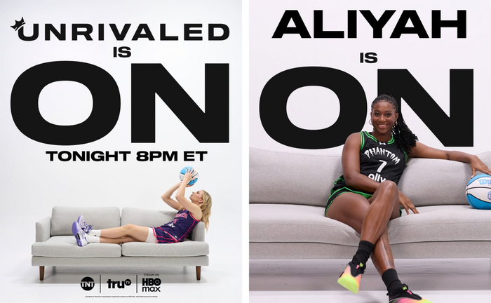
Source: www.instagram.com License: All Rights Reserved.
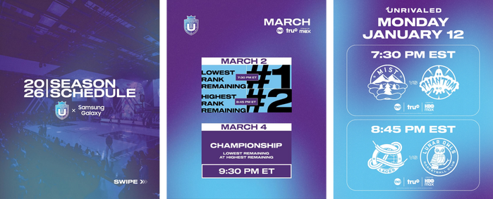
Source: www.unrivaled.basketball License: All Rights Reserved.
Source: www.instagram.com License: All Rights Reserved.
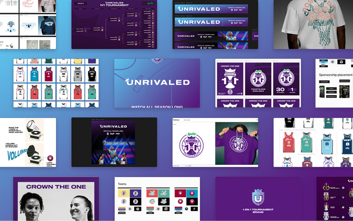
Source: wheelhouse.io Wheelhouse, LLC. License: All Rights Reserved.
This post was originally published at Fonts In Use