AN Interior magazine, Tenth Anniversary Issue
Source: aninteriormag.com Studio Loutsis. License: All Rights Reserved.


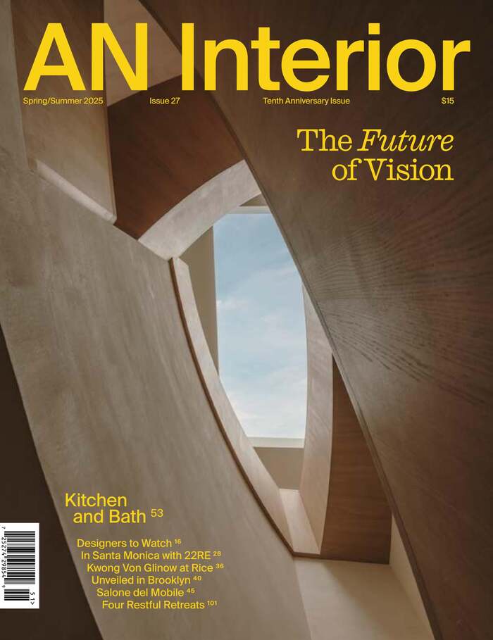
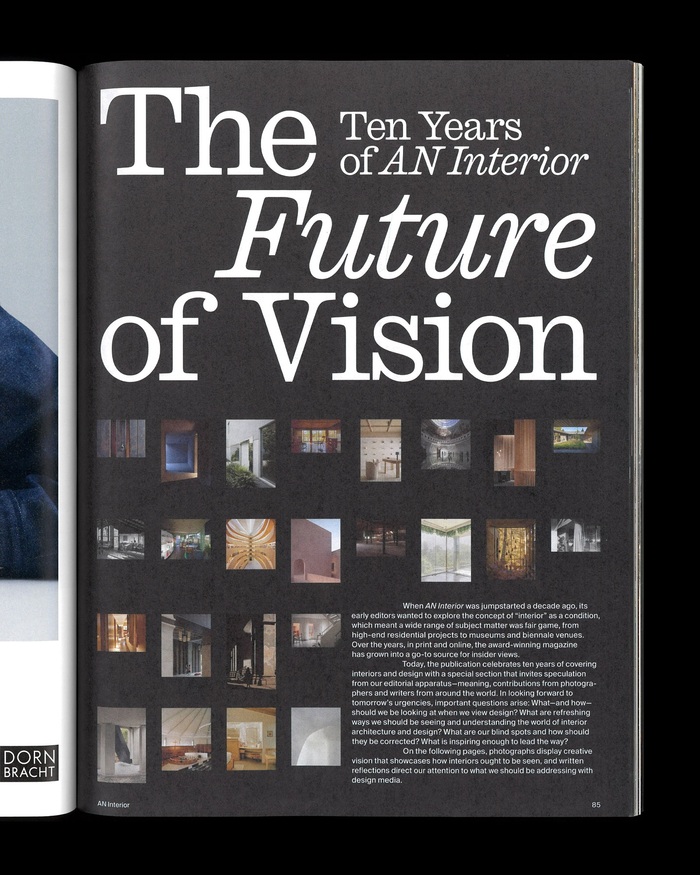
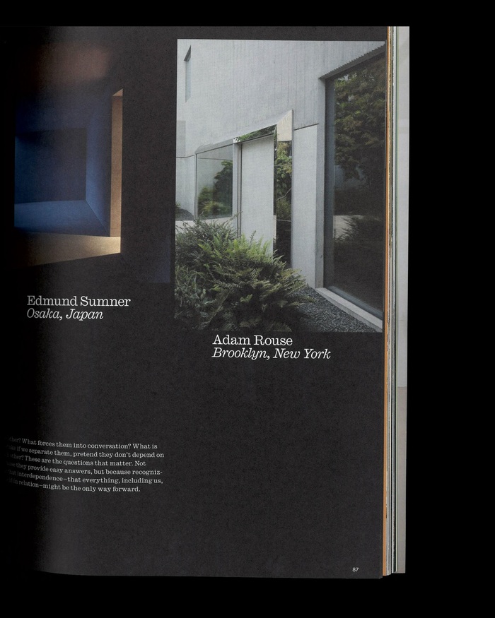
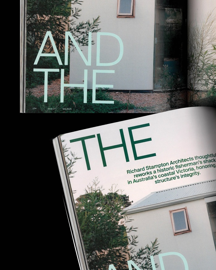
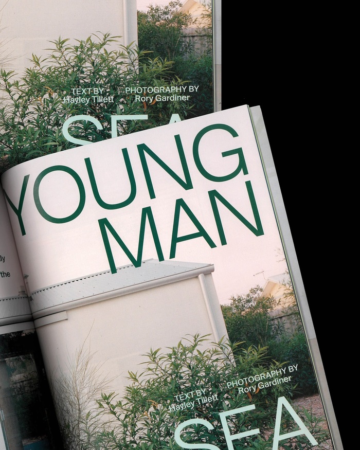
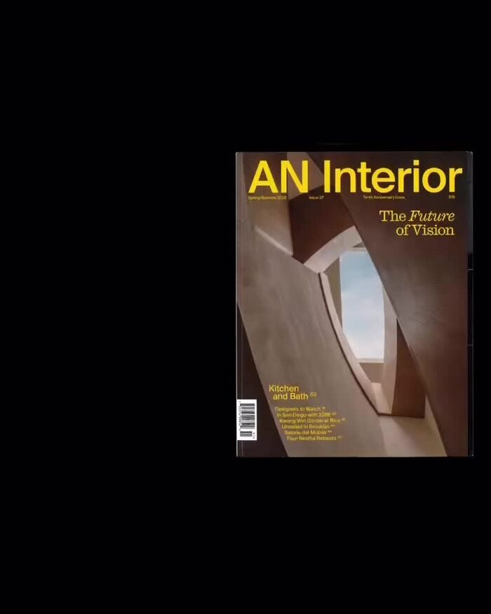
Studio Loutsis used Caslon Ionic as one of the display typefaces for the Tenth Anniversary issue of AN Interior, and mainly for “The Future of Vision” feature. They use it large and for the text – together with Suisse Int’l – and mixing the upright with the italic. Other sections of the issue also feature other typefaces including Terza Display and KTF Rublena.
Source: www.instagram.com Studio Loutsis. License: All Rights Reserved.
Caslon Ionic and Suisse Int’l for the section opening to “The Future of Vision”
Source: www.instagram.com Studio Loutsis. License: All Rights Reserved.
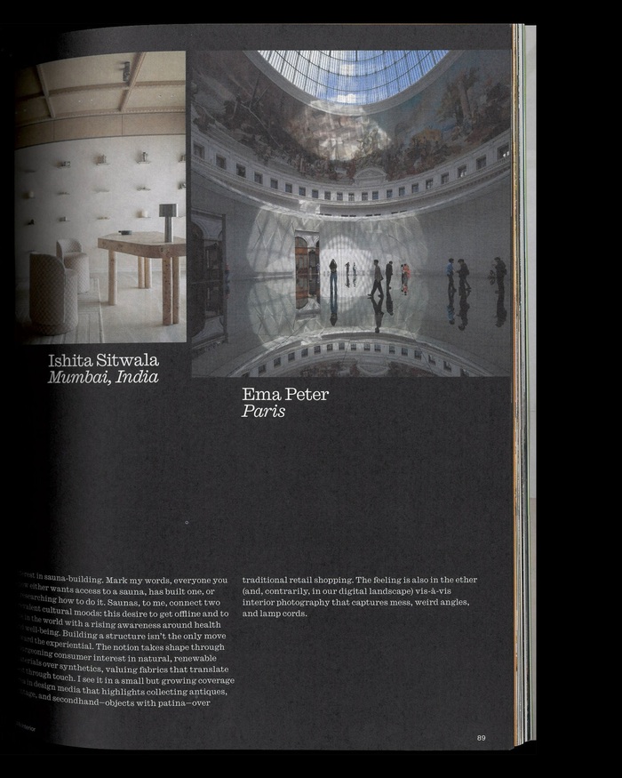
Caslon Ionic used for text
Source: www.instagram.com Studio Loutsis. License: All Rights Reserved.
Source: www.instagram.com Photo: Greg Gazdowicz. Studio Loutsis. License: All Rights Reserved.
Source: aninteriormag.com Studio Loutsis. License: All Rights Reserved.
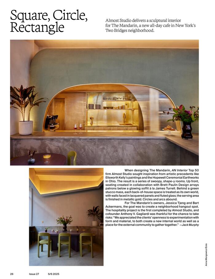
Terza Display with Suisse Int’l
Source: aninteriormag.com Studio Loutsis. License: All Rights Reserved.
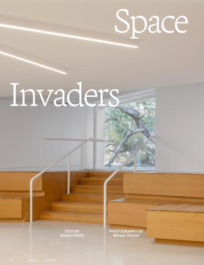
Terza Display for the title of an article on Kwong Von Glinow’s renovation of MD Anderson Hall
Source: aninteriormag.com Studio Loutsis. License: All Rights Reserved.
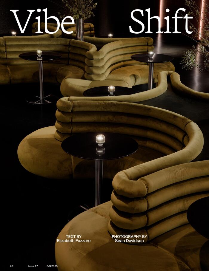
Terza Display for a feature on nightclub design byStudio MBM and Yakka Studio
Source: www.instagram.com Studio Loutsis. License: All Rights Reserved.
Source: www.instagram.com Studio Loutsis. License: All Rights Reserved.
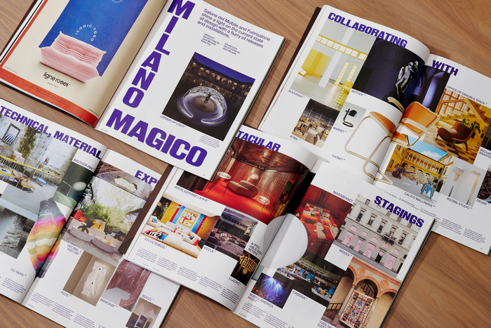
Suisse Int’l is also used as display typeface.
Source: www.instagram.com Studio Loutsis. License: All Rights Reserved.
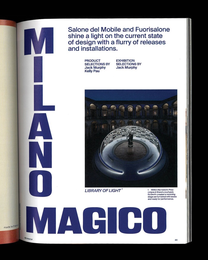
KTF Rublena with stacked letters for “Milano Magico”
Source: www.studioloutsis.com Studio Loutsis. License: All Rights Reserved.
Source: www.instagram.com Studio Loutsis. License: All Rights Reserved.
This post was originally published at Fonts In Use