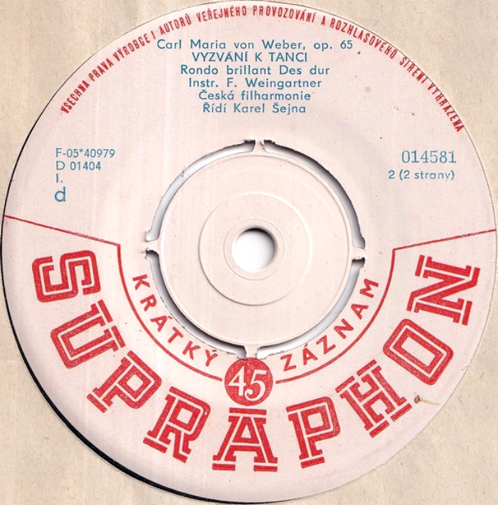
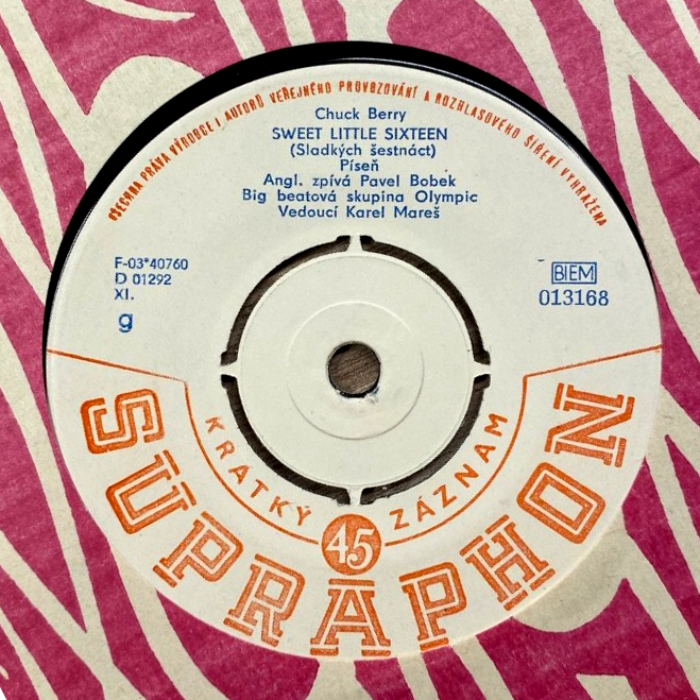
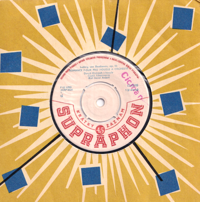
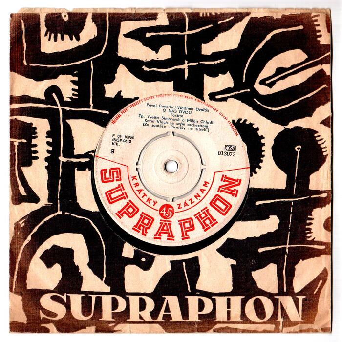
Supraphone single record labels (1954–c.1978)
Source: www.discogs.com License: All Rights Reserved.


Supraphon was one of Czechoslovakia’s state-owned record labels. The main logo – designed by Václav Zajíček and chosen in a competition in 1949 – features the Bohemian lion from the Czechoslovak coat of arms holding a lyra, underneath the name in bold serif letters arranged in an arc. It was recently redesigned by Jakub Kaše from Boomerang Communication in collaboration with Tomáš Brousil
This is not about Zajíček’s logo, though. For the labels of their 45 RPM single records – or krátký záznam in Czech – Supraphon used an alternative logo, featuring constructivist slab serif caps with an inline. While Zajíček’s wordmark is hand-lettered, this uncredited variant is based on a typeface: it’s Faro, designed by Henry R. Möller and first cast by the Schriftguss foundry in Dresden in 1938.
“Krátký záznam” (“short record”) is added in caps from Gill Sans. The credits on many of the labels are set in Super-Grotesk. Like Faro, Arno Drescher’s Futura follower originated at Schriftguss in the 1930s.
If the dates on Discogs can be trusted, the labels featuring Faro were introduced in 1954 and phased out again around the late 1970s.
Source: hudba.bazos.cz Petra. License: All Rights Reserved.
Source: www.discogs.com License: All Rights Reserved.

Source: expo58.blogspot.com brusel expo ’58. License: All Rights Reserved.

Source: expo58.blogspot.com brusel expo ’58. License: All Rights Reserved.
Source: expo58.blogspot.com brusel expo ’58. License: All Rights Reserved.
This post was originally published at Fonts In Use